This morning and without changing anything in my software or settings, I’ve run into a fresh issue with PhotoLab 9: the exported colours differ from those shown in the program itself.
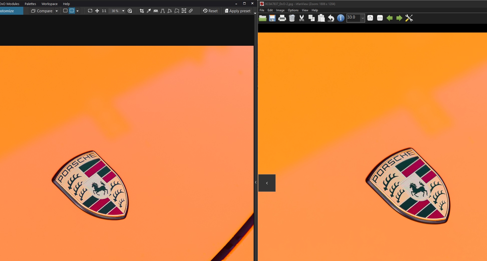
Below is a side-by-side screen grab with PL9 on the left showing my edited RAW and the resulting exported JPEG file on the right.
I’m editing in DxO Wide Gamut as I have been since it was released. I exported the JPEG using ICC profile “sRGB IEC61966-2.1” as I always have and “preserve color details” was *deselected”. I ran the same test using ICC profile “As shot” too, and there was no difference in the exported images.
The colour value of the upper left area in PL is 255,144,36 and in the exported JPEG it’s 255,151,30).
No answer.
But As Shot is the color gamut your camera is set to. Mostly sRGB or AdobeRGB. Check that parameter and search further.
If you’ve calibrated your monitor the system/pl uses that profile to show you the picture. But when exported another profile is used. You might play with soft proof too. When doing so keep an eye on the histogram. Not all differences are visible, to me anyway.
Enable Soft Proofing and set it to show sRGB. Does what you see in PhotoLab’s image preview now match the exported image?
DxO has written that the export process makes some final color adjustments to ensure everything is within the export gamut and not clipped. This is why I always have Soft Proofing enabled. I also tend to enable options to preserve color details. Why are you deselecting this?
Only once I turn “Preserve colour details” to 0 in the Soft Proofing tab. It looks like that may be the main culprit.
Maybe it’s my monitor (though I’ve calibrated that) but I’m after a deep, rich orange from the car’s colours. Enabling the “preserve colours” option on export ruins that. So does “Protect Saturated Colors” in the Color/B&W Rendering section in this case - I’m guessing both perform similar functions.
Sometimes I find this useful, but in this case it’s preventing me from getting the colours I want.
So this is my results: “Preserve Colors” turned off on the left, and on on the right.
You are looking for a solid color surface without details. That is, there is no need to “Preserve color details”, which can be (and obviously is) counterproductive in your case.
Just a quick note:
When comparing critical colors, I recommend using the appropriate tool in PL and no other viewer to avoid possible discrepancies despite correct settings. – Also as mentioned previously, use soft proofing to preview when converting vibrant colors to sRGB.