Colorful Sunset over Biscayne Bay and Miami

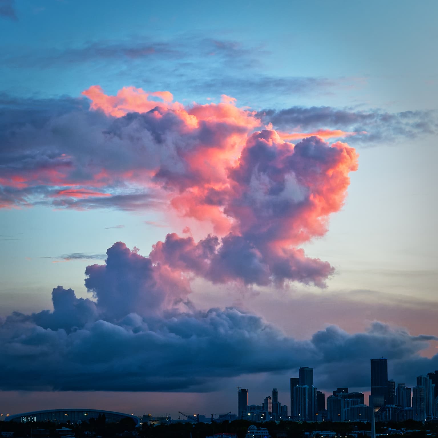
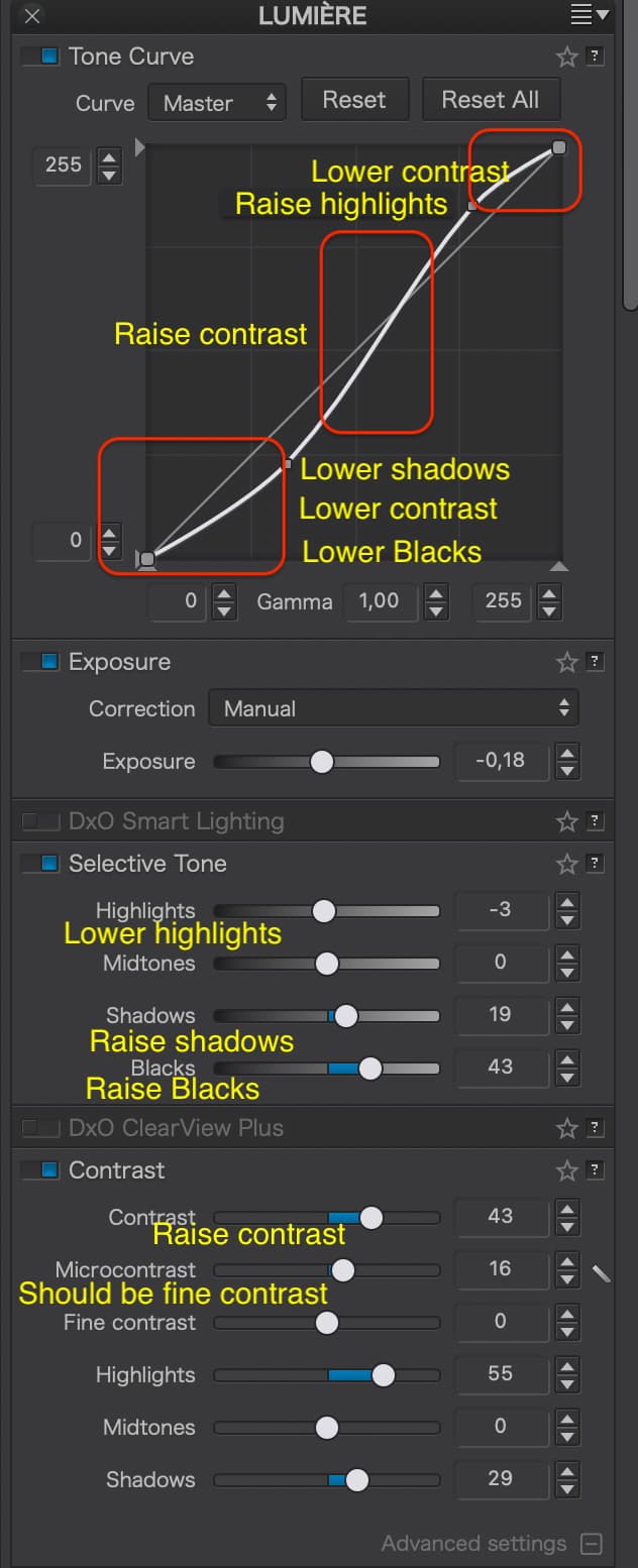
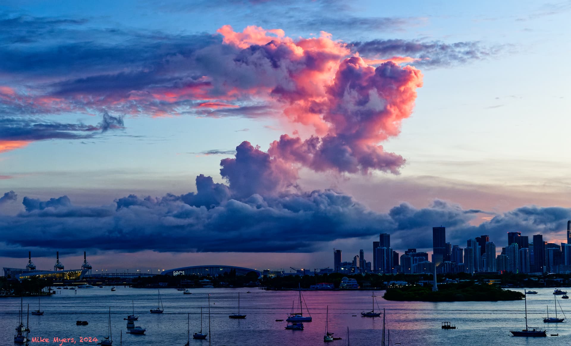
I was busy working on my computer when my phone rang, and while going for the phone, I saw this outside my window. I rushed to get one of my cameras, then rushed to get this photo. The sunset looked awesome out my window, and amazingly it kept getting better, as I kept shooting - but then all the color in the clouds started going away, leaving only dark shadows. I took a few more shots, but it was too late. This was my third shot out of a total of 6 good images.

The more I worked at it, the more it looked on my screen like what I “felt” watching it. I hardly ever see clouds like this out my window/balcony, and there was barely enough time to “do”, let alone “think”.

I put the camera down, called back for my friend, and now it’s five or six hours later, but I wanted to see what was hiding on my memory card.

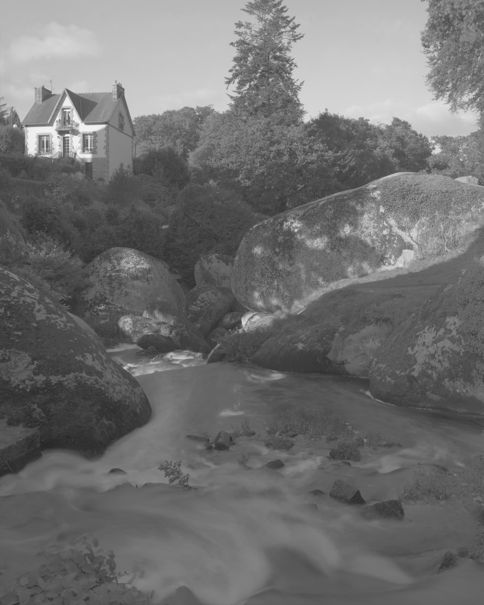
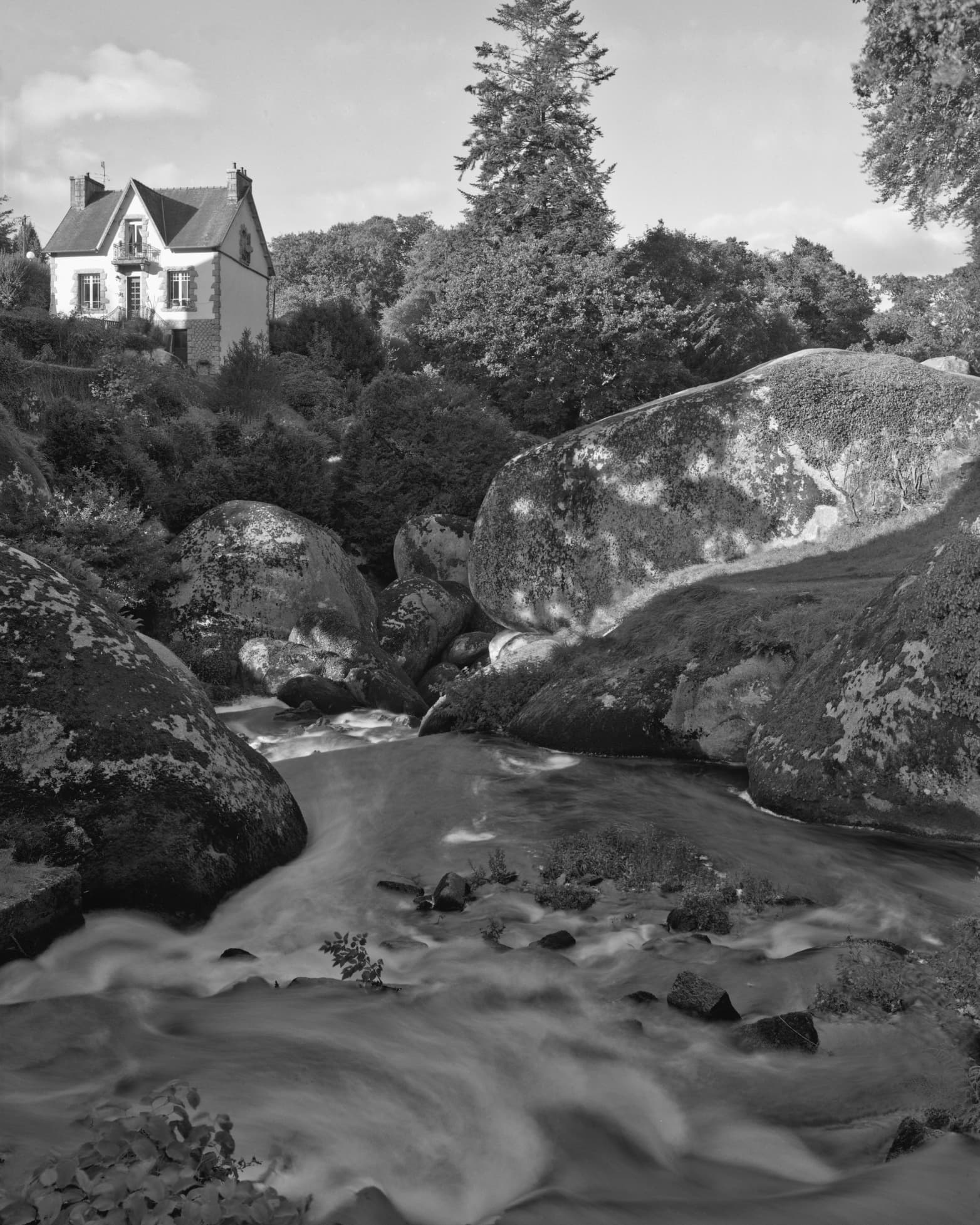
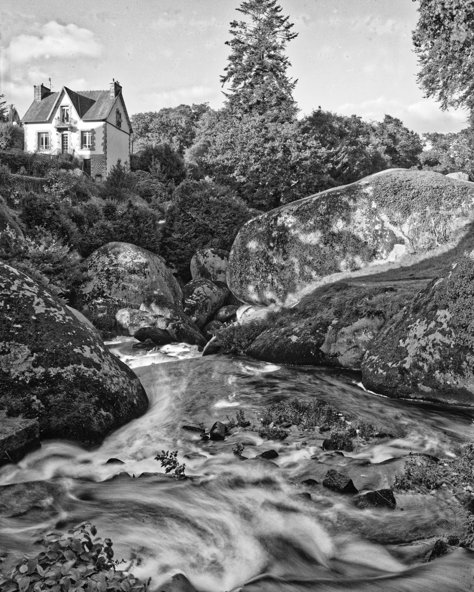
D3M_4329 | 2024-08-24.nef (11.0 MB)
D3M_4329 | 2024-08-24.nef.dop (15.8 KB)

One thing I’m puzzled about. What my brain was “seeing” was awesome, as in how did I get lucky enough to capture this photo. But now, when I look at the un-edited raw file, it’s nothing like what I “felt”. So I used PhotoLab to make the image look like what I felt. Now I wonder if I’m too addicted to PhotoLab, as my eyes see what I’m going to end up with, not what the un-edited world in front of me really looks like. I’m creating what I feel, which obviously, in retrospect, may not be what I actually saw. Or, to put it crudely, the “photojournalism” in my brain is telling me I went too far, but the little bit of “artist” in my brain wants to show what/how I felt.

Not sure if that makes any sense, as the camera has no idea how I “feel”; it just captures the image of what is in front of it. It wasn’t even my good camera, which is resting in my suitcase. But PhotoLab is magical, the more you learn how to unlock that magic.

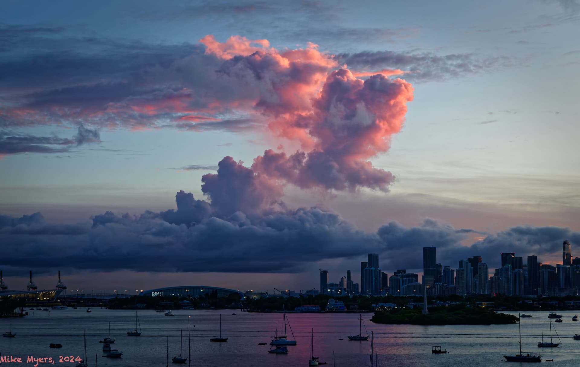
The original file is posted above; ignore my .dop file, and see what each of you can do with this file. :slight_smile:

2 Likes

This is perfectly normal. The RAW file is usually flat and uninteresting. Just as Ansel Adams used his darkroom to bring out the true beauty in his analogue prints, that is what we use PL for with our digital files. Bringing out emotion is a very important part of post processing.

You need to continue yielding to that “little bit”, it’s slowly improving your photography.

Just as every analogue photographer has to learn how to dodge and burn to bring out, what could have been, a totally flat negative. Here’s the basic scan of a 5"x4" neg…

Improved…

With added oomph…

So it is with your shot.

Here is my attempt, framing it square to focus on the most important and dramatic part of the scene…

And here is the DOP with my version added…

D3M_4329 | 2024-08-24.nef.dop (34,0 Ko)


One important point - you are duplicating or contradicting contrast settings by using multiple tools that do the same thing…

There are two parts of my brain, fighting against each other. One part of my brain thinks “the more detail the better”, but the other part sees what you saw - simplify the image by removing things that don’t contribute to what my image is about.

Comparing my final image with yours, I “saw” a lot of things I wanted to bring out, such as the reflection in the water, but the more I included, the less the dramatic part of the image got. You cut out all sorts of “beautiful” stuff, that took people’s attention away from the “heart” of the image.

Your view was of the “heart”.

I feel like I was doing something that I criticized other people from doing with different images - wanting to show too much. I love the image I created, but it got a lot stronger by eliminating things that were irrelevant to the most important part of the image.

I know, lots of other issues, such as the use of all the PhotoLab tools, as for an hour or so I was “whittling” away at the image, trying to simplify it to show what I wanted to show, and if I started all over again, the use of PhotoLab tools might have gotten a lot simpler, without tools fighting each other. That’s important, but the main thing as I feel right now, was cutting out those parts of the image that were “diluting” the final impact of the end result.

It’s easy for me to simplify other people’s images, but it’s not easy to do the same thing with my own images. But comparing my final result with your final result, I can “feel” that your view is more concentrated and more powerful.

Perhaps I need to edit my images, but come back to them many hours (or days) later, with a clear mind, and maybe then I will see things as you did, and get down to the heart of the image.

I sent my final result, and Joanna’s suggested result to ten of my “family and friends”. My nephew replied as following, as to which was the better photo:

“The first one. For me, there is better context in the first picture. The second picture is a picture of clouds and some buildings. The first is a picture of clouds over a serene city with sailboats in the bay.”

I’m waiting to hear back from everyone else. I was surprised, as I thought Joanna’s interpretation was much stronger than mine.

Why does there have to be a “better” photo? Each tells a different “story” of the cloud and presents the viewers with different “feelings”

One photo focused on the majesty of the light in the cloud. This gives me a “feeling” of the drama and power of the light emanating through the cloud. The other is the calmness of city/harbor with the cloud show as a counterpoint. One is more abstract, the other is more concrete.

You will need to decide what “story” or “feeling” you want to share with YOUR photo. Both are valid interpretations.

1 Like

I agree; I like what I did, and I also like what Joanna did. I wish more people would take the time to have their on “go to it” and see what they all come up with.

But to answer your question directly, if I was submitting an image to a magazine, or to a contest, I would need to make a choice, while I like what I did, I like what Joanna did just as much.

I think my version is “more interesting”, as there is more to see. Joanna has already made that decision, and narrowed it down to the highlights of what I captured.

My title for the image “Colorful Sunset over Biscayne Bay and Miami” fits what I did, or vice versa. That would not be an appropriate title for what Joanna created.

Joanna, I was surprised by the feed back I got by email. Comparing the two versions of my photo, here’s what I got back from friends and family:
…
1st one because it is framed well. Falls on rule of thirds, covering clouds the buildings and the boats of the water.
…

2nd one seem to be crop of the 1st one. Only clouds are there and some part of the building.
…

Image is sharp and even after cropping the details of the clouds are clear.
…
The first one with the boats.
…
To me one seems to be cropped and enlarged version of the other more panoramic view. I like the panoramic view as it gives the context to the clouds and the skyline.
…
The first shot shows the total environment, with great clouds, the second shots is focused ( pun intended) on the clouds. If your photo was about the clouds the second one is better as there are less distractions from the clouds.It really depends on what you the photographer wanted to achieve as both are great shots
…
The first one.
For me, there is better context in the first picture. The second picture is a picture of clouds and some buildings. The first is a picture of clouds over a serene city with sailboats in the bay.

Well…

Maybe my question wasn’t fair, as I think either one could have been better, depending on the purpose. My purpose was to show the whole scene. Joanna’s purpose was focused on the cloud. It’s like comparing apples and oranges, can’t be done. Maybe I asked the wrong question? As for me, I wanted everything in the photo, and that’s what I got - but I saw something special and unique in what Joanna created.

I took another photo right after the one I used. I tried to edit it an hour ago, knowing what I wanted to do, so hopefully no conflicting PhotoLab settings:


D3M_4330 | 2024-08-24.nef.dop (16.6 KB)

Hopefully this version eliminates the editing errors I made yesterday.

Again, anyone else that wants to give it a shot is welcome to. If you tell me I screwed up, that’s OK - whatever you think, good or bad, and hopefully you will find a better way to create a final image than I was able to do. Turn it inside out, or upside down, or whatever you like. Don’t be concerned about hurting my feelings - the more this goes on, the more I learn, and with any luck, the more we all learn. That’s what the forum is for.

But one could equally say there is more to distract from the principle subject.

That title is just as word as the image is rambling.

As for mine, the “star” is the cloud - it is obviously taken at sunset - so do you really need a title at all?

Aaaaarrrghhh!!! Do you realise how “photo club” that remark is?

But, if I impose a grid on my image, I get…

… with the vertical part of the cloud on the right vertical third and the top horizontal line of cloud on the top third.

Kinda obvious, if you present both images, that somebody is going to say that.

Weird comment, as there could be street riots going on.

Can’t tell. The DOP filename doesn’t math the original RAW file.

Oops, me bad!!! I think I was just tired.

D3M_4330 | 2024-08-24.nef (11.1 MB)

I suspect neither image is “better” or “worser” (sp) than the other. It’s like what is better, an Apple or an Orange?

The two images are so similar, but so different. Only one of them shows what I was consciously looking at and wanting to show to others. The other image gets to the central point of the image, but leaves out almost all the “eye candy”.

Your thoughts about this?

“Art” is in the eye of the beholder."

My answer - look at the last version of the photo I posted.
That is “my” answer.

But, in this forum, most of us learn from each other, which is why the forum was created, to get feedback. But, while I love getting feedback, some others are upset when I post my version of their photos. Either despite of, or regardless of, what you just wrote, I enjoy getting feedback, good, bad, or whatever.

It does.

That assumes a “connection” is needed. To me, the “contrast” is more important than the “connection”, but that’s just my way of seeing things.

I asked for other opinions, and I’ll thank you for yours.

How does that saying go, “be careful what you wish for, as you may get it?” Well, I did eventually get what I wanted, but others may feel very differently. That’s what allowed Joanna to create her version. Considering I shot this from my balcony, and 30 seconds later it was gone, I’m not aware of anything else I could have done while taking the photo - but obviously, there are lots of choices after.

You, and anyone else here, are free to suggest, or illustrate anything you wish, regardless of what I was or am thinking. I’m wide open to new ideas.

Why not? I’m not so much asking what other people think I could do, as I am asking what THEY would do. Like Joanna.

That I personally like and enjoy my end result is irrelevant. That has never stopped Joanna from making suggestions on ways to improve.

My “skill” is a small percentage of what several other people can do in PhotoLab, so there is always room for improvement. And my “skill” (or lack of) in composing an image leaves lots of room for other ways to do so.

Yeah, I agree with you when you say I “own the-personal decisions”, but anything and everything is open for review and change. My biggest “selection” is B&W vs. color - and even that sometimes gets changed as I’m working on an image.

I enjoy and appreciate “feedback”, good or bad, relevant, or not, technically correct or not. Everything is like “modeling clay”, and can be shifted one way or another. At least that’s how I see things, for better or worse.