my use is not for web.
Is mainly for myself, on my computer.
Besides, sRGB is the oldest color profile, and the more limited one.
It is advised for web use, because on web pages small details and faint tones are not so important, and because it’s the only one supported for sure all around the world.
Afaik, sRGB cannot render a lot of tones. For a faithful reproduction on my computer, I don’t think it’s the best choice.
I just bought a new office/home grade printer HP Smart Tank 7006. Has anybody experience with color management when printing? First attempts came out erratic regarding color and contrast.
Instead of using expensive photo paper for trial and error, I would like to put the settings right from beginning.
Unless you create your own ICC printer profiles for each paper that you plan on using, you will never be able to guarantee reliable colour. This printer was never intended for photo printing and HP do not provide profiles
I do, but not using PhotoLab. My experience is that PL isn’t that great at printing, I get more accurate colours and better detail if I print from either Affinity Photo 2 or Photoshop CS2 (yes, CS2).
The first thing about printing is it is essential to calibrate and profile your monitor to ensure it is displaying the most accurate colours it can. If you don’t do that you have no idea of what the colours will be when they are printed.
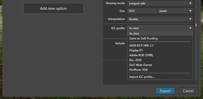
I have a Dell monitor that can be hardware calibrated to its native gamut coverage, which is more or less 100% Adobe RGB. All editing in PL is done using that monitor set to that gamut and with PL using DxO Wide Gamut. I don’t use any of PL’s soft-proofing features. When I’m happy with what I see, I export to TIFF with an Adobe RGB profile embedded.
Still with the monitor set to its native gamut, in Affinity Photo / Photoshop my working colour space is Adobe RGB. The image I see there matches what I see in PL.
In the software print dialog, colour management is set to ‘controlled by app’ and the paper profile is set to the one for the paper I’m using.
My printer is OK but not a ‘pro’ model, it’s an Epson XP-960 Expression Photo. It has six inks. In the printer properties dialog, colour management is turned off. That is vital.
The print colours I get are a good / acceptable to me match to what I see on screen.