Stenis
(Sten-Åke Sändh (Sony, Win 11, PL 6, CO 16, PM Plus 6, XnView))
1
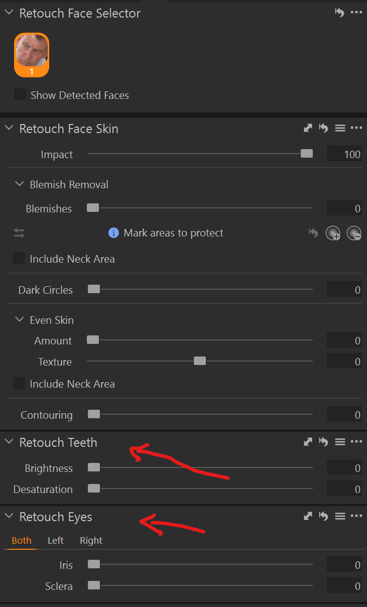
Capture One have improved their AI-masking in several steps over the years and now they just released version 16.7 with a set of new AI-masking features:
It looks like especially the Retouch Face-applet has been improved. Photolab can already combine masks very nicely and that has been missing to some extent before in Capture One.
I really love the Face Retouch in C1 and hope DXO can provide something similar in a close future.
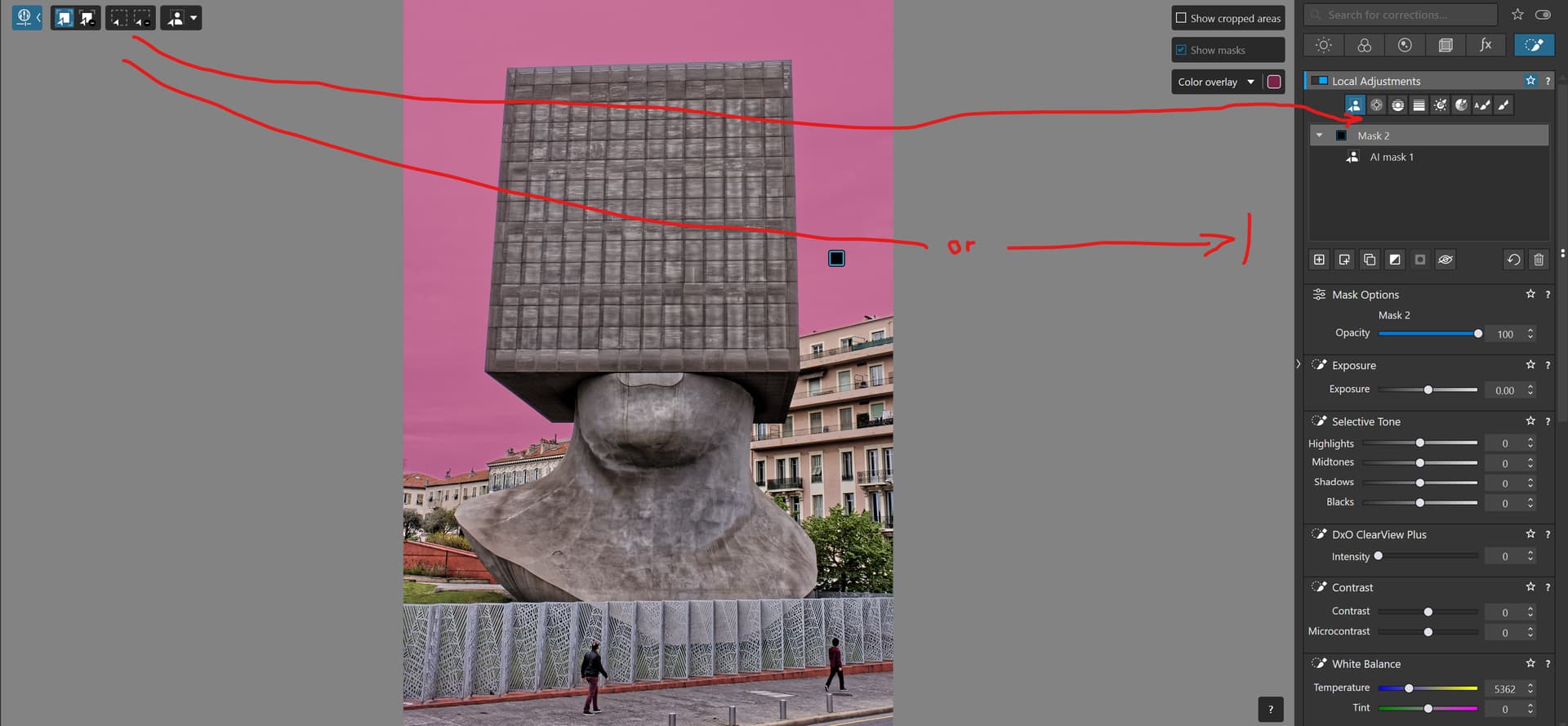
I’d vote for shoring up what they have first. Certainly performance needs some serious attention, and I also think the UI could do with some tweaks. Working with sub-masks is fiddly, particularly where some will automatically add on to the current mask and others will automatically create a new one.
Also, portait-focused tools favour a single genre of photography. I think there are more things they could do for general use first. For example, I think an elliptical gradient would be useful in portrait work, but also for everyone else. Whereas skin effects are only applicable to the one genre.
In any case, this is DxO. I wouldn’t hold your breath.
1 Like
Stenis
(Sten-Åke Sändh (Sony, Win 11, PL 6, CO 16, PM Plus 6, XnView))
3
Agree, despite I will upgrade to a new computer (16 GB → 32 GB RAM, SSD 1 TB → 4 TB and RTX 3050 8GB → RTX 5070 Ti 16 GB) in a couple of weeks. I guess at least I won´t have any performance issues after that, DXO must focus on refining their models and make the system work even on as little as 8 GB, because otherwise they will loose part of their installed base. The competition like Capture One and Lightroom seems to fix that without any more serious problems. DXO can´t let that to happen.
They also HAVE to do something to the interface cathastrophy they have created in version 9 with the Local Adjustment Tools spread out over the whole screen from right to left. That is almost the worst design possible having to fly from the left to the right side or vise versa of the screen evertime we need to switch between diffrent selection and area tools before applying a mask or chosing another one to use.
Why not make the left side parts of the Local Adjustment interface “float”-able - with an option to dock it under the Local Adjustment Tools.
As it is now, I’m on the verge of having to pop a bunch of seasickness pills to cope with having to sit and watch a mouse cursor flying across the screen all the time and it is about as ineffective as it gets if the users don´t use at least the short cuts there is.