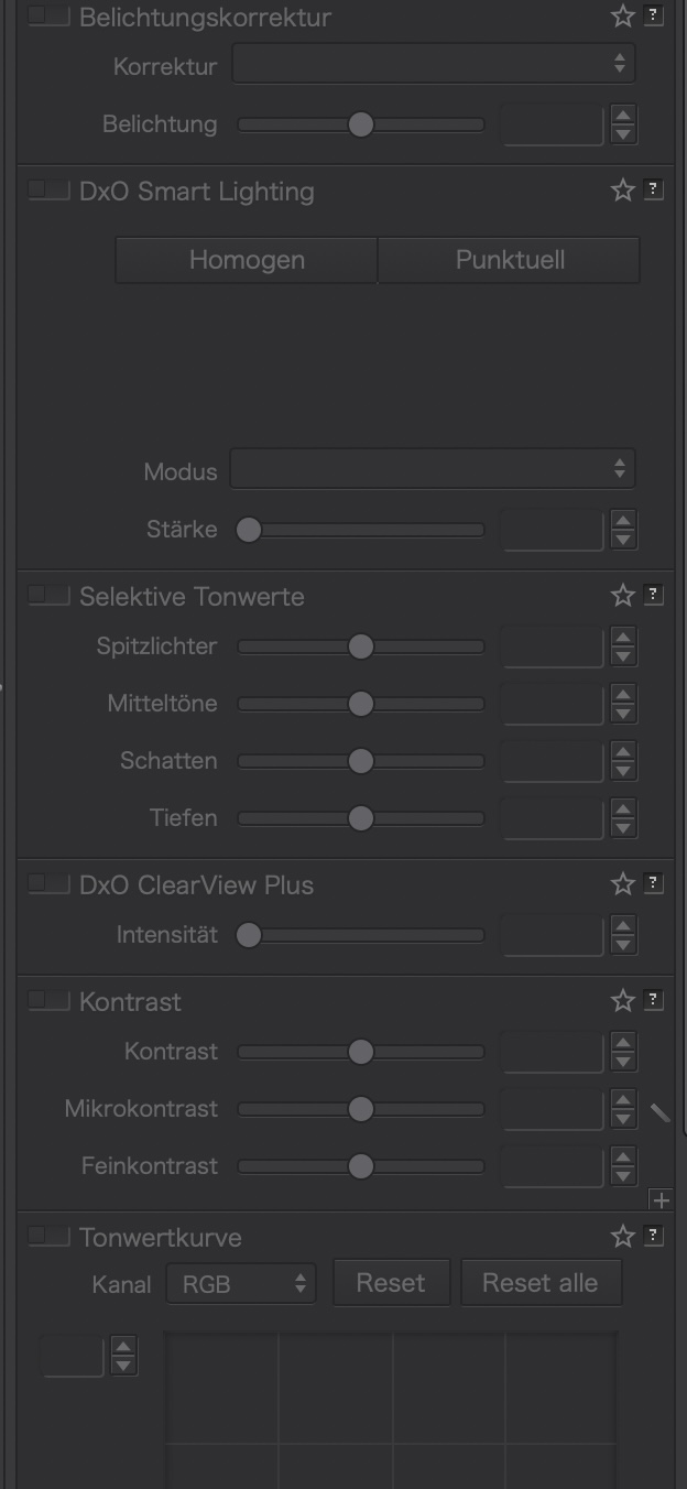
I’ve just upgraded to PL4 from PL3 and I’d like to add my vote for an improved UI. In general the new arrangement of palettes is OK with me but the poor visibility of captions on palettes that are not activated is really not good. I have fairly good eyesight but find I have to consciously search for non-activated corrections. I’m surprised this was thought to be acceptable.
For info, I’m using a 5K 27” iMac and a 15” MBPro both calibrated to 120Cd
Looking back through this long thread it seems this issue was highlighted shortly after PL4 was released so I’m hoping DxO will find time to address this problem before PL5.
I myself have no problems with UI appearance. I dont know PL3, so I cannot compare.
Maybe improvement is possible, or it was better before. I have no major complaints about this.
What bugs me a little bit is image display:
If I zoom out the noise is not decreased as it would be in an antialiased image viewer.
The image can get blurry, or the visible noise increased while zooming out, or hotpixels turn up, which are normally invisible in the final processed image, even then when they would not be fixed.
This looks to me like a (possibly modified) nearest neighbor algorithm which is rather simplistic and even the Windows OS picture viewer and many opensource programs do it better.
This does not mean, I am unhappy with the final results, I am very happy and this is why I bought it.
However a better antialiased image zoom algorithm would be good to judge the appearance of an image in various sizes.
Also I would wish in comparison mode there where a possibility to process and view the visible image rectangle with a single button or key press. It would be enough to give this possibility in 1:1 mode only, because I understand such a feature for arbitrary zoom factors is not easy to implement.
Correct, an it seems nothing is interested in this theme.
With every day I get older, my eyesight gets worse with every day and with every new software version, not only DXO, no programmer seems to be interested in the basic rules for legibility on screen workstations.
I’ll probably get a Braille keyboard for Christmas.
4 Likes
tpytlarz
(Olympus, Mac mini M1, PL6 Elite, Nik4)
46
I am using a trial version of PL5 and it has not been addressed. I have to wonder if there are old Adobe employees running things since they never listened over there either. Should I buy PL5 or move on to Capture One or ON1 now that I’ve decided to leave Lightroom’s software rental program?
hope you enjoyed the Christmas days and got a lot of presents.
Is it somehow possible to give this topic more importance. This is just a FR about it, but there are also many posts with similar content.
If a topic is raised so often by both old and new forum members, DXO should not ignore it for so long.
I will admit up front that I am being rather negative about this, but its frustrating when a piece of software as expensive as PL does not even provide basic features that are usually taken for granted in all software.
In my opinion, although PL is capable of performing all sorts of magic when it comes to processing raw files, when it comes to the UI, and basic features outside of raw processing, it is patchy, inconsistent and notably sub standard compared with the other software out there (and I don’t just mean the obvious “competitors at the same price range”).
I get the distinct impression that DxO consider “minor UI tweaks”, or “minor usability feature tweaks” as wasted effort that wont sell the product, and as such place their primary effort into “making the raw processing algorithms more exciting”.
Whereas from a general usability point of view, certain levels of functionality are simply expected as the norm… and PL does not even match these basic standards in some areas. Basic UI design as called out in this thread is one example, patchy File/Directory management is another example, and I could call out more. Case after case can be found in the forums… yes there is often some kind of workaround, however the point is, at this level of software (professional) the user should not be having to work round so many trivial faults/omissions.
The frustrating thing is that most of these issues are utterly trivial to fix (comment made as a professional software engineer), but they never seem to be considered as important enough, and to be brutally honest are notable enough (as aggravations) that it makes the overall product look unprofessional.
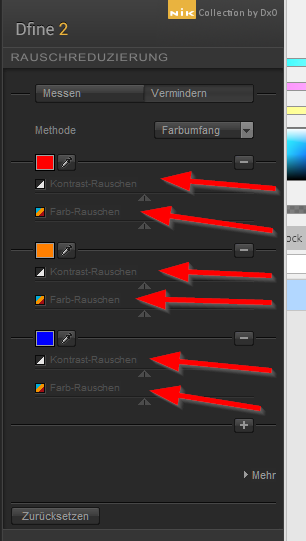
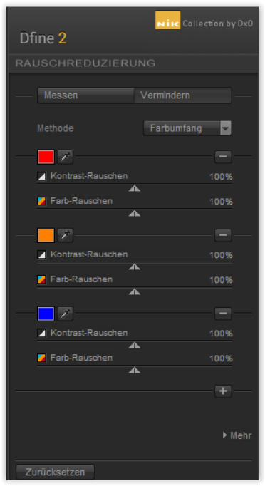
I’m just curious. Back in the day it became modern to have a dark surface and grey icons on it. Looking “more pro” or “less distracting” from the image in the works. However, I’m not seeing all better in grey. And used some time to change the icons of that converter back to colour, as it was simply easier to find out “blue, green, red” and so on instead of always studying the icon carefully to make sure to not to click the wrong button.
What do you guys think about icons in monotone grey or get some help from a colour? Which ones are easier to “read”? Alright, the most significant colours I used for the organizing part of that software which in PL is close to non-existing. The editing icons don’t need colour that much, but the less often used I really am looking for purple = intelligent (search) collection/album. It was much easier to navigate in the folder tree.
Hi the problem with the unreadable, inactive tools I have pointed month ago so you got the like because you pointed again.
I would feel better to give my likes, heart and kisses to the DXO member who can force the minor update which will fix this fu… theme
To answer your question directly, of course a coloured icon is easier to identify rather than a low contrast monochrome. All studies of human eye perception have validated this. It’s not rocket science
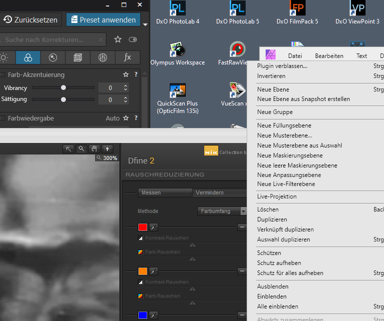
A hard to read UI is a trend in DXO products. I downloaded the trial of DXO V4 and uninstalled after 2 days the readability of the UI was dreadful. I have FilmPack V6 and the numbers on the sliders measure 2mm high on a 27" 2560x1440 monitor set at the recommended 100% scaling in Win 10. Add to that the DARK RED on BLACK colour scheme??? It looks ridiculous now I have written it down.
These types of problems generally arise from the culture of the company. It appears to be that the overall aesthetics of the UI is paramount and the soothing dark grey and red on a black background trumps usability. As the comments on this thread reveal, it is a long standing problem that backs up my theory that it is a “culture” issue which unfortunately usually means that it is not going to be fixed until whoever is wielding the UX/UI power within DXO moves on.
We saw an identical situation with Lightroom. The lead engineers objective was “anything but Photosop” which, for example, explains why the way you crop an image in Lightroom is the opposite to every other mainstream photo editing program Sense only prevailed after the guy left to work for Microsoft and changes were then able to be implemented that previously were impossible.
All we can do is keep asking for changes and hoping for career advancement for whoever is responsible
Actually it should be easily obvious for someone making a photography product: In order to recognise details (ie letters on some UI), the human eye needs contrast. Dark grey on black does provide only little of that. And ageing eyes needs more of stuff called contrast, if you wear multifocal contact lenses as I do even more so.
The fix seems obvious, doesn’t it? So thanks to everybody for keeping that topic alive. UI “dark theme” design has been the latest trend, leading into some dead end as far as I am concerned. I can only assume that software developer’s /UI designers average age is significantly below mine (I’m fitfty), given their apparent superior vision…
Hi @Guenterm
I just realized that after updating Eizo’s Color Navigator my monitor was set to 6500 K,
changed that back to my usual 5900 K and took a new screenshot.
Don’t understand why in your screenshot part of the lettering is unreadable.
Wolfgang