Hi,
Totally agree. The first time I saw them, I thought the feature was disabled.
Hi,
Totally agree. The first time I saw them, I thought the feature was disabled.
I meant that although I work with 120 and Wolfgang only with 80, the ratio is drastic.
You are of course right, there is a big difference between PL3 and PL4. Thanks for the comparison. I don’t understand why DxO changed that.
The point is that screen brightness has zero influence on how a screen shot is taken.
Thanks for clarification!
It appears as if this issue is somehow related to:
Perhaps just the wrong items are “greyed out”…: as mentioned in the other thread, the parameters and sliders of inactive tools should be pale (not their titles)…
I think that DxO needs to address this comprehensively.
(Question is how to treat the votes for these two requests.)
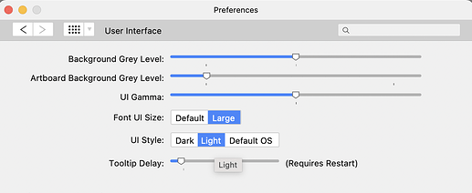
How do you change the font size or color on the Customize interface?
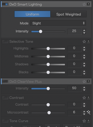
The light grey font on the dark grey background does not have enough contrast when using a monitor that is calibrated darker for printing.
There is already a thread on this topic, please vore here:
https://forum.dxo.com/t/please-increase-the-readability-of-the-labels-on-deactivated-correction-tools-in-the-palettes/17177?u=klick
BTW: There is no possibility to change font, color or brightness.
And we have also Better User Interface - DxO PhotoLab / Which feature do you need? - DxO Forums
And we can take the chance to point to Affinity photo where it’s possible to customize a little bit more

There are some more threads pointig that
Best regards
Thanks for your responses. I have read through these topics and they are on point.
A bad interface hurts sales and this has been a reported issue since December of last year. There have been quite a few updates since then. I wonder why nobody has bothered to fix this.
I have had DPL4 for many months and hated to use it because of the readability. However, over the last few days I’ve dug deeper to find out what’s possible, and have found that DPL4 has a lot more to offer than just DeepPrime.
Since I haven’t been using DPL4 other than as a denoise program, I haven’t been using this forum. Is there a way to get more attention drawn to this issue?
Thanks again.
I’m just curious what size monitor you are using. I find that contrast is more than adequate on my 28-in 4K monitor even if I lower the brightness a bit. While there have been some complaints about different aspects of the interface, I don’t recall contrast as being a major one.
Mark
Based on the other threads, it appears to be an issue on the Mac software.
It’s a problem with the following monitors:
Benq 270C - M1 Mac Mini 2020
Benq SW 271 - M1 Mac Mini 2020
27" iMac 2012
15" MacBook Pro 2016
So, 2 external 27" monitors, a 27" and a 16" internal display.
It’s difficult to read and find sections that are not active. In the screen shot below, Smart lighting is visible, though not great, but ClearView is difficult to make out.

Totally agree!
Dear @sgospodarenko Svetlana,
our heart and soul for all our worries  , hardships and torment…is it possible to merge all the stuff about the user experience with the readability, and to point the guys from development team to this.
I wish you a great weekend
best regards
Guenter
Good morning  ,
,
Sure I will merge all of them in one and then ask a dedicated person to analyze the feedback.
Regards,
Svetlana G.
Done!
@StevenL could you, please, analyze this feedback when you are back from vacation?
Thank you
Regards
Svetlana G.
You are my  of DXO
Thank you 
Many thanks!
In fact, never noticed this before, or did have a problem with it. But now pointed to it, totally agree.
Way better before.
Unused palettes don’t need to be read, they only need to be perceived. Regardless, I loathe low contrast design trends. Photolab’s demographic skews older so I’m not sure why DxO is burdening us with impossibly low contrast ratios. Perhaps DxO feel they have too many users over forty and would like to push the average user age down by driving us away.