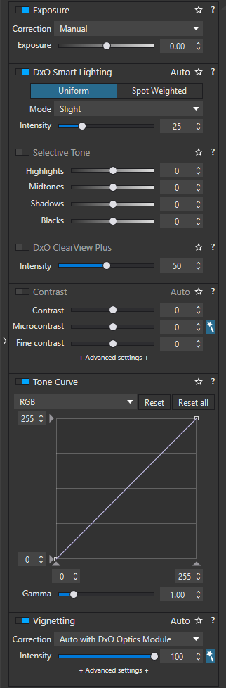
In the Customize mode right tab, the background color of a palette’s title bar leads to much confusion when looking for a specific palette :
If the “Show feature highlights” option is enabled, the background color is light gray and a vivid blue border is added to the left side of the title bar. The title bar background color is dark gray for palettes having no associated feature highlights.
If the “Show feature highlights” option is disabled, all title bars have the same dark gray color which is exactly the same as the palette contents background color !. Since the palette activation button is almost invisible, this makes identifying palettes title bars even more difficult.
If a palette is disabled, the palette title color is light gray and white for enabled palettes. However, in disabled palettes, the slider labels color remains white. They should be also grayed out even if using them automatically activates the palette.
IMHO, all palettes title bars should always have the same background color which should be different from the palette contents background color. Additionally, the palette activation button should be made more visible when the palette is disabled. This would make the right tab much more readable. Ideally, title and contents background color should be user configurable. Feature highlights availability should be indicated much more discreetly.
[This is one of the reasons for which I have (re)started a request about the Solo mode.]
A general overhaul for better readability would be most welcome.
In Lightroom Classic, the UI is easier to read and it does not have any of the switches and title bars. This makes the UI easier on the eyes, but there is no easy way to toggle something off and on. While I often use this in DPL, I never missed that feature in LrC.
By the way, I guess that these buttons are more visible on displays that are not correctly setup for an effective soft proofing, that is, when they are too bright (above 95-100 cd/m2). I take care of this on my displays and these buttons are really hard to see.
Gotta be careful what we wish for here … The last thing I’d want is for the Win version of PL to start looking like the new versions of FP and Nik Collection !!
Right, but there are many sensible ways to accomplish this. It’s all about contrast and text size. No need to go to extremes like white print on black but there is a middle road here too…
OK. Look at the screen captures below (right tab in DPL (feature highlights option disabled) and right tab in Lightroom with solo mode not enabled)
Lightroom :
Palette title and palette contents have a different background color. This simple by itself difference already makes the right tab more readable in LR.
Palette titles are on the right of the title bar which distinguishes them from the palette’s slider labels which are on the left.
Even if multiple palettes are opened, the user clearly sees the transition between palettes.
If opening a palette causes a part of its contents to be hidden, LR automatically scrolls the palette to make all contents visible.
If a palette is disabled (that is, no setting in the palette is different from the default setting), (almost) everything in the palette is grayed out).
Beside the fact that it has no Solo mode, DPL is wrong on all these points. As platypus said, there are many sensible ways to fix these design mistakes. No big changes, no UI re-design, no coding. The right tab can be made much more readable in a snap.