The Windows version always had the ability to vertically stretch and compress the vertical height of the histogram window. I haven’t tried to do it manually over the last couple of versions but I wouldn’t be surprised if that feature is still available.
Does it work for grass fields stretching towards the horizon near the image top?
Can you share the details?
The obvious way, average for gray, is obviously almost always wrong. Camera makers used some training data, long before their methods for AutoWB were called AI
I just confirmed that in the Windows version of PhotoLab if you put you mouse pointer on the lower edge of the histogram, as shown in the attachment, it will turn into a double pointed arrow allowing you to drag it to expand or compress the height.
Re-checked after the latest updates (March 24, 2026):
Since PL8, reducing the palette height cuts off the upper part of the histogram, which is not very helpful.
In versions PL5, 6 and 7, the palette was compressed when the lower part was raised, which in my opinion was how it should be.
Having tweaked the height of the histogram it seems the only way to persuade it to refresh correctly is to select a different image and then go back to the original or to close and reopen the histogram palette. Not exactly ideal, as Mark has already noted:
Thanks for looking in to this folks, and for the suggestions. Being able to expand the histogram vertically is useful (I didn’t realise I had mine “compressed” but it doesn’t let me expand the histogram overall (width too) which would be ideal, so I could see more detail in the areas I’m looking in.
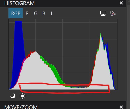
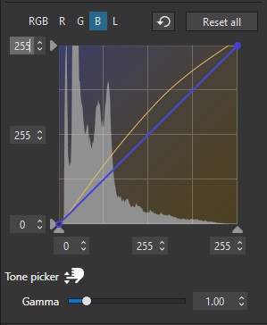
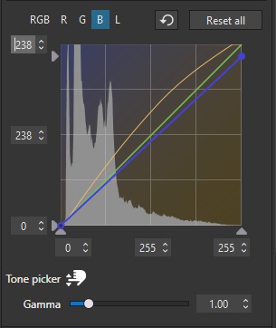
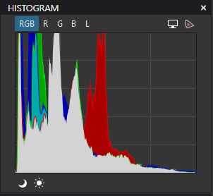
@Wlodek you mentioned sharing details - specifically I’ve found (and I need to do more testing) that if there’s a significant spike in blue, green, or red (it’s most often blue in my recent outdoor shots) at the very edge of the histogram then reducing the value for maximum-possible-highlight in that colour lets me rapidly get a colour look I’m happy with (without even touching a custom WB value).
So we start with (for example) this, where there’s a spike in blue at the high end:
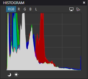
So highlights are a lot more neutral and a great starting point for colour editing. If it were red or green then I’d reduce those down also/instead.
Like I said, I need to do more tests with this, but it seems a good and quick baseline to work with more pleasing colours (and no - in this case - blue colour cast in the highlights).