The American New Color with Fujifilm is represented by the film simulation “Nostalgic Negative”. Unfortunately the Filmpack 6 has no preset, that represents either the American New Color nor the Nostalgic Negative. Has anybody been experimenting with the look of William Eggleston, Stephen Shore, Joel Sternfeld and Richard Misrach in Fimpack 6? Any ideas, how to get the look in FP6?
I dont know if this helps much but, My only suggestion is to do something as similar (in PL of course) to “American New Color” and save it as a preset.
that is the solution, but I was aiming for anybody having some hint about how to achieve the settings. Kodak xyz with some tweaks I guess. Did anybody try this?
I took that very interesting walkthrough and did my best to emulate it in DxO FilmPack/PhotoLab. I’ve attached the preset I built if anyone wants to try it. American New Color.preset (6.9 KB)
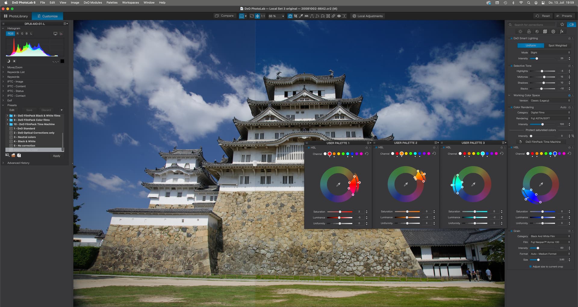
Selective Tone settings create some kind of an S shaped tone curve and colours are slightly shifted as can be seen in the HSL panels above - and then there’s the ASTIA rendering. When I increase that rendering to above 100, the effect seems to amplify the HSL and tone settings which can then be deactivated, BUT the effect depends on the image and each might need some extra tuning anyway.
Thanks for the info.
But definitly no update to 6, and if 7 is as buggy like 6 at the beginning and today i will still be on 5 till 2024
stuck
(stuck using Canon, PL7+FP7+VP3 on Win 10 + GTX 1050ti)
12
If you do that, i.e. skip the update from 5 to 6 and again to 7, then when 8 comes out in 2024 you will no longer be considered a ‘current customer’. That means you will not be eligible for any discounts, except those offered to new customers.
oookay, you’re on 5, not 6 as you wrote. Change the numbers to 16 then. The preset should work then, except for new features of DPL6. The preset does not do that much to my images…but you can see the changes in the screens I posted above…if you want to check the effects.
I have always been in love with Herzog’s use of color (and I frequently revisit his “recent” B&W photo book, too). I’ve tried emulating it in FilmPack, but a proper color grading tool would be necessary – beyond the available split toning tool – to really nail some of the color shifts in his work.
Anyway, I’m glad the preset worked out alright for you. It certainly needs tweaked per image. I actually prefer Color Chrome as a preset base since it gets a little closer to that Herzog look right out of the jump. See these as examples…
Lately, I’ve been shooting with a Ricoh GR III and using its phenomenal “Film Positive” color profile as a base. It reminds me of the Fuji Color Chrome effect. It nets similar results as the American New Color preset I previously shared – especially with global saturation/vibrancy tweaks!
Emulating looks like Herzog’s is not quite easy imo. Not because colour can’t be tuned accordingly, but because of the scenes and the ratio of grey tones vs. colour in many of his photos. We need timeless subjects to even get a chance to make the image NOT look fake with old film simulation, specially if one remembers how photos looked at the time, be it from old prints or personal experience.
I have this book showing landscapes in colours that seemed to be well balanced and saturated at that time. Looking at the images now, I get the feeling that they looked more saturated then than now. Vision changes with what we are seeing day in, day out and most modern photos look way too saturated, or not saturated enough in comparison to what I saw when I took the photo. Moreover, one dimension is missing anyway. I think we need to make the photos in a way to correspond to the scene, momentary feeling and so on and what looks nice one day might not fit our taste on an other day. The key is in abstraction imo.
I agree. Less is more. What makes timeless photographs is compelling subject matter. Curran Hattleburg is a contemporary photographer who uses color to amazing effect - but it isn’t noticeably manipulated or “aesthetic” in a modern sense. He just shoots incredible subjects. Same with Baldwin Lee in the black and white world.
I think there are plenty of interesting subjects in the modern world, but - like Herzog - one must look for them and first learn to see! That’s the base of any good “look.” When I teach photographer to newcomers, I explain that the most important skills they should learn go in this order:
Look (with eyes first) for compelling stories, subjects, or scenes
Learn how to compose a scene in viewfinder
The relationship between shutter, aperture, and ISO / film stock depending on format
Don’t be selective in what one shoots, be selective in what one shares