Hi. I’m new to the forums but have used DxO in the past (ver3 I think), now on ver 7. As I try to get back into photography again something that I’m acutely aware of is how flat my photos look even after I’ve edited them. I won’t pretend I’m an expert in that regard, and have probably forgotten most of what I once knew, but I’d like to eek out as much as possible from them.
I shoot in RAW and I’m mostly carrying my camera when I’m hiking in the mountains locally. Maybe it’s the scenery I’m in (mostly landscapes of heather and grass covered hills on overcast days) though I can’t help feeling so much more is possible.
I’ve always tried to keep things simple and just use 1 brand of editing software (used to be Capture NX back in my Nikon days). Currently I use just DxO 7 Elite (without any of the bolt on extras).
I’ve searched the forum for posts on adding pop, and I’ve found a couple of longish threads. I’ve watched various videos for DxO and the colour tools on YouTube. There is a thread here on presets, but doesn’t seem to have many presets added.
Is there anything else related to making photos pop a lot more that I should be reading here?
I’ve had a go at creating a preset myself but which the forum won’t allow me to upload which is based on the sort of photos I’m currently trying to improve (mountain landscapes).
I’ll try to link it from Dropbox. Please feel free to let me know what you think, modify it, or suggest other things I should be reading/presets I should be using.
https://www.dropbox.com/t/u369h8k84c4GO68A
Well, first things first - Welcome to the Forums!!!
I’m sure others will jump in here with lots of suggestions, but first, do you know how to upload three things to the forum:
First, your finished, edited photo.
(You can “copy” it, come here, and below some text, click “paste”.
Second for people to understand your photo better, also copy the original image here, either “raw” or “jpg” or whatever.
Lastly, as you probably are already aware, when you process an image in Photolab, a “.dop” file is saved in the same location as the image. This contains a list of everything you did to create the image via editing.
Alan, again, welcome!!!
Oh, and while you can continue to post right here, DxO has created a new forum area named “share your images and chat”. The idea is that you can post a photo in a new thread (your thread) in that area, and others will discuss it, and maybe download your original and edit it their way, to be compared to other versions that might get posted. It’s a great way to learn how to improve, or at least learn some of the tricks and techniques that others use.
Thanks Mike. I might try to upload something over the weekend. I know when I tried to upload the preset the forum wouldn’t let me, hence the Dropbox link. Seems like some sort of restriction on new accounts.
I’ll check out the other boards and see what I can learn.
That is not the place for technical queries like this. @alan_m just your conversation here.
I agree with @Joanna - if it’s tech support, this place is fine, but if you want feedback on your images, perhaps later on, the other place is available.
Can you please capture a screen photograph either with your computer or phone, of the exact error message that you get when trying to upload your .dop file to the forum? Is the error message from DxO, or from your computer? I assume you’re using the full version of PhotoLab V7 ?
My approach to “trying something new” is to pick something and run with it. But, importantly, make sure you come back and re-assess.
Here’s my suggestion. For a landscape, a modest amount of ClearView Plus (say 10-15) and then pop the (global) saturation and vibrance up a bit, too. About the same sort of range.
Some people will decry any use of ClearView Plus and suggest alternatives. That’s fine, but the tool is there for a reason. Try it.
Here’s what I’d do. Make the above two or three adjustments, tune it to what you think looks right, then export the image.
Then go look at the exported image outside of PhotoLab. Ideally in company with other images. If it’s “overdone” then it will be more obvious here than when you’re poking at sliders in PhotoLab. At least, that’s my experience.
I’ve been told by more than one person some of my photos are “too sharp” and “too saturated” and that “they look almost too perfect” or “that wasn’t the actual colour you saw, surely?” But guess what… they make me happy. I have superb Apple screens and the photos look gorgeous to me. I’m not a documentary photographer. Heck, I still do HDR sometimes, and that’s a taboo subject these days. Doesn’t worry me.
Happy to help.
The sliders for which you are looking in approximate order:
- Fine contrast (not micro-contrast), +20
- Lens Sharpness (only for supported lenses unfortunately, no manual lenses without EXIF) +0.65
- raise Exposure, lower Black Point (or crafty curves)
- add a bit of Vibrancy or take a little bit away, depending if your colour are too soft or too intense (depends not just on image but intention, this is mostly a creative decision, and not a technical one)
- Creative Vignette
This will get you a long way. Later, tinker a bit with low values on Smart Lighting, local adjustments on exposure, Colour Profiles (vary intensity!). Avoid ClearView Plus at almost any price (Fine Contrast gives you the part you need without the rest of the nonsense). Don’t forget to add DeepPrime (not DeepPrime XD, especially on people, okay on landscape and architecture) on anything above ISO 800 but at very low values (to avoid uncanny valley smoothing).
Adding (colour) pop, interpreted literally, can be done, but let’s first look at what “adding colour pop” might be, because this will help to choose the way.
Adding Colour: Can be understood as “bringing in colour that is absent” or as “making colours look clearer and stronger”. We’ll go on with the latter understanding.
Pop: As in Pop-Art, images with almost discrete levels of contrast and colour, discrete meaning that e.g the spectra of used colours and tonality look like a comb.
Colour Pop: Pop limited to colour?
Inder these assumptions, colour pop can be increased with the HSL tool. Choose a colour and increase (or decrease) its saturation and brightness. Also observe the width of the selection and set it to change only the desired objects of the image.
If you also want tonality to change, use the contrast, micro- contrast and ClearView sliders.
Share an original raw file and its .dop sidecar, if you want some of us to provide examples.
As you can see from @uncoy ´s post and mine, there are several ways to deal with the topic…
It’s at forum level. It looks like I’ve now been moved up from “trust level 0” so I might be able to upload something from now on.
Thanks for your detailed reply Alec. I just seem to have Contrast and Microcontrast. Where is “Fine contrast”?
Yeah, I probably should have explained myself more clearly. What I mean is both in general contrast but particularly in making colours look stronger, brighter, and more distinctive.
As I’m new the forum is limiting what I can upload but that sounds like a good idea.
Sorry Alan, I’m not going to read the manual for you. You can download it. As an exception, I’ll mention that Fine Contrast requires FilmPack (for no apparently good reason but to force advanced photographers to buy FilmPack whether they like film emulations or not). DxO was too busy working on advanced noise reduction at the time, management skipped the course on business ethics and user advocacy.
As I don’t have Filmpack I doubt the Photolab manual would help, but that explains why I didn’t see it. For a minute I’d thought there must have been a module that I’d somehow missed, or a sneaky slider tucked away somewhere. I even cleaned my glasses to double check ![]() .
.
I’ll have to make do with what I have, as I can’t justify buying Filmpack.
…post a dropbox link or use a sharing service like wetransfer.com.
deleted by author
Hi Alan
Reading your initial post the first question that needs to be asked (not seeing any photos) is when are you taking photos? If early morning or afternoon, then the adjustments referred to above by many will pull details out and make your photos pop. I find Clearview at about 10, micro-contrast at about 15, and tweaking colours should go a long way. The other is to ensure your black and white points are pulled across the histogram to make most of the contrast in light available.
If however, you shoot in the middle of the day, this is where you will find photos are hard to get to “pop” as the light is harsh and it blows out the colours when taking photos. Nothing in DXO will help here (but may get some way). If shooting midday make sure you have a poloriser on the camera as this protects the colours being blown out and then you should have a lot more colour detail to play with and then you will get photos to “pop”.
Hope this helps.
Andre
That rings a bell, thanks for mentioning.
And this is a good tip too. Thanks.
I think the forum might allow me to upload files now. I’ll have a look later and perhaps start a new thread with one.
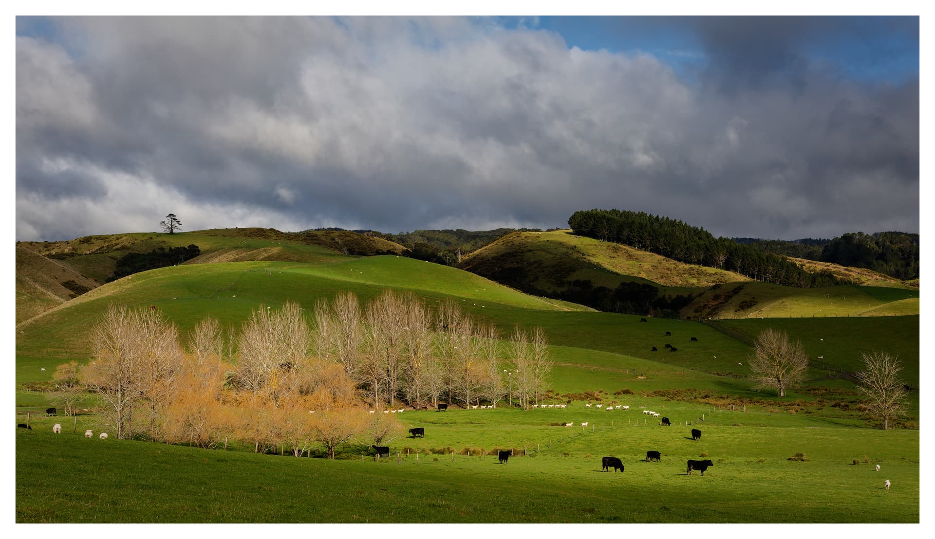
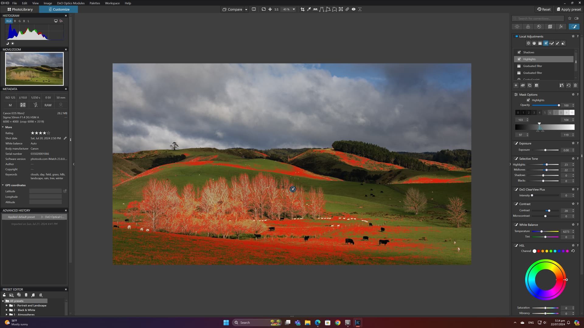
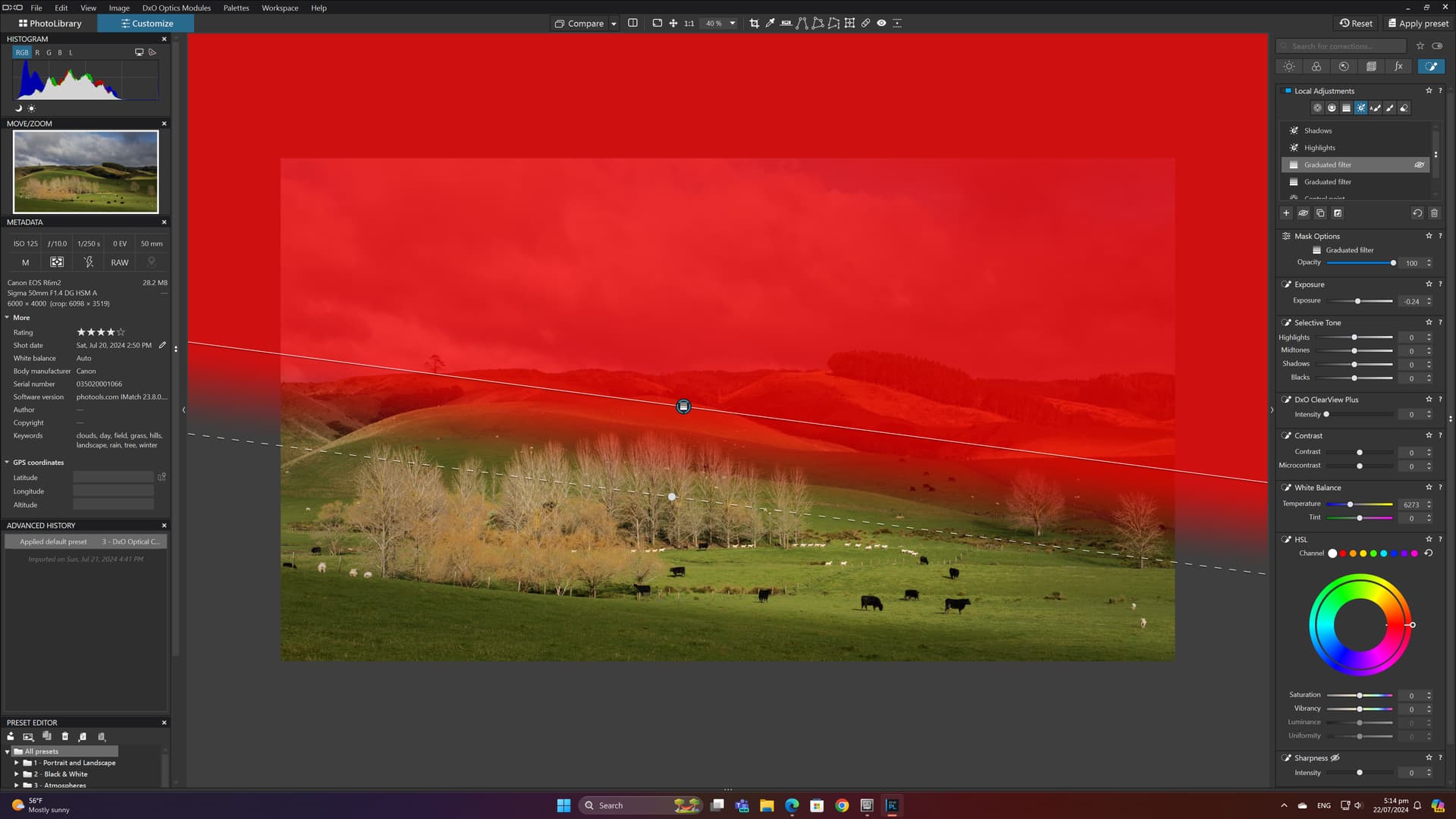
Hi Alan
I have tried to capture some editing I did that was focused on what you are looking to do. This is of a typical New Zealand countryside that can be fairly plain, but with some shadows and highlights I could do a lot with it. A before, after, and steps undertaken with Local Adjustments. This is where the power of DXO lies. My Global adjustments are minimal with Clearview at 20 (unusual to what I normally do), Contrast at -9 (too much detail on the trees) but lifted micro-contract to give a bit of clarity, and pushed global saturation to 6. The big difference came after I used Local Adjustments. Hope this gives some guidance as to what you could do to get more pop out of the photos.
Best of luck
Andre


Thanks for your reply and screenshots Andre. Your start off photo is a lot more contrasty than what I’m getting out of camera, hence me coming at it from a one-click global preset. I think finding an ideal workflow is probably something I need to do too, which might end up closer to your way of working.
If the forum will allow me to upload files now I’ll try to post an example.