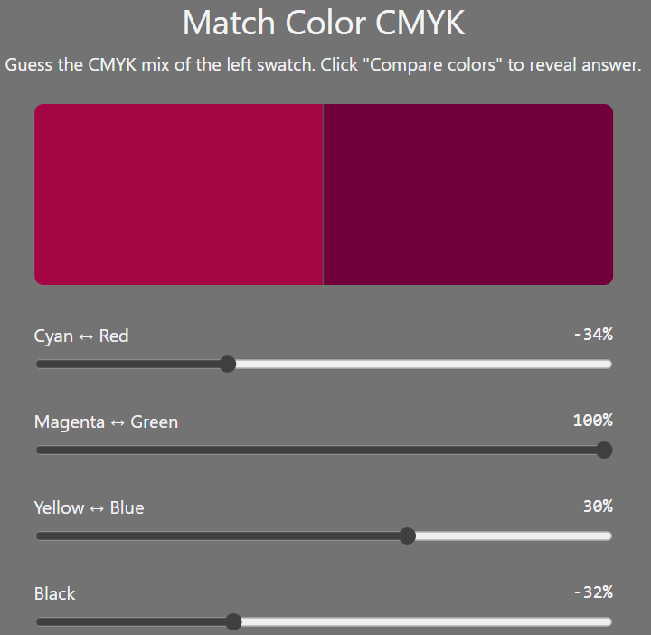
Here’s a link to the quiz (as per screenshot below).
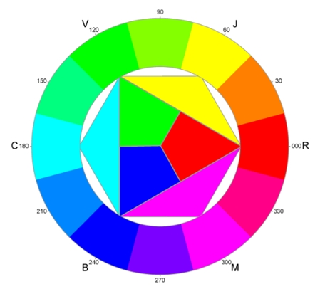
And here’s a link to a related video that explains how how shifts in Cyan, Magenta, Yellow, and Black can refine a hue’s character.
These are concepts that don’t come naturally to me (I’ve gotta think about the rules of colour opposites every time !) - so I found this quite fascinating, and challenging.
The aim is to move the sliders until the colour you see on the right matches the colour on the left.
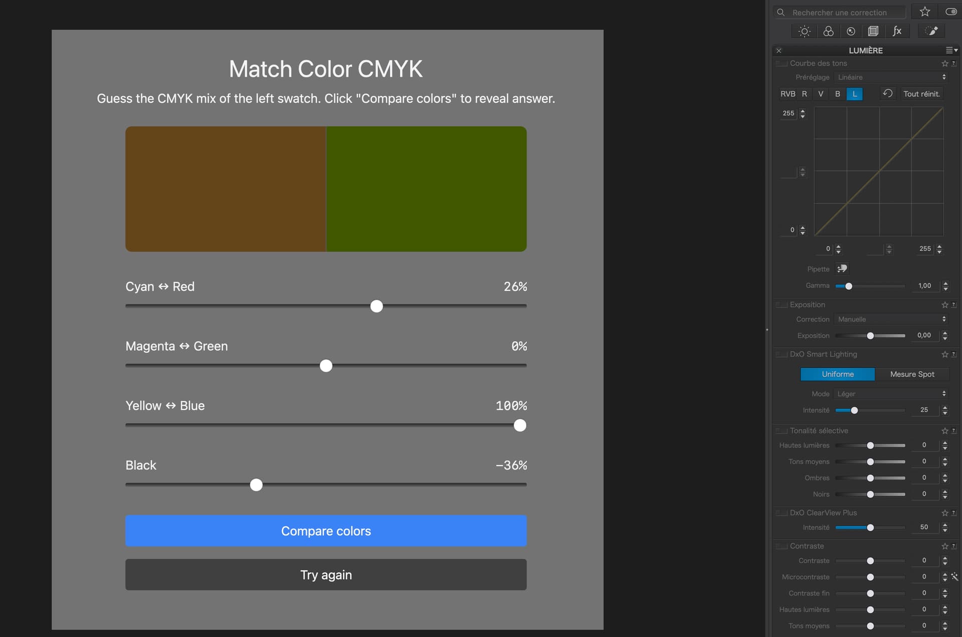
I started by taking a screenshot of the web page and then opened it in PL - see the first image.
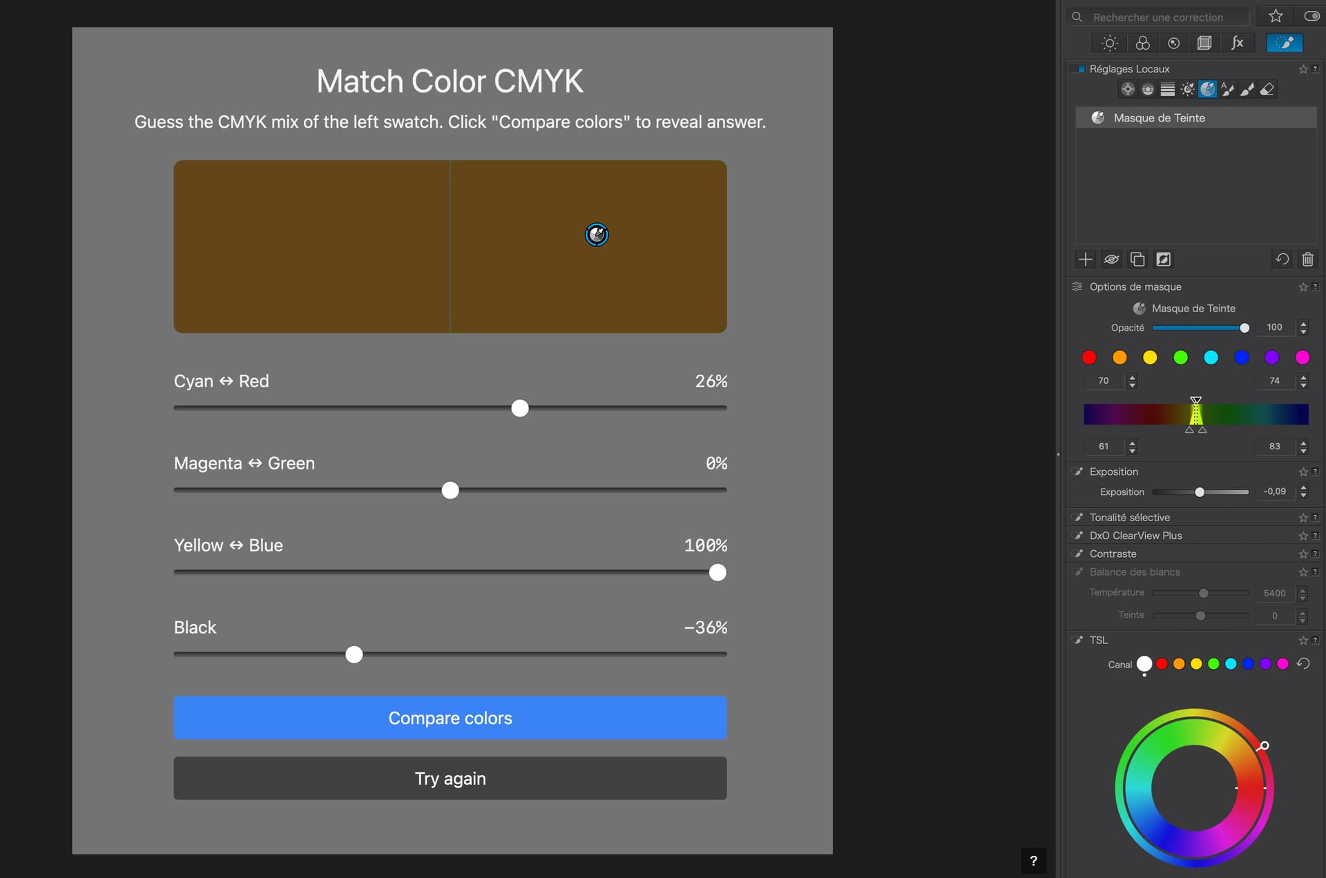
Then I selected the local adjustments palette (see second image), selected the Tint Mask tool and clicked on the righthand patch with the pipette. You can see the selected range on the strip.
Then I used the white circle on the Colour Wheel and swung the outer handle around until the colour of the selected patch matched (as closely as possible) the left patch. I also adjusted the exposure tool slightly to get as close a match as possible.
it’s not perfect but, with a bit more time and effort…
Excuse the phrasing but, if you are daft enough to not have FilmPack, you’re just making work for yourself
Seriously though, there are “essential” tools that have nothing to do with film emulations and everything to do with better tonal control, like the Fine Contrast sliders.
Well, I don’t have Film Pack as the tools they provide that I would use are almost non-existent. I try to keep my photos as realistic as possible and the standard tools in PL are more than adequate for my use. Images can be over processed at times and can look unnatural so I take the minimalist approach.
Almost but not totally. IMHO, it is worth every cent, if only for the four Fine Contrast sliders.
If it’s natural you want, then you really need to reconsider just how much benefit those four sliders can bring to an image without making it look over-processed.
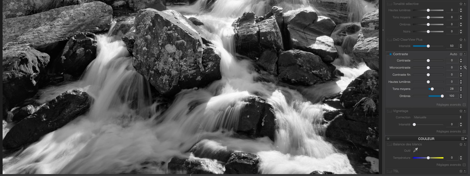
Take this section of a contre jour image with very deep shadows…
Take a good look into the darker areas, which still look dark but now offer glimpses of exquisite detail that changes them from black blobs to sculpted rocks. The only other way to achieve this with FP would be to use sharpening, which is global and affects all tones, which can then quickly look over sharpened in tones that were already sufficiently sharp.
And, when it comes to printing, which we do to large sizes like A2 or A1, I have several discerning photographers convinced that I have used a 5"x4" camera, such is the natural looking detail.
Not forgetting the Luminosity and Tint local adjustment masks, which are far more accurate in their selection than tools like the Control Line or Point.
That was fun actually. Interestingly I’m fairly colourlbind in the reds and a bit of green, but I managed to match all the swatches between 95% and 98%.