Your Black and White Photographs only (no deviation)

Since my last attempt to discuss B&W processing in PL devolved down into all sorts of other stuff, I thought I would make another attempt. So, please let’s restrict this thread to simply discussing how to produce stunning B&W images in PL.

Here’s one to kick us off…

Adjustments…

1 Like

How about a few words on how you did it?
Source and sidecar files? → SwissTransfer.com - Send large files securely and free of charge


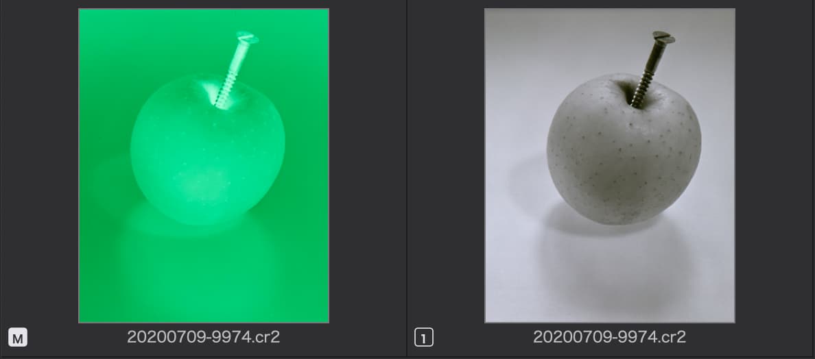
Left: 1975? negative, copied with Canon EF 100mm macro on EOS 5D Mark III body, uniWB setting for easier control of exposure.
Right: Reversed copy, on which I applied the following settings:

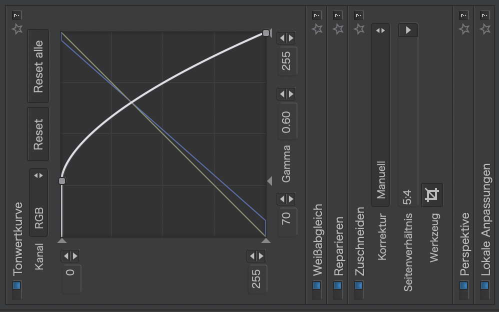
Left to right: Flipped RGB tonecurve for reversal, shifted white point to raise exposure, tilted B tonecurve to produce a slight duotone effect, WB to counteract uniWB (green negative), dust spots repaired with the repair/clone tool, crop set to 5:4 (original was 3:4 but I mostly enlarged to 8x10 in paper), perspective tool used to correct the slight tilt caused by sloppy alignment when shooting the negative. Last but not least: A gradient drawn from bottom to top to darken and enhance the foreground (grain) using the ClearView slider.

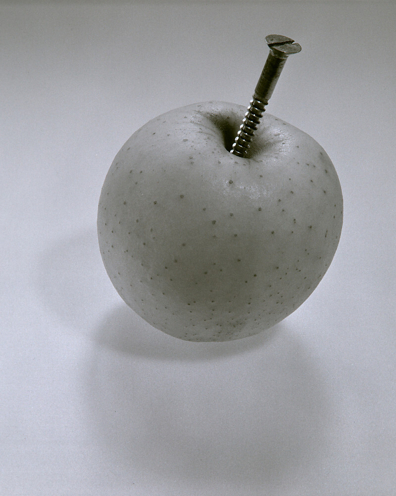
Note: Image should be flipped horizontally - DPL can’t do this though…

Here’s another one: Processing "dull", gray-sky images in PhotoLab 5 - #315 by platypus

2 Likes

Here are some of mine. A while back I had created several PL B&W presets based on some that I had created in Lightroom. I don’t have the film pack, so all adjustments are done in PL using a variety of the tools. The first three are loosely based on my Ilford FP4 preset. The last one is created without a preset.

I usually go out to shoot B&W and set my camera to B&W. By trying my different presets, I can later decide which one is a good starting point for processing.


2 Likes

Another 1978 M645 shot taken from a place that you can get to, if you’re bold and have a 4x4.
The control line I used to darken the top of the image also reveals a few dots at left and some streaks that must have been caused by the development rather than by atmospheric haze. The far end of the valley can vaguely be made out, as is the sky with some clouds. Again, this is a reversed copy of a negative, which makes the sliders act weird at times. Not only act some of them “the other way 'round”, but also in the tonal range of the original (not reversed) part of the histogram.
Bildschirmfoto 2022-03-06 um 00.00.09.168
I took the copy quite a while ago, without exposing to the right, which might have produced better highlights. Due to the Q&D approach and differences in aspect ratio, the image is but 8 of 12 Mpixels available.

Note that I did not use any film simulation here.

Copying negatives with a full full frame digital camera will inevitably result in some loss, if the source has an other aspect ratio than 2:3.

1 Like

Or you use an app which allows Panoramas and set up the camera so it takes the 56 mm width of 120 film

Suddenly I could finalize the images I took in 1990 but never managed get the single pictures seamless to a board of 2.4 m × 0.5 m :grin:

Or reproduce 6×7 or 6×12 negatives. the only thing is: the macro lens’ is vignetting and so was the old Mamiya lens. At best, both vignettes would balance each other’s vignette, but a win in Euro Lotto is more likely.

However, it was worth to lift up the old treasures. :slightly_smiling_face:

1 Like

Yes, certainly, but the idea here was to use DPL only - and the shots were taken as a proof of concept rather than the real thing. Moreover, I found that stitching shots was not worth the effort for “ordinary” prints. My photo service prints this 8 Mpixel image to 30x40cm - at 200 ppi, which is sufficient for wall decoration purposes imo.

1 Like

Ok. These days I rarely shoot B&W film and so far I don’t find myself often in the mindset I was when I only had B&W film with me. Then some subjects work well and others don’t.

Also, given the super reduced DAM abilities of PL…ok, no deviation. And also no B&W samples from me. I’m not going through all folders separately.

There is no need to copy 1:1 isn’t it?

George

…depends on what the original material is. The images I posted here, were originally shot through a Mamiya Sekor 80mm f/2.8 lens attached to the original Mamiya 645 camera. Copying these negatives can be done at 1:1 if you only want a crop, or at about 1:2 (1:1.75 if you want to be super-precise) for the whole negative in one shot.

As nice as it is (and can be) to have an ‘integrated workflow’ with PL & FP,
unfortunately it is not always possible
– and PL still has some way to come for careful editing capabilities.


left: Nikon D700 + 70-200mm
right: Edit + Viveza 2 + CEP (Detail Extractor + Tonal Contrast + Darken / Lighten Center)


SilverEfexPro 2 + Back-/Foreground balance + Dodge&Burn

3 Likes

Great edit that @Wolfgang for me it definitely works more in B&W.

Looks like some tedious healing/cloning involved to begin with too!

Well, I find it much easier to edit stuff like this in colour and thought to show a bit of the necessary steps. – After the B&W conversion I finalized the pic and sharpened it to finally print on A2 size paper.

I must say, I find it quite difficult to subtly adjust the tones in Photolab, as the curve tool is so fiddly and I have trouble understanding the tone sliders.

Theatre photographs.

I don’t do often, but did recently a serie for a company.
All done with Photolab, little viewpoint correction in photolab, then Nik from photolab. Reduced at 1200 pixel srgb here.
The second one has some effect added with a third software for dynamic emphasis. I don’t yet know which one I prefer. Director will tell.

D850 - 85mmf/1.4 - @ f/2.0 - 1/50s - 400 iso - no crop.

Photo taken 2015 in Oslo near harbour where we visited a food market.
First time session with my new EM5 MII
processed with NIK

@JoPoV

Your second version ‘emphasizes’ the center by smoothing out the exterior contrast
– in case that is your intention.
Still, it’s not clear (to me), if you wanted to direct the viewers eye to his/her face,
to the writing ‘Eagle’ or … and that ‘center’ got a bit too much softness.

Maybe you like to try the following

  • after B&W conversion …

  • go to Analog Efex Pro 2 → something like Motion blur
    ( where you can control the effect precisely / did a quick test :slight_smile: )
    – but none vignette (to not enhance ‘perception’) –

  • then as a last step add your framing


Anyway, very interesting!
Are you going to print (what size), are there more pics … like a series?

A nice rendition – and very much irritating. :slight_smile:

At first, I thought you did some composition until I realized that it is ‘just’ decorated with big foil posters.

Oh … I didn’t try this blur. Have to see. But the blur i used only blurs darker part of the image (controled with luminosity curve) and is circular.

The blur come from the character, but I voluntarily omitted a text (the title of the play) which is slightly crumbled in the movement and which brings the glance towards the rifle (which is not very readable, but that respects the esthetics of the play). This is a poster proposal.

Yes, one black and white serie (no yet finished) and one color serie almost finished, all processing done, only have to fine tune selection.

Thank you :slightly_smiling_face:

1 Like

@Guenterm

Oh, yes !
I didn’t understood this image neither.

Nice how top and bottom really match (maybe darks are a little different in top right) and merge together making the perception confusing, except for the expressions of the characters which contrast between the top and the bottom. Poster against reality, difficult to discern. I like it.

@JoPoV and @Wolfgang

Thanks for the :wilted_flower:

here is the original without any adjustment

I have to make it more dark than normal, because I wanted to place it as a poster in my kitchen where the sun shines in the evening when I am cooking

best regards

Guenter

1 Like