Understanding contrast settings (Microcontrast vs. Fine Contrast)

You are correct. I don’t have film pack and I don’t have fine contrast.

Each of these tools behaves much like unsharp mask with different correction radii. In Photohop, you can set the radius of correction and apply multiple passes at different radii. Neither LR nor PL let you do that (PL gives you unsharp mask, but with very limited radius and only one pass), but each offer the sharpening tools you mention. The catch is that the chosen radius is different in each tool and they don’t match from LR to PL. You can pretty quickly figure out the numbers if you put the same photo simultaneously in LR, PL, and Photoshop. Tweak a tool in one of the first and then adjust the Unsharp Mask radius in Photoshop to produce an equivalent result and note the radius number. The tools in LR and PL may have a little more subtlety than a straight unsharp mask, but the result is close enough to figure out the radius of correction. Bottom line is that there is no direct equivalency between the tools in LR and those in PL, only similarity.

1 Like

If i am correct the selective tone and thus selective contrast sliders have to much overlapping for LR users who are trying out dxopl.
Those who are used to building with layers are also frustrated/seeking solutions to compare there old edit workflow.
What speaks for dxo’s workflow is when you setup your own workspace with all the important ducks in a row is the speed you can edit.
The more choice of tools the longer you are seaking the best solution.

About fine contrast.
Yes it’s filmpack only. Why is for me a question because it’s a main tool not a coloring/taste tool.

The light, mid and shadow tone and contrast sliders are having a larger bandwidth then the fine contrast slider.
The main effect of fine contrast is softening or gentle sharpening of for instance soft colors like skin and stuc wals to enhance larger details but not edge out smal details like wrinkles , skin defections and stuc structure.

1 Like

I’m pretty sure the ‘help’ descriptions are wrong. They say that microcontrast targets ‘very small details’ while fine contrast targets ‘medium sized’ (i.e., larger details). But then look at this examples, particularly the sand:

No adjustments:

Microcontrast +50

Fine Contrast +50

Your example made me smile – and it shows very well, that Microcontrast ( texture / local contrast ) is not so much suited for skin.

( looks like you used a mask for the background )

@DocNo That was exactly my finding too. From Photolab’s help on the details:

Microcontrast

Enhances or softens very small details. Particularly useful for textured images, or to compensate for a lack of sharpness.

And…

Fine contrast

Enhances or softens medium sized details. Gives a “softer” effect than Microcontrast when pushed to the right, more suited for portraits.

Two things strike me:

  1. Microcontrast appears ‘heavier’ than Fine Contrast and seems to impact medium sized details.

  2. Fine contrast’s description seems contradictory. If it really does impact medium sized details then it should give a “heavier” effect than Microcontrast, where Microcontrast impacts “very small details”.

I think they’ve got it backwards: Microcontrast impacts medium-sized details and Fine contrast impacts very small details.

I find the same conclusion with this edit:

No contrast changes:

Fine Contrast = +80, Microcontrast = 0:

Microcontrast = +80, Fine Contrast = 0

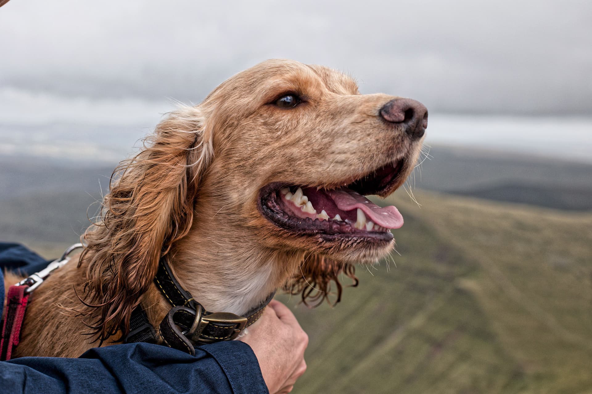
Microcontrast is clearly heavier than Fine Contrast, It’s a minor thing, but I’d suggest changing the “Help” descriptions to describe Microcontrast as impacting mid-sized details and Fine Contrast as fine details.

1 Like

It’s a good point you make re the appearance of a mask. I went back and checked and there’s definitely no mask on my wife’s skin. Here’s a more extreme version, with microcontrast (only) to the max. You can see there are no local adjustments. Not sure why the effect fades out near the skin. Any ideas?

Thanks, Mark … Yes, that’s the point I was attempting to make.

Not with absolute certainty (without being able to inspect the code/logic) - - But, practically, I reckon that’s a reasonable conclusion … as confirmed by this observation;

Apply these settings;
image

  • ensuring the “Magic Wand” for Microcontrast is deactivated.

Then toggle (activate / deactivate) the overall Contrast tool
… There will be no discernible change in the image.

@John-M you need to export them both and then compare side by side.
Contrast effects and sharpening is only visible at 75% zoom rate.
And denoise and other effects on your image sharpnes is only done wile exporting.
So to get your claim, idea, thought proven or tested you need to export a jpeg or tiff.
Not use internal compare view or toggle tools on/off.

“Fine contrast” and “microcontrast” are easy to understand.

  1. they are just words
  2. they deal with contrast
  3. they can/cannot deliver what you want
  4. learn how and when to use them.
4 Likes

they are just words

You wouldn’t be so blasé about a car manufacturer incorrectly labelling “brake” and “accelerator”, would you?

Part of a good user experience is that the function of tools is well labelled and understandable.

Not that this is so serious as a mislabelling on a car, but I’d much prefer to know for sure without needing to start a 40+ comment thread on a forum about it to check.

1 Like

Your demonstration shows, how Microcontrast affects local contrast (useful for structure & texture) and even has a negative impact on the clouds and the background … to be used with care!

And as you experienced, Fine Contrast (comes with FilmPack) gives you softer results.

I don’t see any problems with the description / explanation.

→ Like with any software, you have to try out to get to ‘know’, what you can achieve with it. ←

1 Like

Well, We’ll have to take a look at the manual. Look at the (condensed) statements:

Microcontrast brings out details and gives the image more “bite”

Fine contrast brings out medium-sized details and is gentler than Microcontrast

Imo, this is fairly clear, though I would have used “fine details” instead of “medium-sized details”, but one could argue that, in the realm of details, there are large, medium and small details, all of which are details nonetheless. Anyways, my point is that one has to learn to operate an app - as one has to learn how to drive a car…

For those who learn by reading rather than trying, the manual might be a good starting point, even though the manual and related search could greatly be improved.

1 Like

From the way it’s worded, I would expect Microcontrast to imply a softer effect than Fine Contrast, when in fact the opposite is what (broadly) actually happens.

To be honest the actual titles of the two are a little ambiguous since both “Micro” and “Fine” could mean very small.

Indeed I’d be tempted to suggest the top three contrast settings (Contrast, Micro… and Fine…) be relabelled Global Contrast, Heavy Contrast and Light Contrast or something similar; better denoting the impact they’ll have if used universally (as you say, you wouldn’t want so much Microcontrast on a creamy background!).

Appreciated you have to mess around with some tools to really see what they do for an image / situation, but in this case I think the labels and descriptions could be a bit clearer :grin:

Fully agree…and there’s more potential interaction if we consider the appearance of…

  • contrast: Selective Tone vs. Tone Curve vs. Contrast vs. DxO ClearView Plus.
  • detail: Lens Sharpness vs. DxO ClearView Plus vs. Microcontrast vs. Fine Contrast vs. Unsharp Mask

Some of these tools tend to act like a broadsword rather than a scalpel…

2 Likes

I think they are very well labelled and do what the description tells.
Micro contrast seems to work at higher frequency than Fine contrast (so the “radius of action” is smaller). This is why it seems to produce a visually stronger effect, because the effect is more concentrated on a smaller zone, less spread out in space . It does act on smaller details than fine contrast.
Think of it in split frequency separation terms, and the results should appear more conform to their description.

1 Like

But then wouldn’t you then expect microcontrast to come closer to enhancing individual grains of sand while fine contrast would enhance larger variations in the ‘texture’ of a beach. But precisely the opposite happens (as per my examples above).

Or look at the images of the golden retriever. Fine contrast brings out individual strands of fur. Microcontrast creates areas of light and dark across strands of fur.

1 Like

He’s a Cocker Spaniel :wink:

But the rest I agree with. The “impact” of the tool described as impacting very small details seems greater than the tool described as impacting mid-sized ones.

That’s why - for me - renaming these seems the obvious choice. Lightroom can’t be copied OFC but “Clarity” and “Texture” seem less open to speculation, with one signifying an overall heavier approach and the other working on finer details .

Microcontrast is also creating moiré due the overdetailing accentuation.
Your text above explains why.
A strands of fur has 2 or 3 pixels acros? So fine contrast dot covers 3 pixels? (we don’t know the radius)
Microcontrast is 1 pixel? => over edge enhancement causes moiré. When you zoom in at 75% the moiré is gone because the enhancement is added correctly but it’s too hars on the non excisting lining of detail.
And say micro has 0-5 as lumination level and fine has 5-15. (threshold)
Take a image and go 50% or higher with micro contrast, clearviewplus and fine contrast export them with deepprime but not deepprime plus.(which also enhance details more active.)
Then drop those jpegs in a side by side viewer zoom in at 100% compare, then 200% compare , then 400% if it’s possible.
You will see
Blunt microcontrast is deepblack outlining the smallest details pretty hars.
Clearviewplus does at some places the same and hold back at other places to avoid oversharpening if possible.

Wile fine contrast dots are larger in pixelsgroups and less dark/deepblack.
That’s why it’s more gentle on your out linings of edges.

The only “strange sliders” are those of selective and advanged contrast high midtone and shadow and black. Those are to overlapping to see as on area. One effects the other. So not so much as USM works.

Look at very grainer image below zoomed at 200% with absolutly no correction applied but micro or fine contrast :

First one : absolutly nothing applied.
And just focus on the area surrounded by a red line

Second one microcontrast 100%
look the same area and notice how darker is the darkest part now and how it spreads.

Third on : Fine contrast 100%
look the same area again, and notice how the darkest part is a little less dark but spreads further.

Does this shows you the difference between both now ?

CLICK TO SEE IMAGES AT REAL SIZE OF COURSE !

1 Like