said otherwise: there is no point in exporting an image coded in a restricted space (srgb/adobe rgb) to a larger space, so much to continue in adobe rgb
on the other hand, processing an image in a wide space (dxo wide gamut) allows much more “fine” calculations on the shades of colors and there is an interest in exporting to prophoto rgb to preserve these shades (and the saturated colors which are outside of adob or srgb) so that the printer’s printing software converts the space of the photo (prophoto) as late as possible to the smaller profile of the printer (ink - paper couple) there will gain on some rare photos in shades or saturation.
for photos that are not very saturated at the base (portraits/other…) whose colors fall into srgb, of course, nothing will be gained.
who can do more can do less.
therefore working with software whose workspace is “wide” leaves more possibilities even if in practice few photos will benefit from it
Enjoy more accurate and lifelike photos with PhotoLab 6’s new wide gamut color space.
Far exceeding Adobe RGB, it uses spectral primary colors for natural, vibrant results, particularly in highly saturated images.
The upgrade means you can boost colors while avoiding clipping in saturated regions. Plus, the new color space also means the ClearView Plus tool can achieve even better results as it has more colors to work with.
As a result, DxO PhotoLab 6 is also a perfect fit with the latest generation of wide-gamut monitors.
So, if you don’t need those benefits, stick with the older WCS or with PL5. But I like what the new WCS makes possible - and that acknowledges why customers have been asking for a wide-gamut WCS for years. So far, I’ve seen some better renderings using it even though I only output in sRGB (screen and JPEG). I haven’t decided what settings to use when exporting to TIFF: so far, I use “As Shot” which goes to sRGB, probably because that’s what I set in the camera for JPEG output. I don’t think it will be worthwhile for me to export to a wider gamut unless I actually start using a wider gamut for output I can see (screen, printing, etc). On that note, I personally wouldn’t use ProPhoto unless I wanted to work on the TIFF image further in a program that could use such a wide gamut as a WCS. Its gamut exceeds what’s visible, leading to a real risk of clipping otherwise. But FWIW, the DxO Wide Gamut WCS ensures that an export to ProPhoto stays within the visible range.
No, but as @OXiDant says, you are putting your lower gamut file in a much higher gamut colour space for NO benefit. With the WGCS in PL6 you may now get some benefit.
In the past you MAY have lost some colour without even knowing it when using the Classic Colour Space.
Which brings me to the question:
What is the correct colours for a photo? To me it is what I remember (very subjective) and what I like when I edit which is also very subjective. Is it an exact representation of the scene you photographed? I doubt it as everyone has their own interpretation.
Everyone is trying to get the perfect colours from this new colour space and soft proofing functionality rather than thinking: I can get more saturated colours but need to be more careful because it can modify the look of my photo when publishing (printing or displaying on the web etc.)
Here’s another attempt at explaining the reason and purpose for this request/suggestion.
The following screen-shots are from here … DxO’s support pages.
… Because;
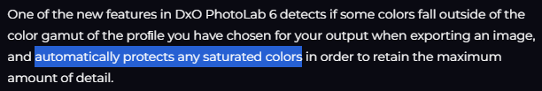
I explained (above) this “automatically applied protection” as occurring in two cases;
…
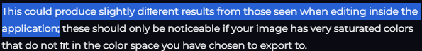
That last point is VERY good advice … Otherwise, your “exported images {may} look different compared to what is seen on-screen while editing”.
To restate: The purpose of my Request/Suggestion is to ensure that PLv6 always behaves so that naïve, unsuspecting users are NOT caught out by this (effectively) hidden algorithm.
Note: I am not arguing against this Protect Saturated Colors algorithm (it’s a very-good-thing) - but, the subsequent behaviour of PLv6 would be greatly improved with this proposed solution.
Tip: Meanwhile, my personal work-around is to have SP=ON at all times (tho, YMMV).