Place the pipette in the marked area and see how the reducing the saturation and increasing the luminance (it’s a balancing act) brings out more detail.
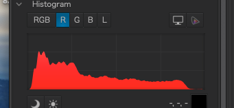
I never realized there was a reason to click on those individual “markers”, but here is my screen after actuating the red marker:
Are you saying that since the upper part of the “red” is cut off, that means the red is over-saturated? I never realized this tool existed, let alone knew how to use it.
As a test, I opened the following (un-edited) image, and got this:
Everything else you wrote I will try to understand after breakfast, but if I understand you correctly, whenever I might be tempted to adjust the saturation, this tool will tell me if I’ve gone too far. Fascinating.
Where is this pipette hiding???
I see a “red hand” that I can move around over the image, but not a pipette.
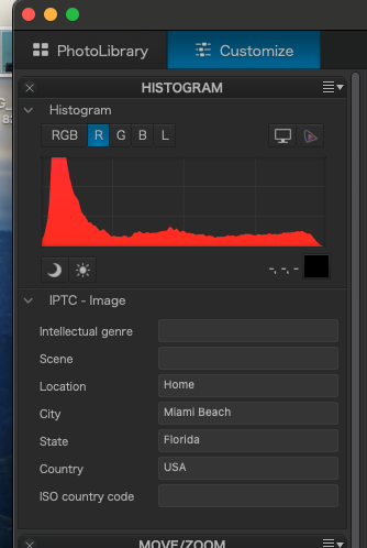
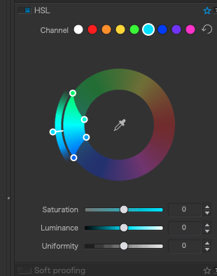
I assume that I will first select “R” since I’m adjusting the red channel.
I remember increasing the saturation, which I suspect is my problem now.
I never get to see a “pipette” in my main screen.
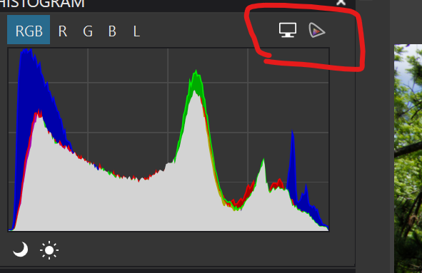
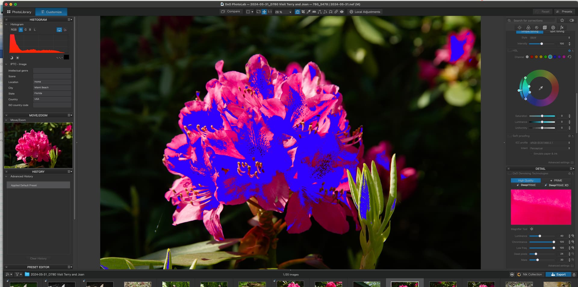
When I click the “display” icon, I see a bright blue blob covering much of my screen.
If I start reducing the saturation, by the time that blue “thing” is gone, my flower is pink.
If I reduce the saturation completely, I’m down to a black-and-white image.
Perhaps I should make a virtual copy, and reset it to the original values, then start over.
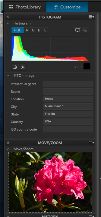
Joanna doesn’t show the left panel after doing this - she shows the right panel.
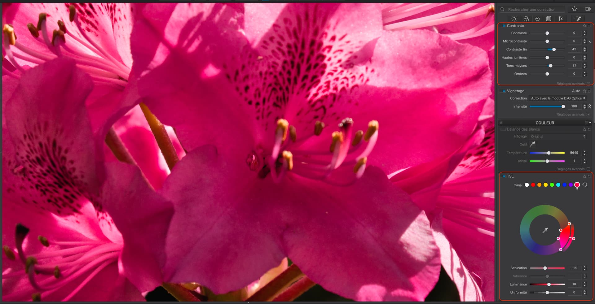
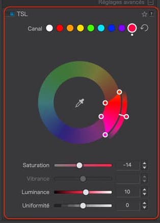
The pipette to which @Joanna is referring is in the center of the Global HSL color wheel which she shows in the last image of her post. Have you never used the color wheel before? Using it is not just about adjusting the sliders. But in any case if you had taken a closer look at what Joanna did, you would have seen she lowered the saturation to -14 and increased the luminance to +10 after using the pipette to select the specific range of colors she wanted to adjust.
Any adjustments you make anywhere should be subtle. It is very easy to over adjust. Have you never used the histogram before? Do you know how to use the tone curve? Do you ever use the Sun and Moon icons in the histogram to help you identify underexposed and overexposed areas of you image? It seems that you may be unfamiliar with these various tools. The tone curve is a very useful tool.
After all this time and thousands of posts, perhaps finally you might want to consider reviewing everything PhotoLab has to offer on your own and then ask questions about features that you do not understand. You will probably learn much more that way and spend far less of our time having to teach you everything. Just a thought.
You’re probably correct.
Thank you for all the help, even if it takes me decades to learn PhotoLab.
I bought PhotoLab to replace Lightroom many years ago, and for the most part I do “basic” things, which included bumping up the saturation which I now realize was a mistake. Won’t happen again unless/until I understand it better.
Then too, I just read this:
Reminds me that I am not seeing what most of you see, as I’m still using PL6, not PL7, so apparently the saturation controls are different.
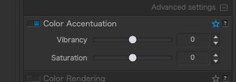
As to this latest question, I will try to sort it out on my own, but until then, I will ignore the “vibrance” and “saturation” settings (I still have both) until I understand what I’m doing.
Thanks, Joanna, for bringing this up, as I didn’t realize all the implications of changing vibrance and/or saturation. Not using them at all is better than using them incorrectly.
Perhaps the forum could have a “beginner’s” thread
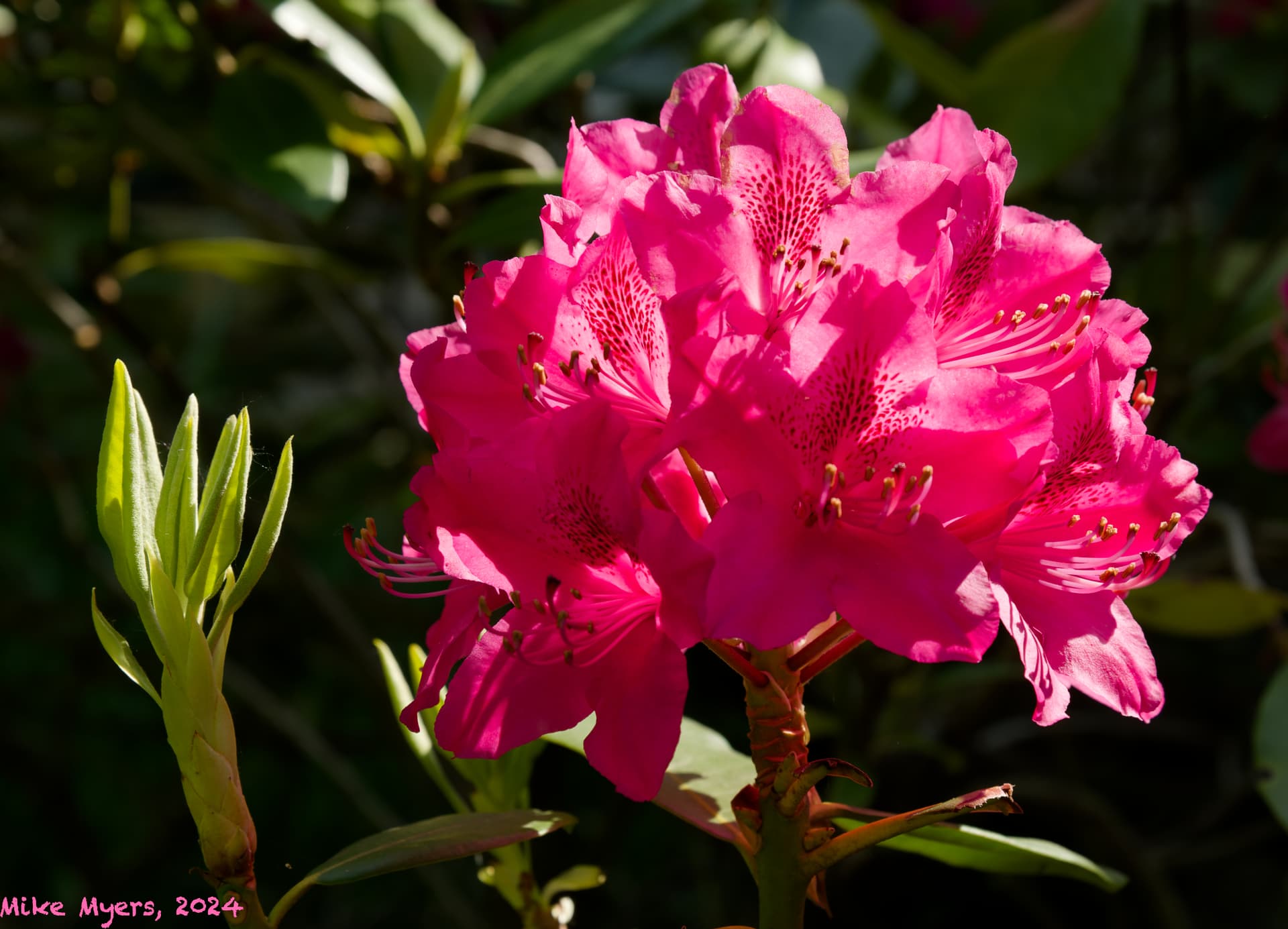
Anyway, here is my image, with vibrance and saturation back to their default values:
Mike, the biggest problem with the saturation and vibrance slider being in two places in PL 6 (at least in the Windows version) was that the results one got using one set or the other were not identical. The second issue is that when using both sets combined the results were iinconsistent and unpredictable. There were also positive reasons for having them separate from the color wheel. In the end the implementation in PL 6 and PL 7 both have their limitations.
There were also some positive reasons for having them as both part of the color wheel and separate from it. However, the flaws I mentioned in my previous post were not really understood by most of the people who complained when the second set was removed. Even though implementation in both PL 6 and PL 7 have their limitations. I prefer PL 7 having only a single set of saturation of vibrance sliders.
Just to make sure I understand you correctly, in PL6 there are two identical sets of controls for “vibrance” and “saturation”?
In PL7 this was reduced to one set of those (independent) controls, with a slider for vibrance" and a slider for “saturation”?
In my screen captures up above, I find Vibrance, Luminance, and Saturation. I am lost (not that I plan to use ANY of them again until I understand this).
I guess I need to look up those three terms as used by DxO:
There were two separate sets of vibrance and saturation sliders in PL 6, One set was associated with the HSL color wheel, The other set was in a separate location. The problem was that they were not identical in use. And the results using both sets together were additive in an unpredictable way. Still, there were certain cases where having the availability of two separate sets of sliders was useful, but I don’t miss the second set.
In PL 6 and PL 7 the global luminance slider is only associated with the HSL color wheel and is only available in a single location. However, there are Chroma/Luma sliders available for masks in local adjustments for both versions, and PL 7 also has a new local adjustment version of the HSL color wheel with its own luminance slider.
Before you consider upgrading to PL 7, keep in mind that PL 8 will be released in a few months.
Thanks, Mark. Actually, I have never had any interest in PL7. Any potential interest in PL8 will likely be based on what I read about it in these forums.
Joanna reminded me a year or so ago about DxO’s “Black Friday Sale”.
I suspect my only reason to buy PL8 is to support DxO.
Also…
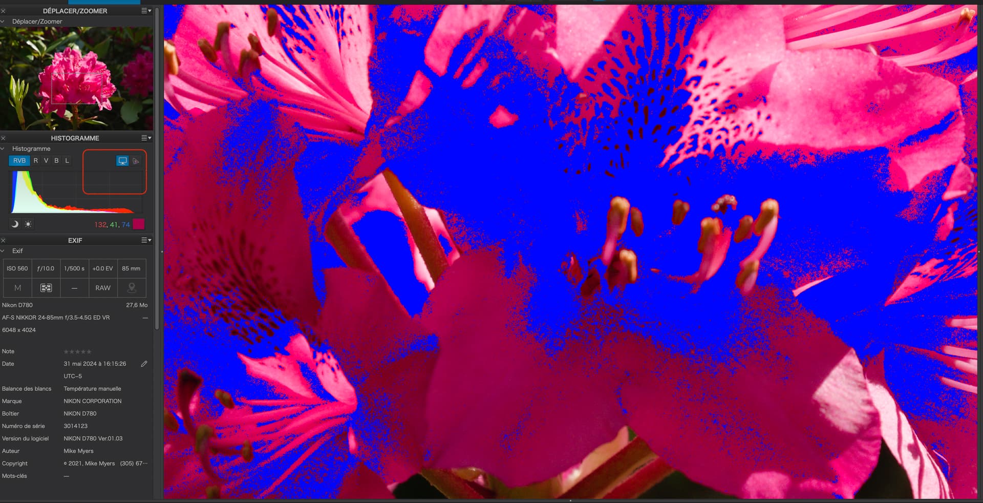
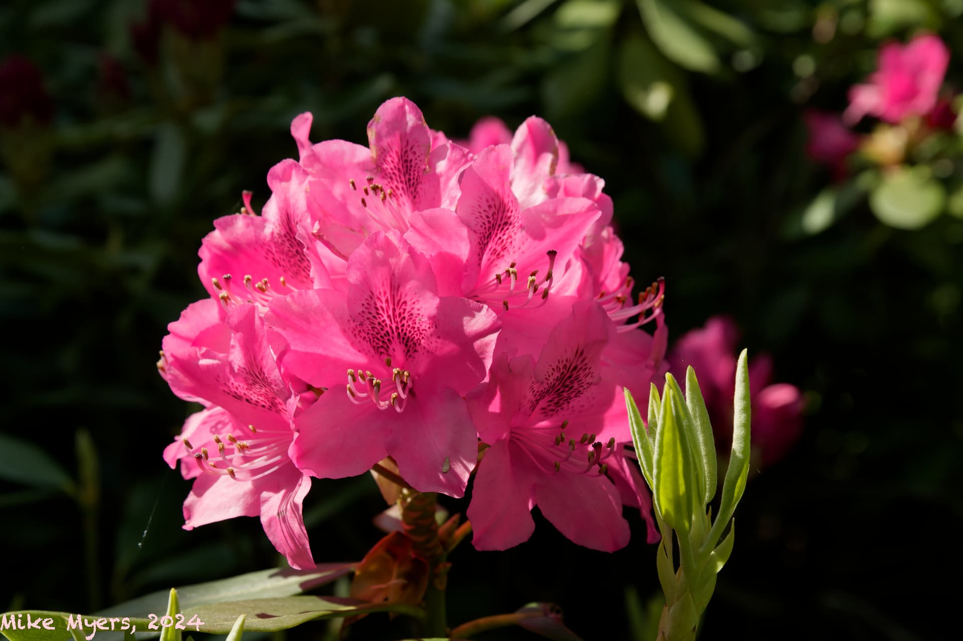
I selected another flower photo, turned on the setting for “red” and also for “saturation”, and this is what I see:
Is this trying to tell me that the red channel saturation is going through the roof, as in I need to fix it? The image is straight from my camera, and if I do try to change the saturation, it starts moving toward B&W. Is this “normal”, or is it trying to tell me that for whatever reason, the red channel is oversaturated, and needs to be fixed?
This is not an image I started to edit, although I do like it.
I hardly ever mess around with colors, when I’m using PhotoLab.
There is absolutely no need to select the histogram for the red channel - just leave it on RGB.
No, not the red channel, just those parts of the image that are marked as saturated, which might not be just pure red.
If you followed my instructions, you should have selected one of the coloured dots above the colour wheel, which is closest to the saturated colour…
Here I chose the dot at the right end. These dots are not specific colours, they are just starting points and any colour dot may be changed to any other colour if you run out of similar colours.
Then I clicked on the pipette and that allowed me to sample the colour in the image that I wanted to adjust. The pipette turns blue to indicate it is active and then I click somewhere in the saturated area (even if it is covered by the blue mask) and the inner ring may shift to match the colour range.
Now, the saturation and luminance sliders will only affect the selected colour range.
Having used the pipette to select the colour range, start playing with the saturation and luminance sliders to reduce the blue mask as much as possible without reducing the saturation too much.
You can also fine tune the selected colour range but that I will leave for a future lesson.
I notice that part of the bud, in this latest image, which is yellowy green is also marked as over-saturated. If you want to adjust that, choose one of the other dots of similar colour to the bud and use the pipette to select the range from the image, then do the same as with the red(dish) dot’s sliders
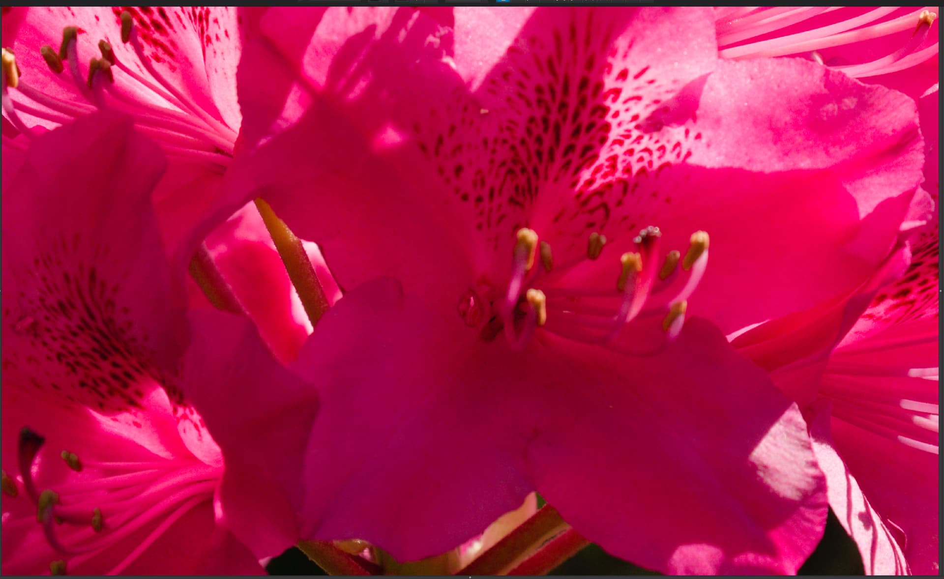
On my other image, I started with “red”, and followed your instructions above. Everything seemed to do what you expected it to do. Then I did the same thing for “green”.
When I was done, I changed the watermark to white, for no reason other than what I wrote to @Wolfgang before, and exported it.
You all have opened a door into a whole new world of PhotoLab, which I was oblivious to before. I didn’t have any idea how to deal with “saturation” until now.
Here’s the finished image - there may be lots of other things I need to do with it, but the saturation should now be correct.
Conclusion - obviously (now) the finished raw image from my camera might NOT have the proper values for saturation - I never even considered this before. So doing this procedure will give me the proper (best?) values for saturation? …just like what I do with the exposure sliders.
…wondering out loud, what percentage of people reading this thread already know this, or are learning from the information you are all providing so clearly. I’d like to think I’m not the only one here oblivious to this…
Stenis
(Sten-Åke Sändh (Sony, Win 11, PL 6, CO 16, PM Plus 6, XnView))
1519
Mike, I think it is the other way around.
I think most people in fact do know how to use the color wheel - at least the basics - because it is the absolute obvious way to handle color grading.
… but as I wrote way up in this tread, there are problems with this system since it is not accurate enough (the scoop of these pickings is too sloppy by default) when it comes to nuance separation. If you pick a color and start to adjust for example the saturation in some nuance you will find that you will affect not just the object you picked the color from but even one, two, three, four other nuances of the same color you picked, depending on how your image looked from the beginning.
That was why I exaggerated this problem earlier when I pointed out that the difference between using the picker or just klick on one of the eight “color” balls above the Color Wheel applet in Photolab often is negligible. I was really surprised when I found out how it really works - or not works to use the right words.
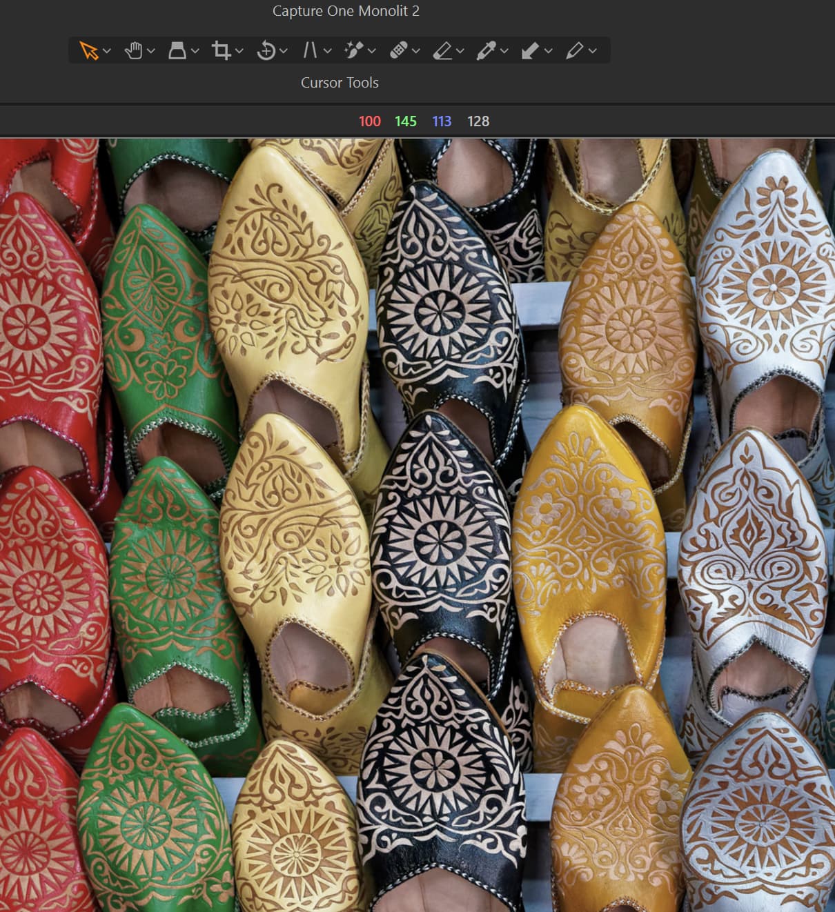
To give an example from Capture One:
At the top of this snippet, you can see four digits. The first three is the RGB values for the green shoes in the picture. So, in this case Capture One absolutely is able of picking the absolutely correct RGB-codes for that particular color but not even Capture One seems to use that as a possible default when using that applications color picker. Even Capture One is far too sloppy to my taste but less than Photolab when it comes to precision. Of course I know how to narrow and adjust the scope of both the Color Wheel in Photolab and the corresponding tools in Capture One but for me these sloppy defaults feels very ineffective and disturbing.
I think both DXO and Capture One need to improve these functions.
I´m also quite surpriced that Joanna had to help you with this. Most users I think tries to check out new features as they are introduced and the Color Wheel was a quite big deal when it was released some versions ago. How many years have we had the Color Wheel in Photolab now?
This poor precision is why I prefer to use AI Select in Capture One instead, in order to obtain the precision, I need. Poor precision can really decrease productivity and in Photolab there isn´t even a proper usable substitute for the Color Wheel to find - because I don´t think the Control Points are proper substitutes - no precision there either.
I rarely use the “color wheel”, as I mostly want to edit my images as little as possible, and capture things in my camera properly.
I was very surprised that I could do what Joanna showed me, and my gut feeling from all this is to never bump up the saturation as I have been doing.
For the most part, I want to create my images INSIDE the camera, not afterwards. I use the tools to “fix” things, not to “create”.
I think I mostly use PhotoLab to correct errors in how my camera captured a scene, compared to how I expected it to do so. I already know what I want when I look through the viewfinder, other than “cropping”, and the ability to straighten tilted images.
As an artist, I can appreciate everything you wrote, and why. I guess most people in this forum want to CREATE beautiful images.
My point of view, is that I want to CAPTURE what I SEE, and share it with others. Most of the time, if I SAW it, I want to have it IN my photo. Not always - but most of the time. If in my mind, I saw “fluffy white clouds in a deep blue sky”, that’s what I want in my photo. If there’s a dirty old tire in the frame, I sometimes (but rarely) try to remove it, which is why I’m so terrible at doing this well. All this changes when/if I try to create “art”, and I’m obviously not very good at it (yet).
I’m obviously not “most users”, but I did eventually struggle with, and learn, control lines. I’m not really interested in “new features”; I’m interested in how to get the software to do what I want it to do, for better or worse. For me, “new features” just confuses what I already think I understood.
I’m a lousy example of what PhotoLab should do. I mostly just do NOT want it to mess up my photographs, and I realize that by the time I get done editing, much of the time, I shouldn’t even call them photographs. Nowadays I look at images, and make them look “better” (big mistake, not to do so any more!!!), and export them. I would be happiest if what I saw on my screen matched what I thought I saw on my camera viewfinder.
I’ll shut up here, as I may be the only person to feel this way. It’s much, MUCH more important that PhotoLab does what all of YOU want. I’m just “along for the ride”.
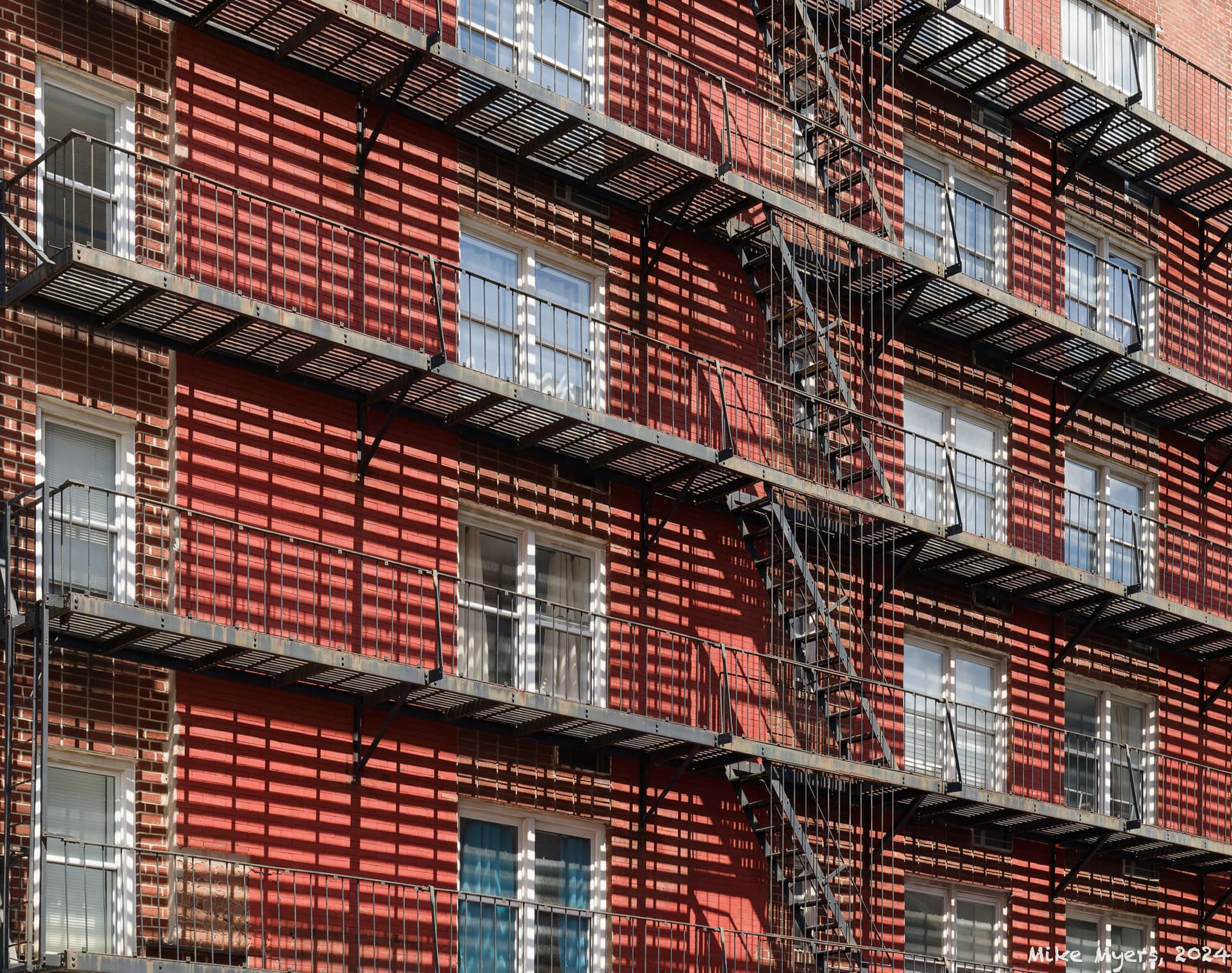
One last photo from my trip. While I was in Manhattan, I observed this fascinating (to me) view, with the fire escapes and shadows making for a rather bizarre image. When I got it onto my computer, I did my “straightening (not)” tricks, but deliberately left it very accurate, meaning when I see it on my screen, I feel it wants to start tumbling down.
I also wanted the entire front of the building, but cropping it tighter removed some parts of it that didn’t match what I wanted to show.
It did capture what I wanted to show, but it keeps fighting with my eyes, which feel the image isn’t level, even thought I got everything just where I thought it should be.
Oh well, it was fun to capture, and fun to edit, and if any of you already feel my mind is a little “warped”, this will prove it.
The main purpose of PhotoLab is not to fix things in poorly captured images but to finish already well captured images with a variety of tools that generally far exceed the capabilities of most cameras and the proprietary software their manufacturers provide. The goal is to use these tools to fulfill a photographers intended vision. While it can also be used to “fix things” that is only a secondary advantage.
Should I assume that you don’t use local adjustments to raise shadow detail in dark areas of your images even though you can see more details with your eyes than your camera can as a result of its narrower dynamic range? Do you never use perspective tools to fix lens and positional perspective limitations? Perhaps you have a draw full of tilt-shift lenses. Have you never taken a picture where a main feature of it requires some enhancement to meet you vision. Do you actually have a vision when you push the shutter? The vision is the purpose, the goal of capturing the image in the first place. If you know how to use all the tools available to you, PhotoLab will allow you to fulfill that vision.
If your goal is shooting straight out of the camera shots with the most minimum amount of enhancement, you might be far better served using Nikon’s NX Studio. It applies all your camera’s internal Jpeg settings to your raw files by default as a starting point to editing your files. Frankly I think you would find it far more satisfying and far easier to use than PhotoLab and it has a far more limited tool set. And the best part is that NX Studio is free! If you haven’t tried it yet, your should.