Photography is the creation of a 2D image of a 3D world with the use of light. After this process the editing, manipulation,showing on a screen, printing etc. comes.
To keep the trustworthiness of that image as high as possible most journalistic contests forbid the image to be manipulated. If you’re doing art this is no problem.
@Joanna, I don’t believe any logical arguments you, I, or anyone else gives him will change anything.
As a result of his photojournalism past, Mike strongly adheres to terminology, standards, and rules created for specific groups of photographers and for particular sets of conditions.
Having been part of that for so long he is apparently unable get past it even though it no longer applies to him. As a result, he may be stuck drawing between the lines and is uncomfortable with out-of-the-box creativity that requires breaking the “rules” and “standards” that have for so long defined his approach to shooting. His definition of what is, and what is not, a photograph is a part of that mindset.
Mark
1 Like
Stenis
(Sten-Åke Sändh (Sony, Win 11, PL 6, CO 16, PM Plus 6, XnView))
1445
Mark, I think most photographers are fin with “manipulation” that violates the rules of “non manipulated” image norms at contests/competitions as long as you are open with what you have done.
The problem occurs when photographers pretend, they comply to these rules and definitions, outspoken or not, that also may be slightly different in different contexts.
For some year ago we had a Swedish wildlife photographer that won a context a South African magazine had arranged. These pictures were supposted to be documentary / not manipulated. The picture of his that won the contest was of a pretty well known elephant, so some people rather quickly found out that he had cut and pasted at least one of the ears so clumsy that they found that something looked wrong with one of the ears. On top of that he had exchanged the sky to one that was over dramatic.
Earlier another photographer here had cut and pasted in lynxes and racoon dogs in nice environments to such an extent that other nature photographers found it very odd. Even if our Lynx population has increased it is still really rare to be able to see these shy animals IRL. After a short while people on differens photo forums started to analyze these pictures and soon found them to be fakes.
I can tell you that the anger among these nature photography purists of ours almost got them to roll him in tar and feathers. It just exploded and the photographer has since then paid a very high price because his cred as a former high profiles nature photographer got totally destroyed. Almost overnight he became a paria and had hard to get any jobs to live of.
Maybe it is completely irresistible for some to cut corners and to become famous over night and/or to win both money and a powerful brand name that can be used many years to come to secure the supply for these photographers - but the price can be very very high.
Again: It is really no problem at all with manipulation of pictures as long as you are open with what you have done with them. Some pictures are documentary and some are not. Nothing to be upset over really.
I don’t enter my images into contests or competitions. It is just not something I have any interest in. I also suspect that relatively few of the billions of photos captured every year find their way into such contests or competitions… If somebody goes around the rules of a contest or competition and enters an image that was specifically manipulated in a way that the rules prohibit, I would be very concerned as well.
I am personally not interested in creating composite images of any kind and no interest in replacing skies which is so popular today.
Mike takes a more extreme view of image manipulation, including the removal of even very small visual distractions in an image. These distractions, like a bag of garbage or an old car tire, can ruin an otherwise pristine scene, and make the difference between a good image and one that needs to be discarded.
What a started this whole recent discussion is Mike’s conviction that removing even a small distraction from a photo renders it into something that can no longer properly be called a photograph. I disagree.
Mark
1 Like
Stenis
(Sten-Åke Sändh (Sony, Win 11, PL 6, CO 16, PM Plus 6, XnView))
1447
Mark I have been a member of several photo clubs and at least from my experience especially men in these clubs have been very competitive and they love these monthly competitions we had and it was really important to win and by extension maybe become club master. I have never been part of that.
But I am reluctant to use myself and my photography as a yardstick and also have nothing in common with all the photo worlds nature photography purists, so I have a very pragmatic view on cloning etc. It is also possible to have an opinion on faking in contest despite one doesn´t participate personally in them. It is a just a matter of opinion and fair play. To cheat in a competition and win is like painting a painting with shit! … despite it might not literally stink.
Everyone involved in documentaries, photography competitions, etc. knows that they have certain rules to follow, …
But that’s not my world. I take photos for my pleasure and edit or compose anything the image needs. – Whether others call it art or something else is completely irrelevant.
3 Likes
Stenis
(Sten-Åke Sändh (Sony, Win 11, PL 6, CO 16, PM Plus 6, XnView))
1449
I think it gives a pretty practical take on how C2PA gets implemented in the cameras, how metadata is structured and how authenticy and provenance can be checked by a picture consumer like for example a newspaper.
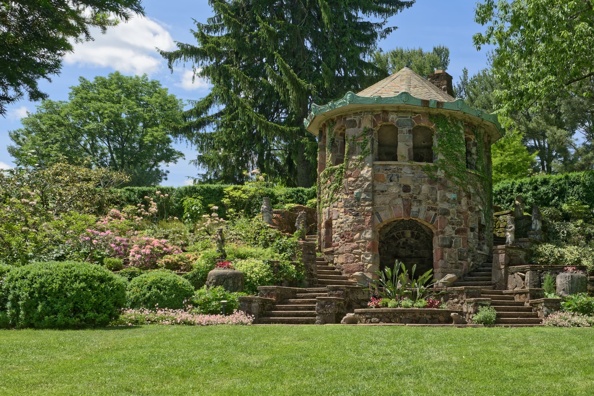
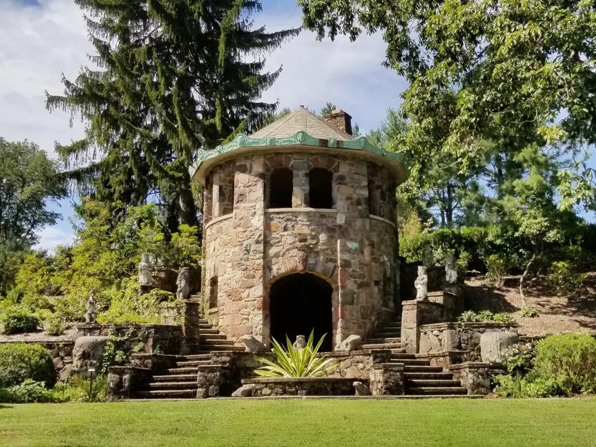
I don’t post many photos but it was such a bright and gloriously beautiful day today here in central New Jersey, USA that Wendy and I went to one of our favorite places, Greenwood Gardens, around 15 miles north of our home. I wanted to share something from our visit. It was taken at around 2:30 pm with my 23mm f/1.2 Voigtlander at f/11 and processed in PL 7.7.1 .
I understood it exists out off an extra included sidecar file and 1 or more thumbnails. One thumbnail per edit session and saving. They can also be stored in the cloud.
The sidecar file contains the used program and tools and a hash file connecting it to the main image. Per edit session all.
Hi Mark,
My i say ive mixed feelings on this shot?
At first glans it looks great.
Then i think is it over sharpenend?
Or just detailed in a full range of greenstuff?
Or do i mis “color”? Too much green to little flowers and other stuff?
It looks like, damn it’s too flat looking so i add microcontrast to enhance the detail.
But then again i look at it on my tablet so i will look at it again on my bigger pc screen see if i change my mind.
(These shots are like holiday shots, you had to be there to see the real image in depth.)
Oh it’s no critic’s it’s what i think at first glans looking at it.
I did not add any additional micro contrast other than the default amount which usually works well for me most of the time. I also did add a bit of fine contrast. However for this particular image on such a bright vibrant day, between the two adjustments I may have overdone it and I will review it and perhaps repost. I will also check sharpening to ensure I did not unintentionally overdo that as well although I do not recall oversharpening it and I don’t see the presence of halos around objects. I did shoot it at f11 so everything should be in sharp focus. I will review it later today. Thanks again for your comment.
On my bigger screen the pink is much more present.
i think my trigger of “some thing not right” is the surrounding of trees which lack a fair amount of “blu air”
maybe the “balance”
i did nothing to the image except a screenshot:
not a 9/16 i think just eyebald it. ( if you have more sky above your crop i maybe add this too to give the chapel more space.)
this looks more pleasing to my eye’s.
again no critics just how i see it, would engage it myself.
maybe you say yes better or no not what i i would do. both fine.
( probably the sharp and detailed grass at the foreground is what triggers my feeling of oversharping and which flattens the second part in the middle which should be the atractionpoint. )
Not sure about the pinkishness that you’re referring to. I don’t see it at all on my 28-in 4K monitor. Are you referring to the coloration of the stones in the building? Those colors are pretty accurate. But I will rework it a little bit with regard to sharpening/contrast to see how that works out.
I actually took several versions . The overall balance looked better to my eyes with the grass line at about 1/3 of the way up from the bottom. But I can play with one of the others where the grass line is lower and there’s a bit more sky and tree tops.
the colors pink which you should see! the rocks the flowers not a problem but more a good thing. Don’t change that.
i ment now i cropped the gras a bit those colros came more in front and thus more visible.
i think if i would stand and look at this, this would be my mental image. filtering out the grass in front.
On this version I lowered the fine contrast and the default micro contrast. I will look at selecting one of my other versions with less lawn in front of the stone structure but for the moment I added a cropped version of the same image.
It is often difficult to be a non-biased critic of one’s own work. It helps to have an additional set of eyes to point out flaws.
Stenis
(Sten-Åke Sändh (Sony, Win 11, PL 6, CO 16, PM Plus 6, XnView))
1460
Where I live, when the spring starts, which this year just a couple of weeks ago we use to have a really wide spectrum of green. The only thing that struck me as different from my experiences in your picture was that almost all of the plants seem to have almost the same nuance and saturation.
This year (yesterday we had 31 degrees i may which ought to be a record) everything just exploded in one week or so. We have on old saying about an old shoe maker who used to take a holiday between “hägg och syren” just to experience the spring. This year he should have been forced to abolish his holiday since they almost got into blooming at the same time. Everything got so compressed this year.
We have had an absolutely freezing, icy and terrible winter - the worst I can remember in my 74-year-old life. On that we got a spring here in May that has been fantastic so far because it turned out to be more summer than spring.
I just reviewed all the SOOC jpegs and raw files from that shoot, sixty-five different images from various parts of this 28-acre (11.3 hectare) garden which is a portion of this former privately held estate. I think my images captured the general spectrum of green that I saw. While it may look fairly subtle in the image. there are definitely differences. Also keep in mind that it was a brilliantly sunny day which could have had an impact on color saturation.
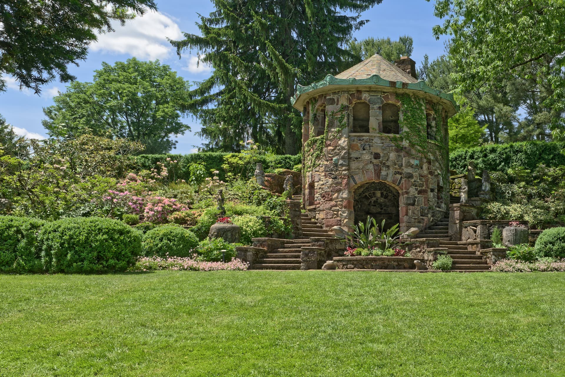
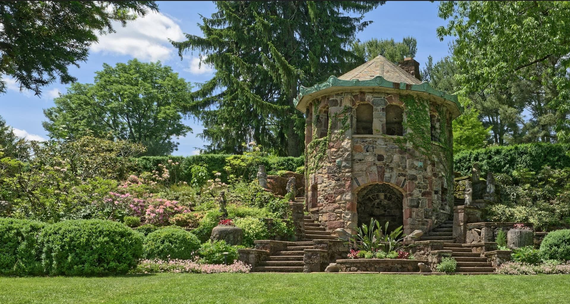
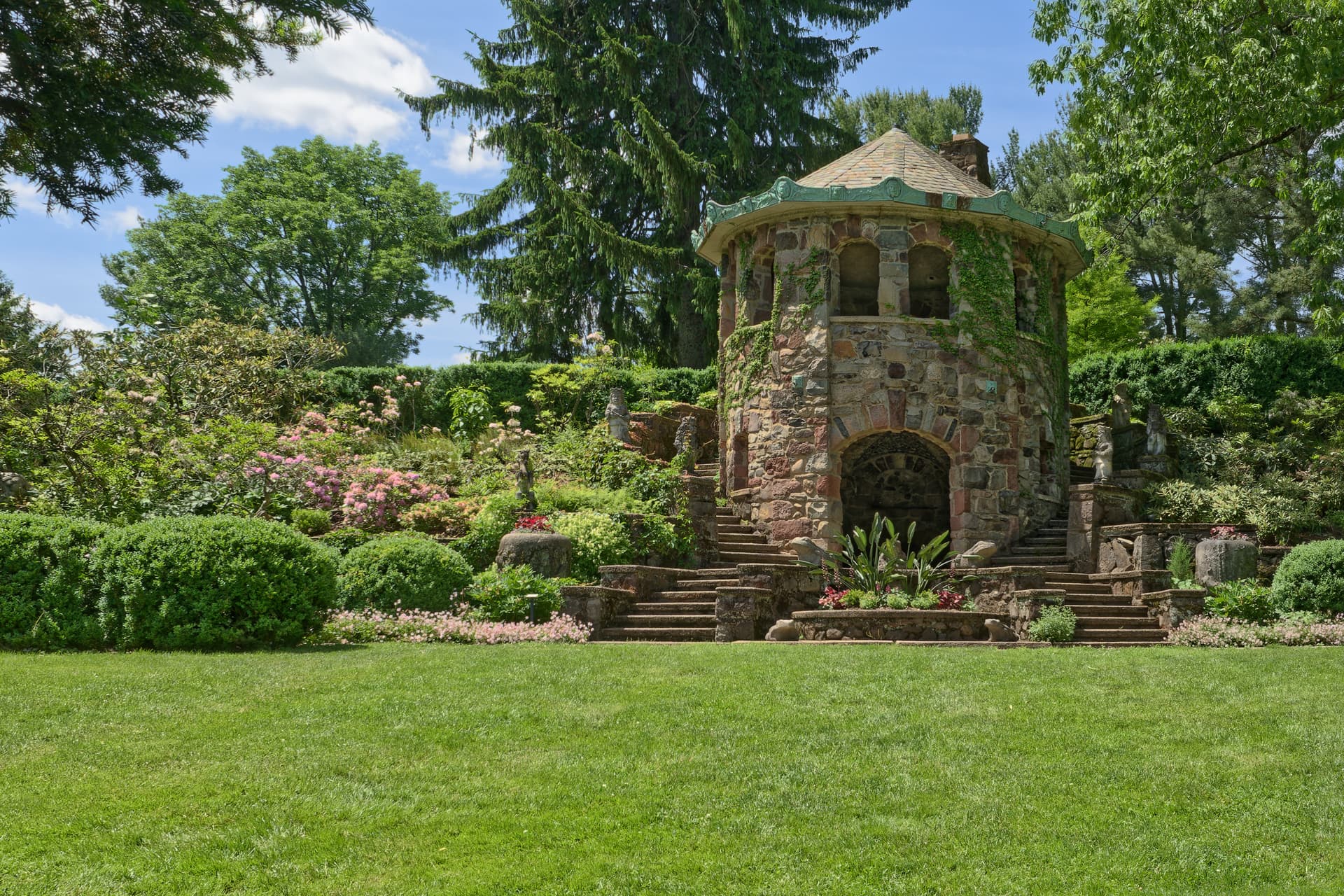
This particular structure, which is one of several in the gardens, is called the Tea House and was used by the estate’s original owners in the early 1900s for afternoon tea when the weather was not inclement. When I searched the internet I was not surprised to find a number of images of this structure.
Based on the plantings, the three images I found online and attached here, appear to be from different years and/or different times of the year. They all have one thing in common, the spectrum of green in these images is not any more varied than in mine, and maybe even less varied.
I believe everything pops a bit more in my rendition, however I added no additional vibrance or saturation to the image except for the sky. I used a Local Adjustment Luminosity mask to make the sky look closer to what I actually saw that day.
I used an LA auto mask to raise the shadows a bit in the window openings on the second level and the entrance opening on the bottom level.
I also used spot weighted Smart Lighting to change the dynamic relationship between bright and dark areas which had a major impact on the final result. It is one of my favorite tools.
The default Lens Softness Correction was used and I added a small amount of micro contrast and fine contrast which were reduced from the first version I posted.
Mark
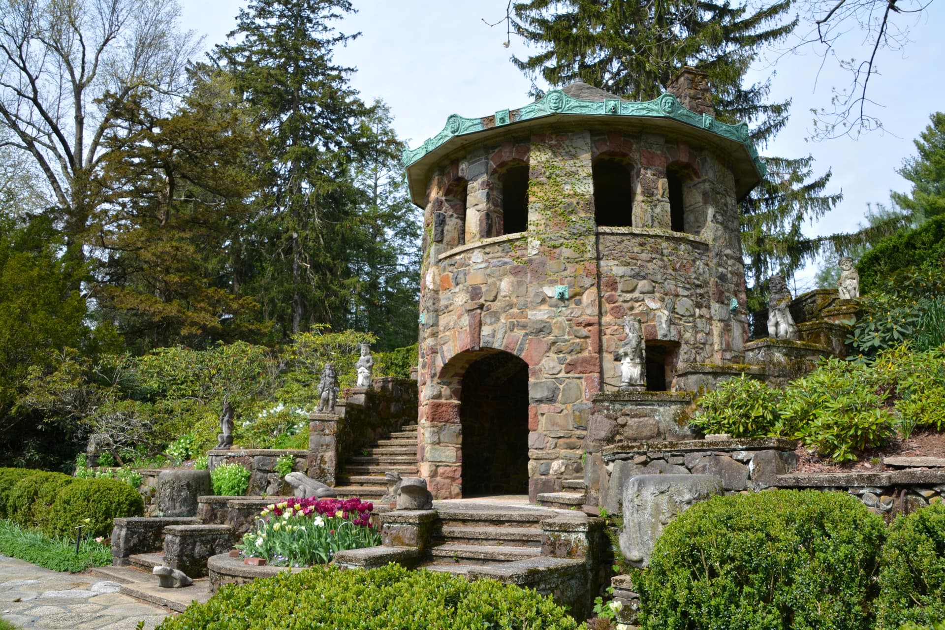
Three versions of this structure found online. These are not mine and I have NOT altered them!!!
Hi Mark,
the last image shows the best color separation of these three images (all downloaded and viewed with a color-managed viewer).
In comparison, yellows and greens appear to be highlighted in the first image, and in the second image the contrast appears to be exaggerated, which then also causes the colors to appear harsh (or due to compression and low bitrate).