Part 2 - Off-Topic - advice, experiences, and examples for images being processed in DxO Photolab

Joanna, what is the difference between when we use PhotoLab to remove a piece of garbage from an image, or when we use any of these image editors to replace an entire sky, or a car parked in front of a building where we make the car disappear?

The choice seems to be either not allow ANY manipulation to add or remove objects/people/whatever from an image, or “anything goes”.

To me, once we change an image in those ways, it ceases to be a “Photograph” and becomes a “Photo Illustration”, photograph being what the camera actually recorded.

I used to blame this stuff on Luminar, but Adobe is just as “guilty” of contributing to this issue.

At least PhotoLab does NOT contain a sky replacement tool!!! …or does it? :slight_smile:

No Mike I can hardly go on a carousel for small children without getting severely sick and vomiting but I have driven old Convair 340/440 passenger planes at the ground that I was certified for as a technician in the seventies. So, I did drive them a few times when we took them to a special place for engine and system tests after overhauls at our work shop. This was when I was working for the Swedish domestic Lines Linjeflyg.

During my military service for one year 1969 I was also working some time with maintenance at the F18 air base with maintenance but most of the time we worked with servicing the J35 Dragon planes during the days when they were flying (both day and night).

If you look at the background of the picture from the F18 base you can see a hill in the background. Inside of that deep into the mountain there was two tunnels big enough to have place for 15 of these fighter jets each. This was built in the cold war days to be able to take a direct hit of an atom bomb. Today this base is since many years back closed and out of use.

My favourite plane among our Swedish SAAB fighter jets is neither the Gripen or the Dragon but the Viggen. It was a bigger and more powerful plane the todays JAS39 Gripen and you could even reverse and go backwards with this very special short take-off and landing fighter jet. Viggen means Thundernolt in English and it was the thunderbolts the Nordic god of war Tor threw at things he wanted to destroy. They were created when he hit something hard with his hammer Mjölner.

Here a Youtube video with this pretty peculiar plane.
If you follow the edge of the two wings with your finger you will find yourself drawing a line in the shape of a “vigg” or thunderbolt and that was maybe the main reson to the name of the plane.

Look how extremely short the starting distance is.

Gosh!!!

I had no idea jets could move in “reverse”!!!
Shows you how little I know.

Enjoyable video - thanks for sharing.

What do you have to say about one of greatest ever landscape photographers, Ansel Adams, who wrote the following about his image of “Winter Sunrise, Sierra Nevada from Lone Pine”

“The enterprising youth of the Lone Pine High School had climbed the rocky slopes of the Alabama Hills and whitewashed a huge white L P for the world to see. It is a hideous and insulting scar on one of the great vistas of our land, and shows in every photograph made of the area. I ruthlessly removed what I could of the L P from the negative (in the left-hand hill), and have always spotted out any remaining trace in the print. I have been criticized by some for doing this, but I am not enough of a purist to perpetuate the scar and thereby destroy – for me, at least – the extraordinary beauty and perfection of the scene.” Ansel Adams

A print that is available and described as coming from an original photograph…

Well over $1000 for a framed print, and that’s for a digital reproduction.

One of the reasons the images you post here attract such disdain is that you might describe them as “factual” and “untouched” but, what you have done is changed their appearance from how they appeared straight out of the camera by altering perspective, exposure, noise, contrast, lens aberrations, framing, etc. Unfortunately, the viewer’s eye is dragged kicking and screaming around the image, being constantly distracted by all sorts of junk that have no place in anything except a journalistic record shot.

If you really believe that nothing should be changed, then do not use PhotoLab, or any other software, apart from converting from RAW to something like a jpeg.


I’ve showed you this before.

SOOC…

After post processing…

According to your definitions, I shouldn’t even do this.


And then there’s this one from Helen, where the tops of two cars kept on attracting the eye from the amazing cloud formation that was the subject of the image

SOOC…

Area where two cars were parked…

Finished edit…

If she hadn’t been there on that time of that day, those cars wouldn’t have been there. Helen’s aim was to record the cloud formation over the river at low tide.

This kind of image is designed to be timeless. Just like Ansel Adams, we happily remove “temporary” artefacts, because they are not part of the permanent subject of the image.

On the other hand, as I have previously stated, although we use AI noise reduction, neither of us would steal other folks images, as provided by generative AI.

As I’ve said repeatedly, the best photographers have been retouching images in their darkrooms long before computers were invented.

There is only answer from my point of view, continue doing what I do, what you do, and what Helen did, and what Ansel did. You can do and explain however you wish. All I need to do is accept that I am creating “photo illustrations”, and the issue is resolved.

So, are they photographs, or photo illustrations? Apparently the answer depends on the “rules”, where awesome photographers have been disqualified for breaking those strict rules, and why you, Helen, and Ansel, and especially ME, would have been disqualified.

Your explanation makes perfect sense, just as I feel justified in removing a piece of junk from a photograph I’m about to take. What Ansel, you, and Helen did is common sense - but don’t enter the image into a contest with rules that don’t allow any such manipulation.

I’m certainly not going to argue against you, as I agree with everything you wrote. But I wouldn’t submit an image to a competition that specifically dis-allows this kind of editing. Otherwise, I agree with you.

The building photo I created would have remained “legal” until I used the distortion tools in PhotoLab. But, using those tools, as you have explained, creates a stronger image.

Obviously, you have not understood (that is not enough experimented) how the Force parallel tool works.

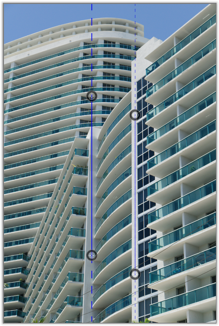
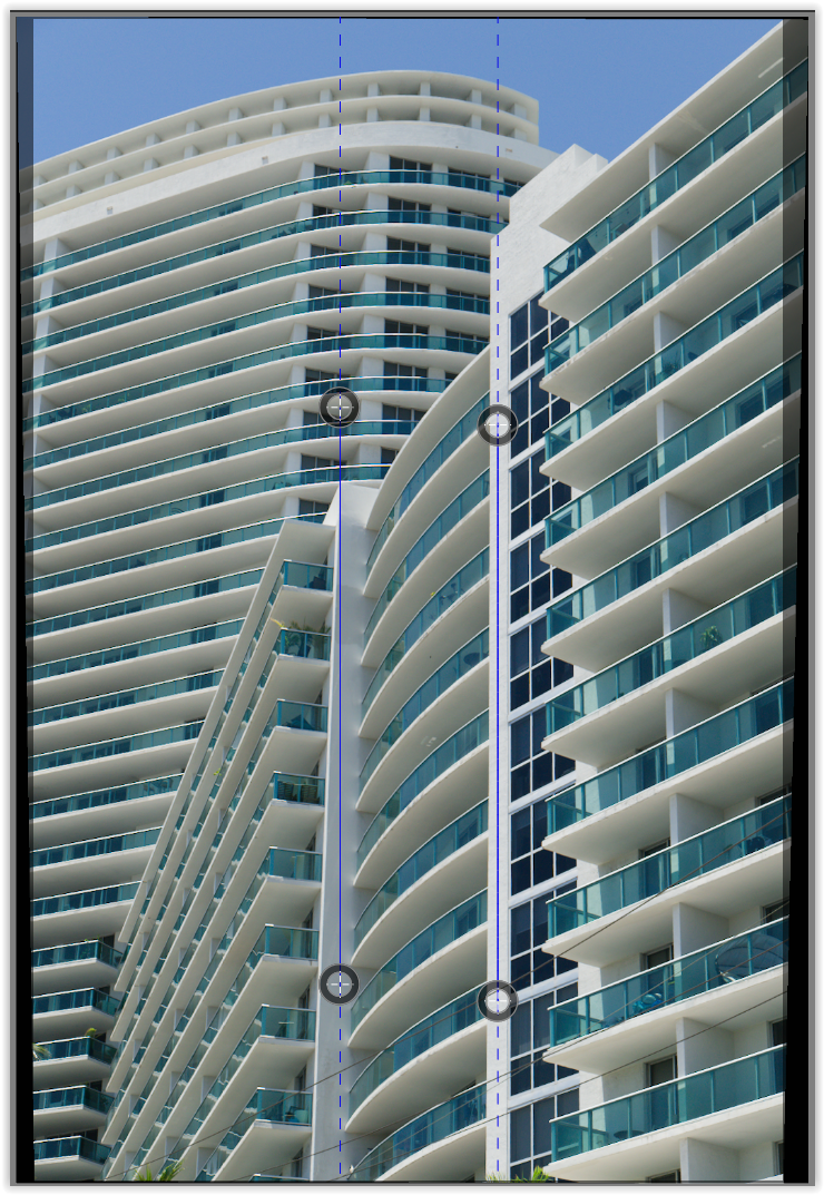
This pic (taken at 28mm / equivalent to FF) shows converging lines as well as decreasing size of the more distant objects.

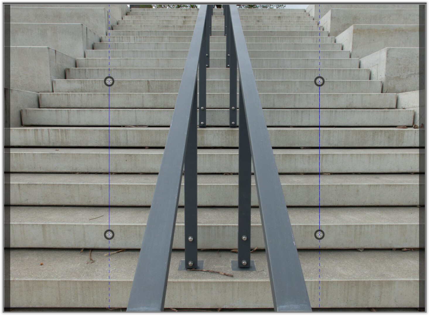
When you move one (!) of those vertical lines alongside the railing

and apply the modification,

the entire image is rotated and that railing appears strictly vertical.

.

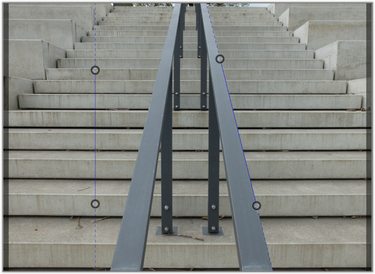
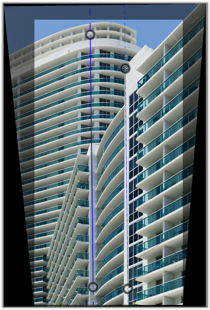
About your pic (ooc, developed w/ optical corrections only, for better visibility in color),
where I moved both vertical lines across, but without adjusting anything.
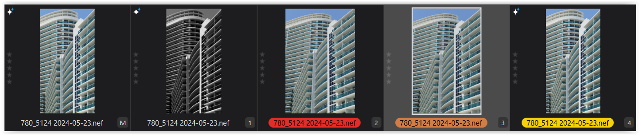

VC 2

Instead of manipulating the perspective, you also could have left it as is. Both ‘main axes’ tilt slightly inwards to ‘stabilze’ your image – as we know and expect it.

That is, if you needed to correct the perspective, it would have been enough to correctly adjust the one (!) vertical line on the right along the axis – and only then after to check the vertical line on the left.


VC 3

But you positioned the right vertical line so that the axis now tilts outwards, which causes your image to appear to be tilted to the left – and the middle top balcony appears to be even longer (inspite of the greater distance). And you even used the Horizon tool at some time.


VC 4

.


see → 780_5124 2024-05-23.nef.dop (53,4 KB)

.

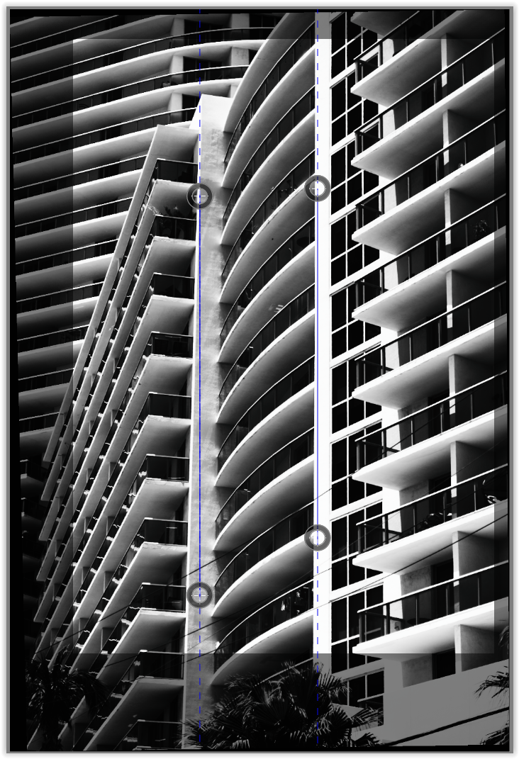
Compare the vertical lines on pic #5120 with those on #5124VC 3.


780_5120 2024-05-22.nef.dop (22,1 KB)

I found #5120 more interesting and chose this stark black and white representation to transform the buildings into an abstract motif.


about your eternal problem
Yes, if you enter a photography competition you will be disqualified,
but because a name tag was used in the picture.

I started to play with your moon picture too and tried all sorts of exports without being able to export at all without getting “Internal Error”. I tried both JPEG:s of different resolutions and TIFF. All of them crashing!!

Looks like I will have to use Capture One instead. :frowning:

Have anyone else had that problem.
Also used Deep Prime XD

I even tried the other picture you sent us with the Miami skyline silhouette and got the same kind of error. My Photolab doesn´t like your NEF-files at all :frowning:

There’s quite a difference. First we are not adding something in to the image that was not there before. And what we generally remove are non-essential aspects of the picture whose presence can spoil the entire aesthetic. We’re not talking about images intended for publication as news items, after all. If you had as an example, a otherwise perfect picture ruined by the presence of an old tire that in no way adds to the story but turns an otherwise great image into something that needs to be discarded why not remove it, especially if the outcome is for your own pleasure

If I recall you recently had no problem doing it to one of your images of a very bucolic scene spoiled by the presence of some trucks on the left hand side past a body of water. The main difference of course between what you did to remove them and what Joanna and I did was that we used the tools to try to replace the vehicles., You used tools to blur them out which was less effective and created a smear in that area of your image.

Mark

This I disagree with. When I remove the piece of garbage, or whatever, unless I want a pure white or pure black colored blob to replace it, the software will fill in that space with whatever it creates to do so. That is very much adding something to the image that was not there before.

PhotoLab tells us where that “fill in material” is being copied from, and while it was in the image originally, it was in a very different location. It’s nice that PhotoLab allows us to select all this, while PhotoShop just speculates on what might have been there before - as when I removed a parked car from a photo. The final image appeared realistic, but was completely wrong.

Given my choice, PhotoLab is preferable, and PhotoShop can create images that are obviously fake.

Are you using Mac or Windows? For decades, my file naming convention includes the use of a “vertical bar” ( | ), which confuses Windows. @Wolfgang explained all this in detail. I’ve been using my naming convention for decades, and don’t want to change - there ought to be a way to get Windows to somehow work around this, but that’s way over my head.

Anyway, if you are using Windows, this might be the explanation for your issue?

You are SO right. No, I don’t understand “how” the PhotoLab tools work, only what they do. The only thing I think I understand is that if I select two lines, and use the “Force parallel tool”, at the expense of distorting my images, it forces those two lines to become parallel.

However, that is NOT what I want, as when I do force them to be parallel, the image looks wrong to my eyes. So, I use the tool, but deliberately do NOT make the two lines perfectly parallel. Doing it this way, the image is much easier for me to look at and understand and view. Using the tool perfectly creates an image that bothers me.

There are an infinite number of things, that while I understand them enough to use them, I certainly have NO IDEA of how they work. To me, it’s creating an illusion, and I get a better (more convincing) illusion when I fudge things a little.

Joanna understands this, and called it a “well known phenomenon”. I don’t understand it, but by trial and error I can get it to do what I want.

That’s what I was trying to explain earlier - to me, it’s a visual thing, not a mathematical thing. That’s why photographs that are “perfect” sometimes look “wrong”. My brain expects parallel lines to look a certain way, and I just “fudge” things until my brain accepts what I’ve done.

I think you understand what I’m trying to say, even if I’m not giving a very good explanation.

Regarding your explanation, yes, that one railing appears vertical, BUT to my eyes it doesn’t LOOK vertical even though I can prove to myself that it is. There is too much other stuff going on. Mathematically, you are correct. But my brain doesn’t see things that way. My brain is telling me that right railing is tilted, even though I can prove to myself that it isn’t.

That right railing looks to me like it is tilted to the right near the top, even though I know for a fact that it is NOT.

I suspect the real trick is to NOT make it perfectly vertical, in a way that fools my brain into thinking it IS perfectly vertical.

Or, maybe the game really is to make people THINK they see things the way the photographer wants, even if that is to really what the person is seeing.

Time for you to either give up on my completely, or to try to figure out why I see things the way I do.

After all this, I see the image that you wanted to create - very nice, in every way.

However, that is not the image that I wanted to end up with - at the lower left, you are cutting away things that I consider very important, those diagonal lines. For my photo, I wanted those included.

We all see things differently, and I can appreciate what you did, and what Joanna did, but I’ve already posted my own final result. I like all the versions, but I prefer my own. But I do like the way you “shaded” your image. I prefer that to what I did. The contrast in your version is beautiful!!

About the lines getting longer - that doesn’t bother me.

About the “name tag” you say I used - where is that?

That is not rally how it works once you learn how to use the tool. You can select from the surrounding background like extending a patch of grass or bush branches.

Attached is two versions of the same image. It is a crop of a much larger image of a lake in Tennessee with a large boat ramp. There is garbage on the ramp and what looked like a twisted guard rail and a large rubberized tarp of some sort. There were incredibly ugly and had no place on this otherwise pristine lake so I removed them.

Mark

With Garbage:.

Without Garbage

The Memorial Day air show continued today, and will continue tomorrow as well. I’m only posting this to show Joanna how her advice on slowing the shutter speed to get the propeller to look more realistic worked quite well:

780_5259 | 2024-05-26.nef (26.0 MB)
780_5259 | 2024-05-26.nef.dop (13.5 KB)

One last photo. I thought I was done for the day, and stretched out on my chair, resting, with my camera on my lap, when I was startled by this huge monster that flew by my balcony, giving me barely enough time to capture four photos, only one of which was reasonably sharp. I don’t know what it is, or does, but I imagine it can carry enough weapons to single handedly end life on most of our planet. I’m used to aircraft from WW II, but not monsters like this. Maybe somebody here will recognize it.

Enough. I enjoy shooting birds, and boats, and ships, and strange looking buildings, and things that “tickle my imagionation” (mis-spelling deliberate). I don’t enjoy photographing things that scare me. I wish I had never seen the movie “The Day After”, but it really messed with my mind - along with things that I know, but wish I didn’t. But photography is thoroughly enjoyable, and while I’ll probably never get to where I know “enough”, as Cunard says, “Getting there is half the fun!”.

Mark, I know what you mean, and what you describe is how I try to do it myself, but that’s irrelevant. Your finished photo may well be what you imagined, but it is not what was really there. By my definition, you end up with a “photo illustration”, while the original image is the “real photograph”. Suppose you had wanted a peaceful blue sky, with fluffy white clouds. Or, maybe you didn’t like that “dock” (or whatever it is), and removed it.

Reminds me of the saying “you can’t be a little bit pregnant; you are, or you are not”.

DxO offers tools to do what you do, and I do. Luminar goes a lot further - don’t like the sky, replace it.

In today’s world, I suspect 95% of the people who see my moon with the airplane in front of it will instantly assume it’s a fake - but maybe the exhaust from the plane distorting the moon will make them re-consider.

Bottom line, from my point of view, the top image is a photograph.
The bottom is “something else” - to me, it’s a Photographic Illustration, for lack of a better term.

Heck, I’m beginning to think nothing is real. People on TV usually do NOT look like their images. The only magazine I think I trust is National Geographic. The airplane images I just posted were all edited, using PhotoLab tools to make them look better.

I used to think the only thing “real” was a RAW image, possibly along with a “checksum” for that specific image. But enough of that. I agree with you, but maybe not if you want to call the second image a photograph.

But who says it has to be really there to be a photograph. It’s not like my photograph was a composite of different pieces put together. All I did was remove unpleasant distractions that would make a nice photo look less nice. You can call it anything you want, but it’s a photograph.

Is it really any different from any other photograph that we might edit in PhotoLab or any other editor. Any changes you make in PhotoLab will make your images look different than the way your camera captured them, altering the original.

Mark

The journalism “do not add or delete anything” is probably started when digital image started to be common sense to use.
The fear of photoshopped “news” is one of them.
The other is “your not a skilled photographer if you need a bunch images for free to choose 1.” Film cost you so your not spraying and praying.
Aka digital is for losers back in the day’s.
(Filmpack is a ghost from the past in that aspect. A seak for the good old day’s when boy’s where still man…:wink:)

Imho any rawfile is editted and thus not “the truth”.
So cleaning up dirst/garbage or changing appearence by deleting some distractions without changing the shot you where seaking for is fair game.
A image is telling the “story” “the feeling” “the moment” and our brain is filtering also when we look. In real life.
(If we séé all the garbage that’s laying around we would pick it up and trashcan it but we don’t so we filtering that out of the final image we séé in our mind)
Same with dissturbing objects our brain ignores that.

But when we see a screen or printed image we start to “scan the image” examening the pixels and séé all the distractions. Probably a old lizardbrain habbit, examening your food or object in front of you could save your life :sweat_smile:

So imho let the image show what YOU want to show because that’s what’s makes a image “real”. (if it’s not part of a newsreportage offcoarse)

Right, have to go , dropping my 16 year old son on Schiphol he’s going to Rome for few day’s with his schoolclass. (he’s got my old fz200 and crashcurses of iso,apertureand schutterspeed.)

1 Like

Hello Mike,
That’s a B-1B “Lancer” bomber with sweptwing capability :slight_smile:

Google on ‘manipulated iconic photos’. You’ll see a lot but I miss a lot too.
The Russians manipulated images to rewrite/correct the past.
A Dutch example was a photo of an army truck in Afganistan. It won the third price I believe. But then they discovered it was manipulated and the photographer lost his price.
It’s in Dutch so you have to use Google Translate or Deepl.

George

1 Like