I’ll go along with that - it was only a snapshot as I walked by the tree, and I “saw” the face in the tree. OK, let me revise my “challenge”, which is now open to any photo any of you might have taken at any time, with any camera, in any location, that seems to show a “face” in the tree, or whatever it is you feel also shows something similar.
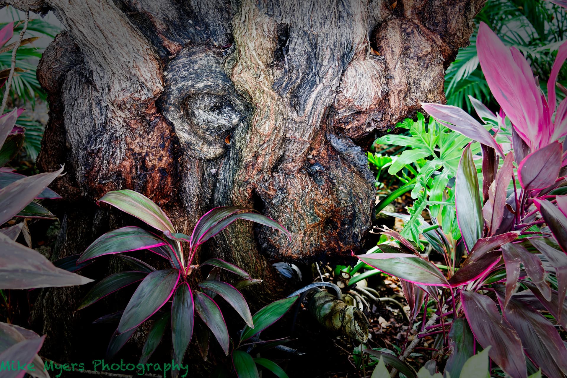
I will finish editing this image tonight or tomorrow night. My “face” image is a creature disguised as a tree. Two eyes, a nose, a forehead, and a mouth. Imagination required, PhotoLab skills optional. If you don’t have an image like this already, go find an appropriate tree.
There you have a project, where YOU can show, if and how to turn a quite random snapshot into something more meaningful – following YOUR imagination, when you saw the ‘face’ on the tree trunk.
While it will cause some work, you might consider if and how to crop the image, maybe use a static square, if you don’t go with portrait orientation, play with partly desaturation and experiment with dodge & burn to bring out that face / figure. – Don’t mind, it will take all your energy, but the focus really must be on the subject.
Your result should be interesting, especially as it takes you all away from any journalistic approach.
It might be done, but I want to look at it again after another night’s sleep. It’s not really a “random snapshot”, as I saw the “face” and took the photo to document what I saw. I included space around it, just in case. I doubt it’s going to be “meaningful”, unless other people’s imagination is as strange as mine. Most people will just see a tree.
Whether or not my result is “interesting” depends mostly on “imagination”, and seeing things that aren’t really there. It’s like looking at clouds, which normally just look like clouds, but every once in a while they remind people of something “real”, perhaps a shark. Whatever.
If I still like it, I’ll post it tomorrow, maybe with no more changes.
Nope, if I wanted it to be a nice photo, there are a lot of things I would not have done, but the way it is now, I think it’s hard to miss thecae - two eyes, nose, forehead, an ear, and mouth.
Maybe I’ve just got a strange way of seeing things, an you’ll just see plants around a tree, which don’t look all that good - but I don’t want people to notice them. I think I achieved my goal.
Enough. Maybe that I saw a monster and not a tree means my brain is scrambled, or I’ve seen/watched/read too much science fiction. It’s difficult now for me to “un-see” whatever it is. Good luck if you can do it better!!
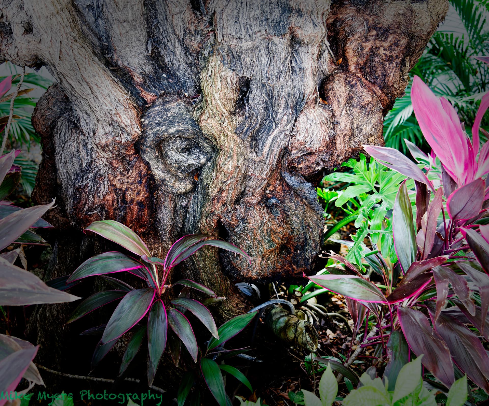
You have now cut his hair off. He has lost his mouth and chin which looked pretty good in your original.
The original picture showed that your journalism came back out and you allowed to much around the tree. I don’t know how many images you took originally but you only needed the one that was the picture that was telling the story.
I only took the one snapshot as I was walking by, with no intention of doing anything with it. There wasn’t time for my journalism to come back - I just raised the camera, pressed the shutter release, and continued walking home.
To me, the original image shows a tree.
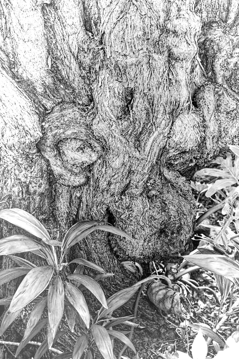
To me, the revise image hints at the face of a monster.
Thanks for the feedback, I can easily change the crop so it is more like what you prefer.
I hadn’t really noticed the “hair”, but I agree with you. I changed the crop, and a few other things, and left it so the creature is staring to something to the right of me. With your suggestions, I certainly prefer it to what I did before…
If you understand how clearviewplus works you can use it.
The algorithm tries to only find realy tiny sharp lines which would be outlining details of objects and add in that line the microcontrast and avoid that in plains of color.
A bit like this guy working with sandgrains. An other nice one
He uses sandgrains like (black) pixels(sand don’t let (much) light through.
By darkening places in the plain with more sandgrains on glasplate with light under it, the edgeline gets accentuated so the object gets more pronounced and more detailed.
My point is over do that stacking of sandgrains it won’t get better. The magic is in the gentle touch.
In that b&w video you posted he’s used it at 50 60% (i think @Joanna got a heartbreak seeing that )
Not very smart on images which need a smooth tonality to use that strong effect.
In minor 5-20% it can help you to gain some edge enhancement for artificial sharpening and color vibrance (saturation). What you be doing with micro and fine contrast is connect the blacks more to “groundlevel” which looks like more clear view. As in putting a polaroid sunglasses in front of your eye’s.
Landscape views have often in the second half of the image (the far distance) some haze or mild foggynes. Heatwaves, dust and such (massive insect clouds ), sunlight diffusion that kind of haze like look. Then it’s much easier to use local masking and use mildly microcontrast and vibrance/saturation to effect only that area. And then global some finecontrast enhance the hole image. Go switch adjusting between global and local to merge them together. Again light touching is the key often.
Whoops, sorry Mike. As I have said before. You should be taking pictures for you. Just because I think your current picture is not the best. It still has to be your choice. I only made the comments as I felt you had taken away the character of the face. I do not know whether you saw film Lord of the rings, but the people or should I say tree people were very similar to that face. As Joanna and I have said before, you are leaving too much space around your picture and then when you get it back your cropping to close. Another example was your white building that was being constructed. You cropped off the top, which took your eye out of the picture, with no way to return. The sky at the top your eye went out of the picture on the left side, but the additional floors brought your eye back in.
Sorry for the adverse comments. Only trying to help.
So, I’m doubly wrong. I thought the main purpose of ClearViewPlus was to “cut through fog” making things appear sharper. Until just now, I thought it worked on the entire image.
The way I’ve been using it is to turn it on/off, and see it I prefer it, and how much of it. From what you’ve written, even though Joanna’s comments were helpful, I did not understand HOW it worked, as you just explained.
I guess I need to capture some test images, and practice with this until I better understand.
I both agree with you, and disagree. In college, I did things my way, and got a poor grade. When I did things the professor’s way, I got compliments.
I’ve been using PhotoLab since version 4, and while I can create images that most people I know love, when posted here, I learn all the faults. Even if I don’t fully understand, I almost always feel I should follow the advice.
Not with this monster-face. I like the image I posted, but I like it even more with more of the forehead showing. I had my mind set on what I wanted, but it’s obvious to me now that I was wrong - with the forehead and hair, it’s a better image.
No, I didn’t see that film, or any of the similar films.
Guilty as charged. I rarely know exactly how I want to crop an image until it’s on my computer, and I hate when I realize I didn’t leave a little “wiggle room” around my image, so I can correct for a tilt, or other minor issues. My brain is always a little in “rangefinder mode” where I don’t know exactly where the edges of my image will be.
Please don’t be “sorry” about adverse comments - the more comments, and the more criticism, the better. Good feedback is always helpful, and good for “doing better next time”.
Each time I take a new photo, I’m trying to be aware of the previous feedback, especially if I saw my photo as having “mistakes” to be avoided in the future.
herman
(Leica M9 | iPhone 17 Pro | iMac M1 | PL9, FP8, VP5 | Photo Supreme)
1622
If it was my image I would go for something more graphically.
Also I would use a portrait (vertical) crop.
Don’t know if you like my version at all, it just resonates more with the gnome I see in your tree.
Well not wrong , but maybe misguided.
Usermanual:
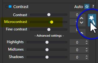
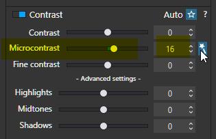
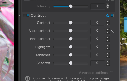
Microcontrast: also called local contrast, delivers fairly similar results to sharpness correction, but without the inconvenience of generating artifacts. Microcontrast brings out the details and gives the image more “bite.” It is ideal for landscape, architectural, and industrial photos.
You can adjust the Microcontrast in two ways:
Manually, by moving the slider to the right (stronger), or to the left (weaker).
Automatically, by clicking on the magic wand to the right of the slider.
If you read this you can understand that when you use the magic want function microcontrast becomes a part of lenssharpnes. Thus this is not dumb plain fixed strongnes of adding near black microdots. It’s actual a image sharpening/enhancing by the lensmodule.
So by setting the automodes active of microcontrast dxo helps you to find the sweetspot in using microcontrast. But it’s not smart as in finding local parts in the image to dehaze. It’s overall evenspread over the image outlining edge lines.
CitaatAutomatic mode takes into account the presence of faces in order to preserve them, and also takes into account digital noise so as to avoid accentuating it excessively. For JPEG images, automatic Microcontrast is limited to a value of +5.
Here you can read that microcontrast isn’t very good for faces.
And that noise grain and microcontrast also not very clean images gives. So high iso values and strong microcontrast is a no go.
CitaatFine contrast (DxO FilmPack 5 ELITE Edition installed): The Fine contrast slider brings out or softens medium-sized details, and is gentler in its effects than the Microcontrast, slider, making it appropriate to use with portraits.
This explains the use range of fine contrast. The contrast dots are bigger and less black. So it’s more gentle and less agressive on details.
A way to remember the slider use:
Micro use microsteps in adjusting, contrast effect goes fast strong.
Fine , this slider is for fineadjusting, you can slide higher and longer for the effect you seek. (like the old glassbulb-worldradio’s tuners. Who was having a fast ring which give you fast running through the no broadcaster and new broadcaster fm/mw range. Wile the fine tuningring was voor smaller change of the needle position with every inch of turning.)
Citaat DxO Smart Lighting is probably the most complex of our corrections. It has a global and a local effect on the image – affecting the whole picture and local details – and has a strong influence on contrast and brightness. Such a complex correction can only be mastered with practice. However, you will quickly see for yourself how effective DxO Smart Lighting is even for difficult images.
See even a “simple” exposure thing like Smart Lighting would be in your mind, is adjusting contrast and thus your tonality of the details. Using it in a strong way will destroy details if not used correctly.
And now your Clearview:
CitaatThe DxO ClearView Plus tool automatically eliminates atmospheric haze in both RAW and JPEG files.
The main purpose is thus “Dehaze”.
In order to be able to define and seperate fogg and haze from actual image pixels it has to have a example LUT of images who are clear from fog and haze.
And a certain range of pixel saturation and lightnes which can be identified as “fogg effected”.
When it has created a mask it uses the black microdots to repair the desatured pixels which where effected by the fogg/dust particals in the air.
So it ls smarter then magic want function of plain microcontrast slider.
Thus recap:
Use automated function as help aid by dxo which has scanned your image calculating the effects of iso value, exposure levels, lens resolving power by using lensmodule data. Just be not affraid to overrule this aid to your own taste.
don’t use microcontrast slider to enhance a image globally but use clearview.
Still remember Microsteps.
use manual microcontrast only in the local masking features to accentuate a certain part wile backdown on the other parts. Balance and bring out your subject of interest.
fine contrast is a nice way to be subtle and still clear up the hazy glans. Vibrance is also a nice feature to use side by side finecontrast in order to get the right saturation and clarity.
How does one do this? Which function are you referring to? So DxO will scan the full image, and decide on an effective solution, and how much to use???
So, so, so much to read, and understand. …this leaves me thinking that until/if/when I understand these things, perhaps I shouldn’t use ANY of them until I do.
see the number:
make a folder of certain images of any kind, highlighted,zoomed detail, colorfull, bright, low light, base iso high iso scenery landscape , city, bricks/buildings you name it. call this test folder.
then you can fool around and hit reset every time you like to test out a tool function.
every time you have a image which has a “certain” problem this is a good test image for later.
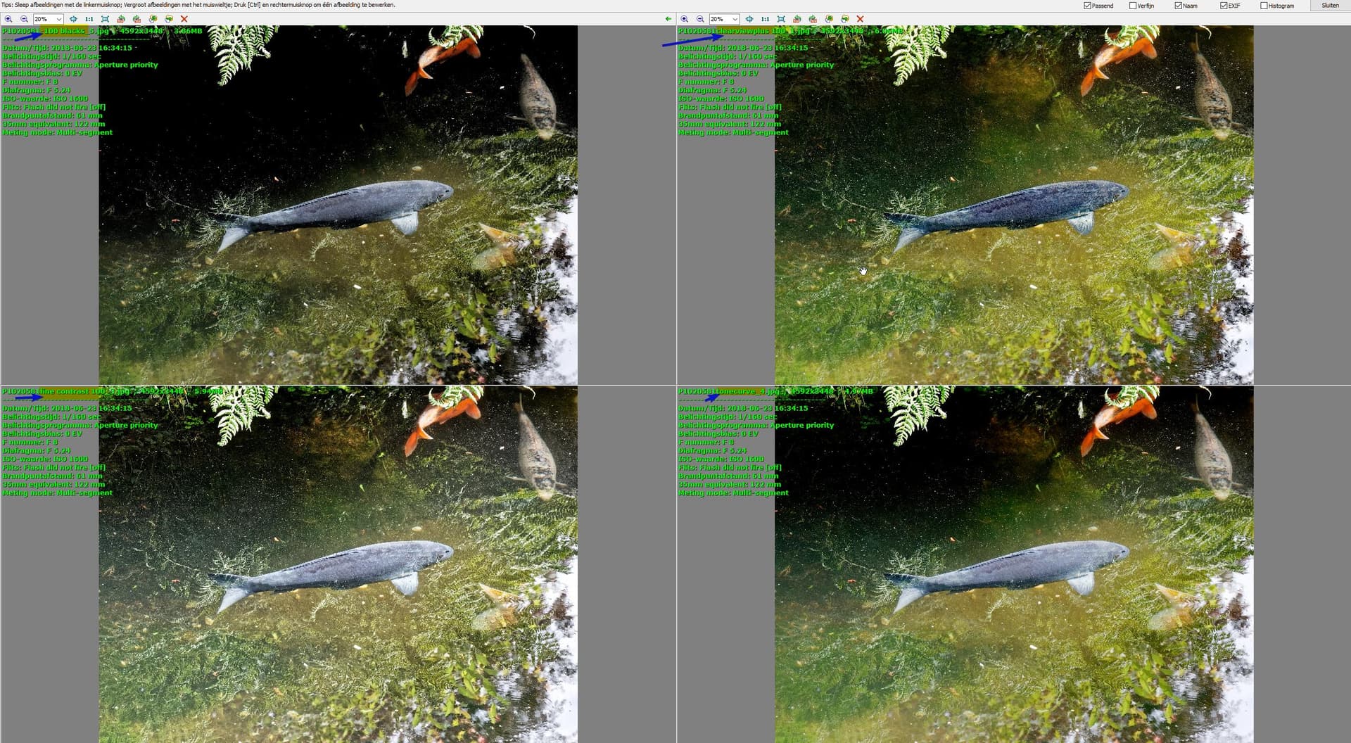
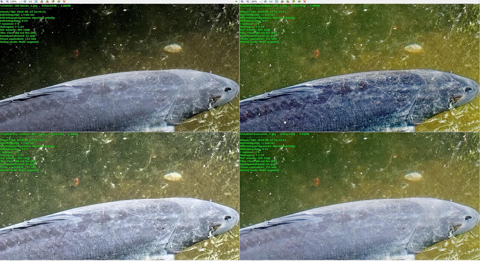
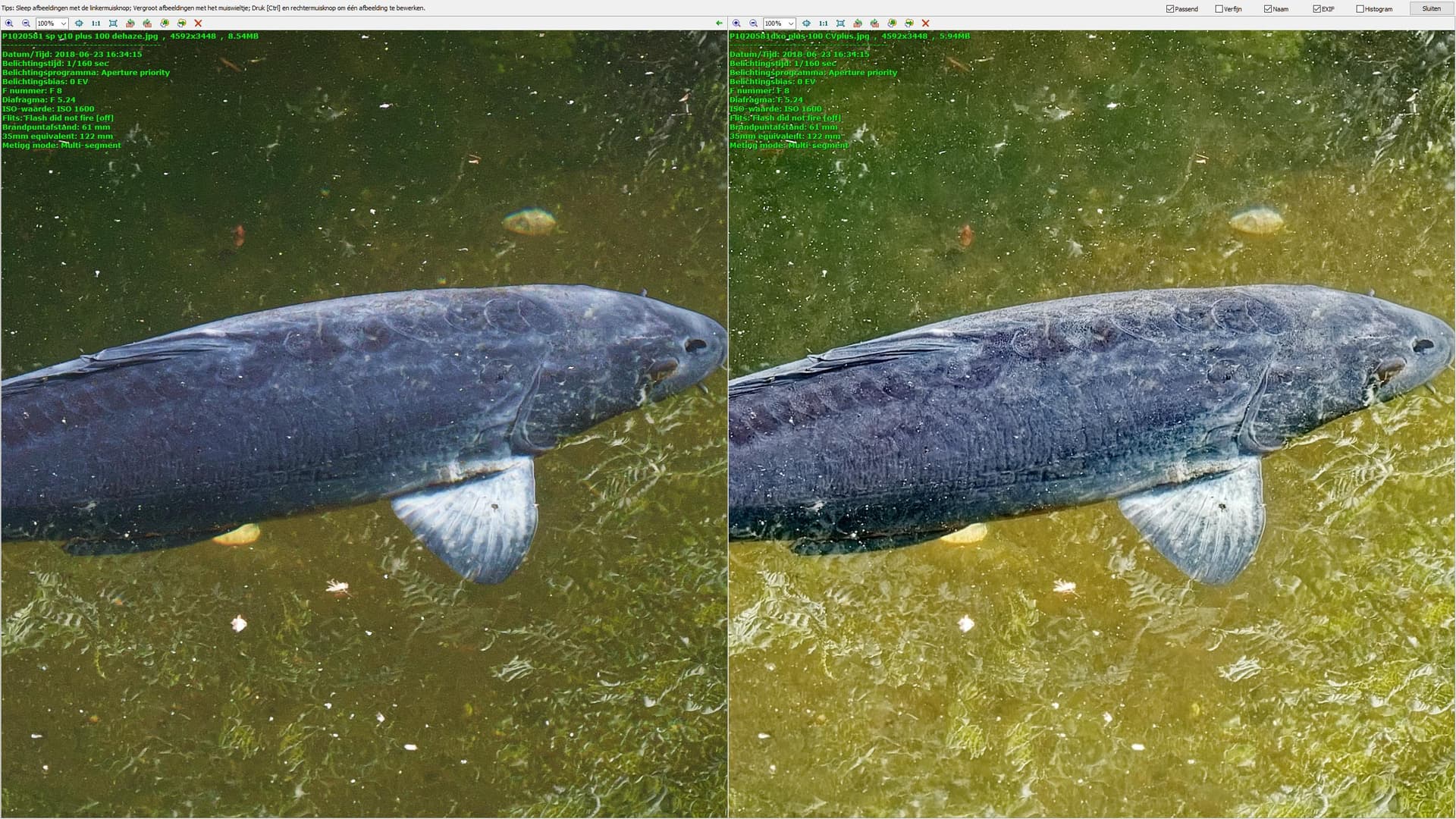
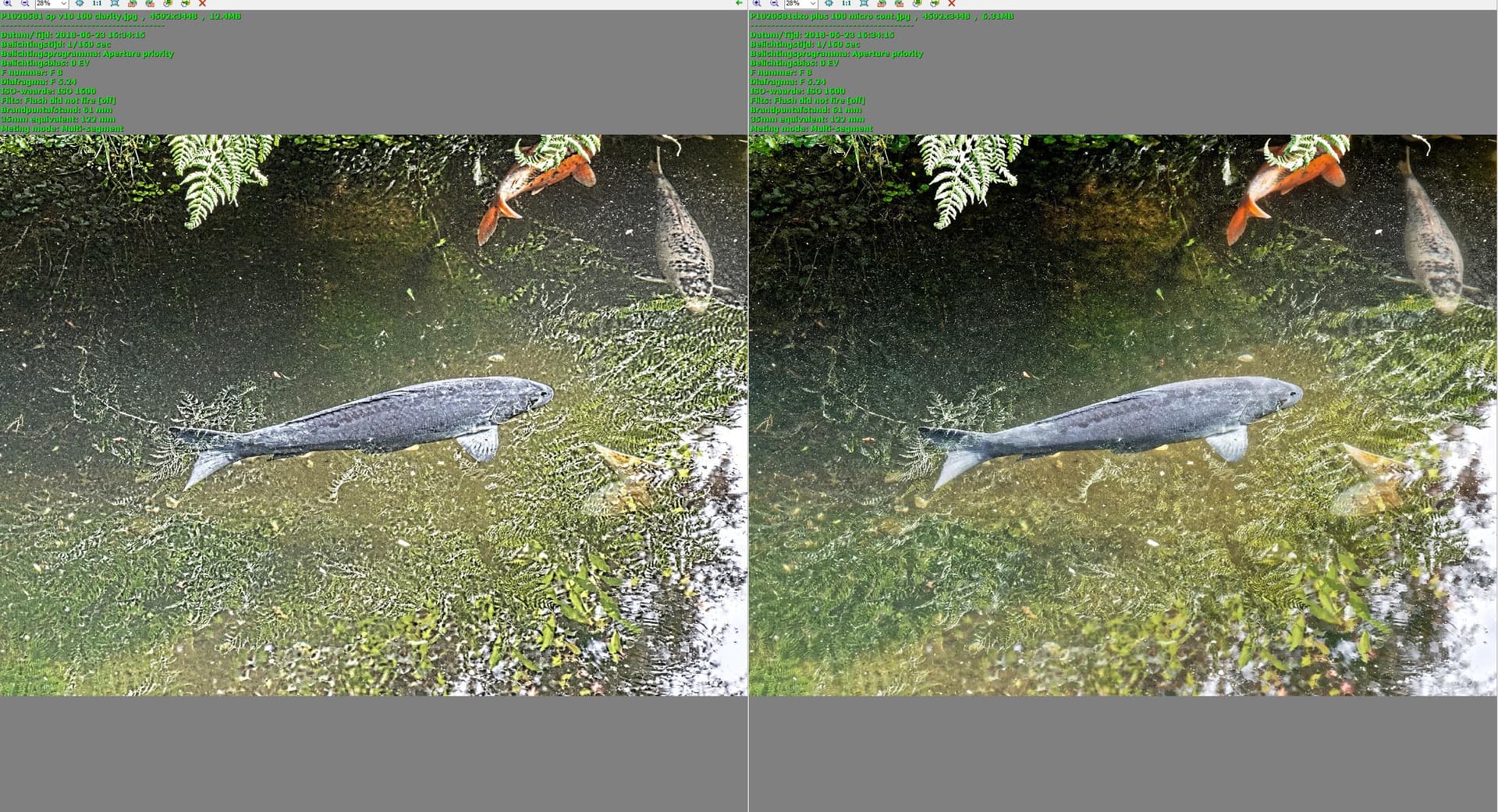
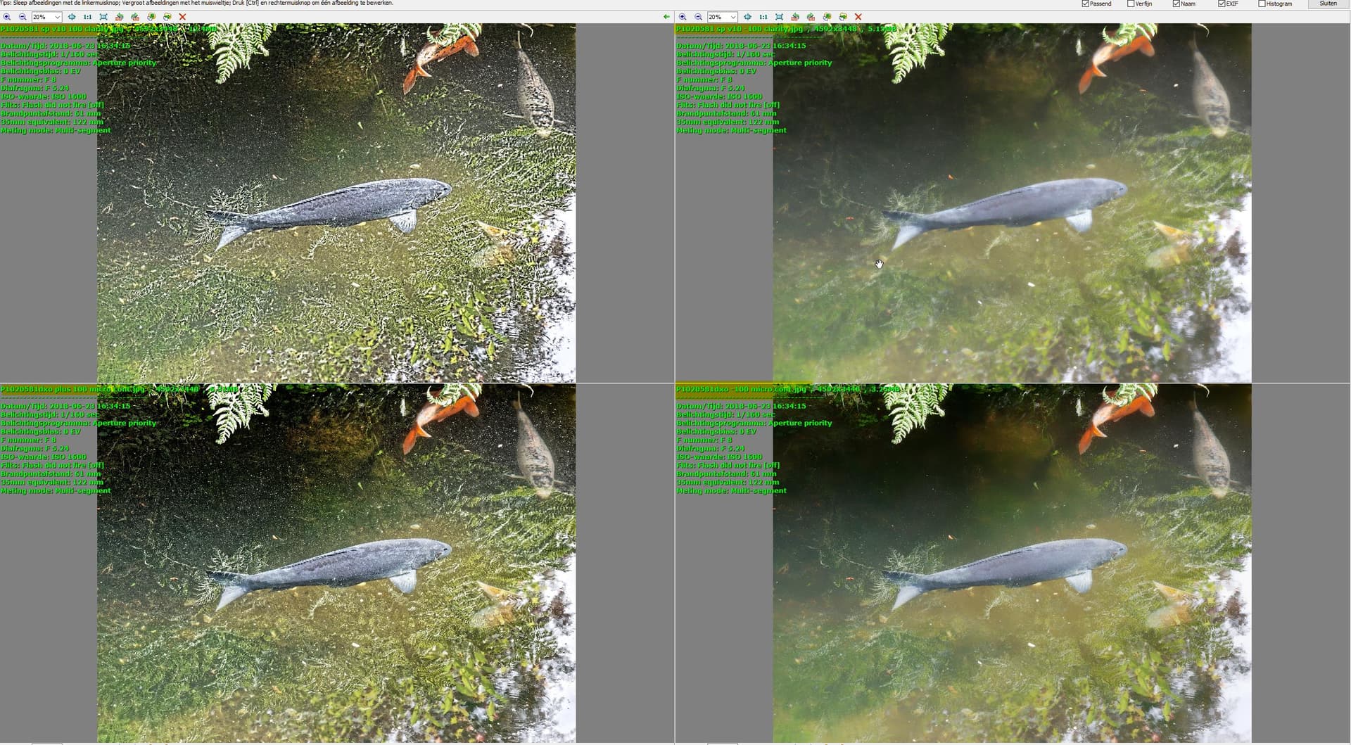
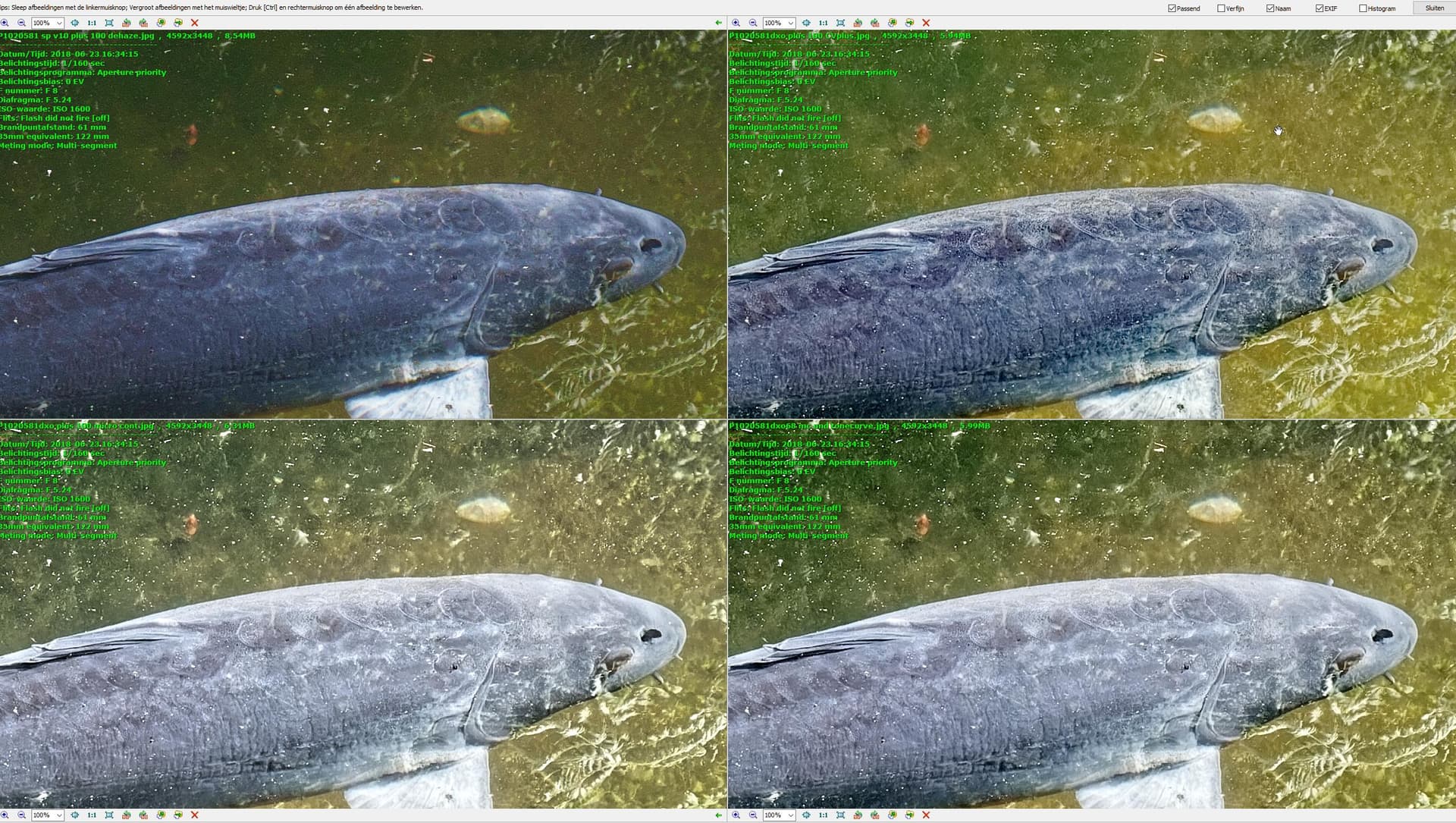
the first you get from me: P1020581.RW2 (18,8 MB)
and the examples:
explaination of the sliders:[Silkypix usermanual](file:///C:/Program%20Files/ISL/SILKYPIX%20Developer%20Studio%20Pro%2010%20for%20Panasonic%20English/manual/man0006.html#fine-tuning-tone)
See this as a different teacher who explains you mathematics from a teacher you don’t grasp. other point of view and different words can help to understand./grasp.
there is “Clarity”: which behaves the same as Microcontrast.
there is “Blacklevel” which is “dehaze” aka polaroid sunglasses. Not the same Blacks in dxo! tone curve as i did in the clip does the same tric.
and finaliy “Dehaze” in Silkypix : Dehaze restores and emphasizes the lost saturation in hazy areas due to dust. Increasing the level of Dehaze will remove hazy areas and produce clear images.
this should be the Clearview plus in dxo right?
few video’s to watch: clearview and microcontrast
this upper video is all about combining tools of contrast trying to find solutions of things you don’t like/want. compare silkypix vs dxo contrast functionality
watch the histogram changes of both. “waves” move to left means darker to right means brighter. Waves move down les saturation, up more saturation.
right, compare: 100% “dehaze” of silkypix vs 100% clearviewplus of dxo.
ok and now you can play with combinations
they don’t bite each other. (clearview is a smart combination of existing tools in dxo i think.)
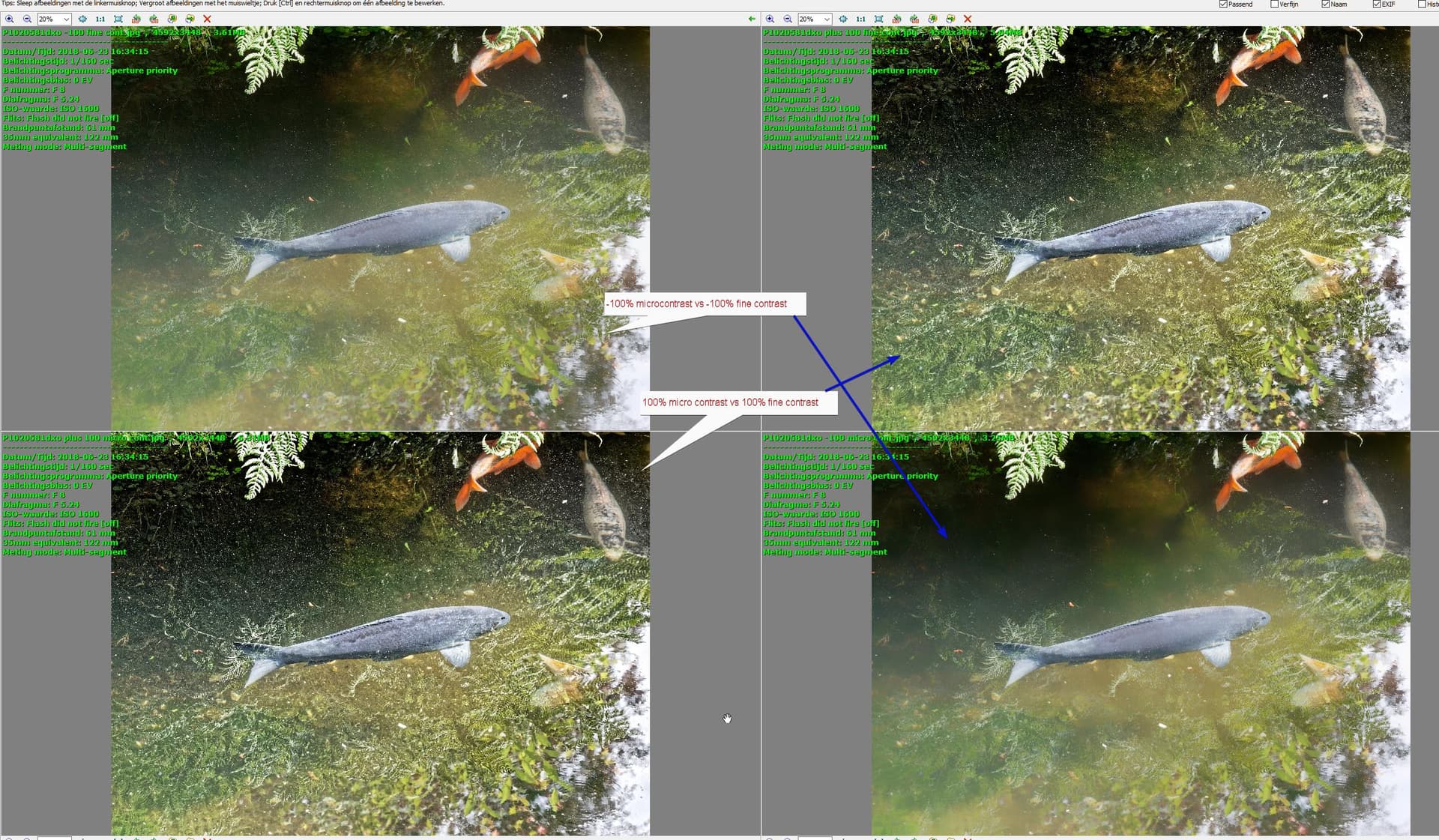
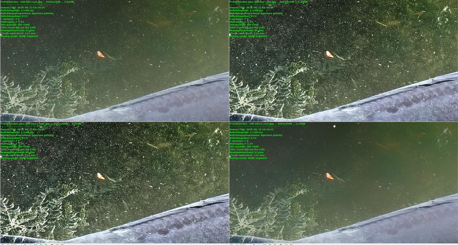
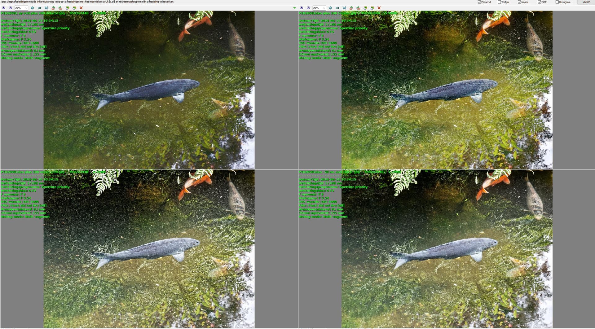
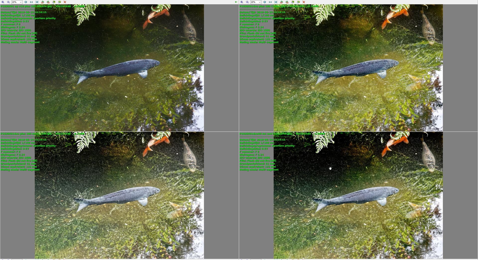
What i tried to find is how is clearview and dehaze build if i try to mimic it with fine and micro contrast.
-28 microcontrast and 100% fine contrast nope not near enough.
add some tone curve “blacklevel” mimic to it.
getting close but not close enough to clearview.
more tonecurve dragging down in the bottom part:
point is i need local adjustment to get closer towards clearview and Dehaze smarty pants algorithm.
Sorry @mikemyers for this longwinded post. i tried to show you how you can play with test images in order to find the right purpose and gain knowledge of weak points and strongpoints of each “contrastslider”
Silkypis uses words of Clarity and Dehaze wile DxO is more “technical” in there choice of words.
Clearview is like having a polaroid on your noze with a special filter which add sharpnes to it. a very expensive sunglasses.
I now think I know what you’re doing, just need to understand the “why”.
More, later tonight, after I read through this several times.
Certainly another interesting interpretation.
Your version almost looks like a line drawing. Almost.
I will struggle to understand this.
I think I would be happier if there was just one control labeled “contrast”.
I suppose until I learn these things, I can ignore all of them except for “contrast”.
Messing around with tools I don’t understand will lead to negative results.
Better to not use anything until I properly understand it, and why and when I might want to use it.
My next image will leave out all the tools that I don’t properly understand.
Thanks though - it’s obvious that most of the tools don’t do what I thought they would do.
My problem, not PhotoLab’s problem.
It’s like messing around with the settings for aperture, shutter, and ISO, without having any understanding of how they work and how they work together.
No need to be sorry, but it’s going to take me a lot of time to digest all this. I don’t have or use Silkypix, and the last thing I need now is yet additional software to further complicate my life.
My immediate plan is to stop using any of these additional features until when/if I think I understand them. Better to not use them at all, than to use them incorrectly.