Off-Topic - advice, experiences and examples, for images that will be processed in PhotoLab

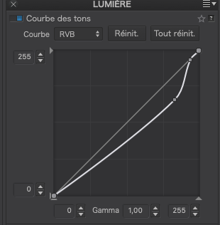
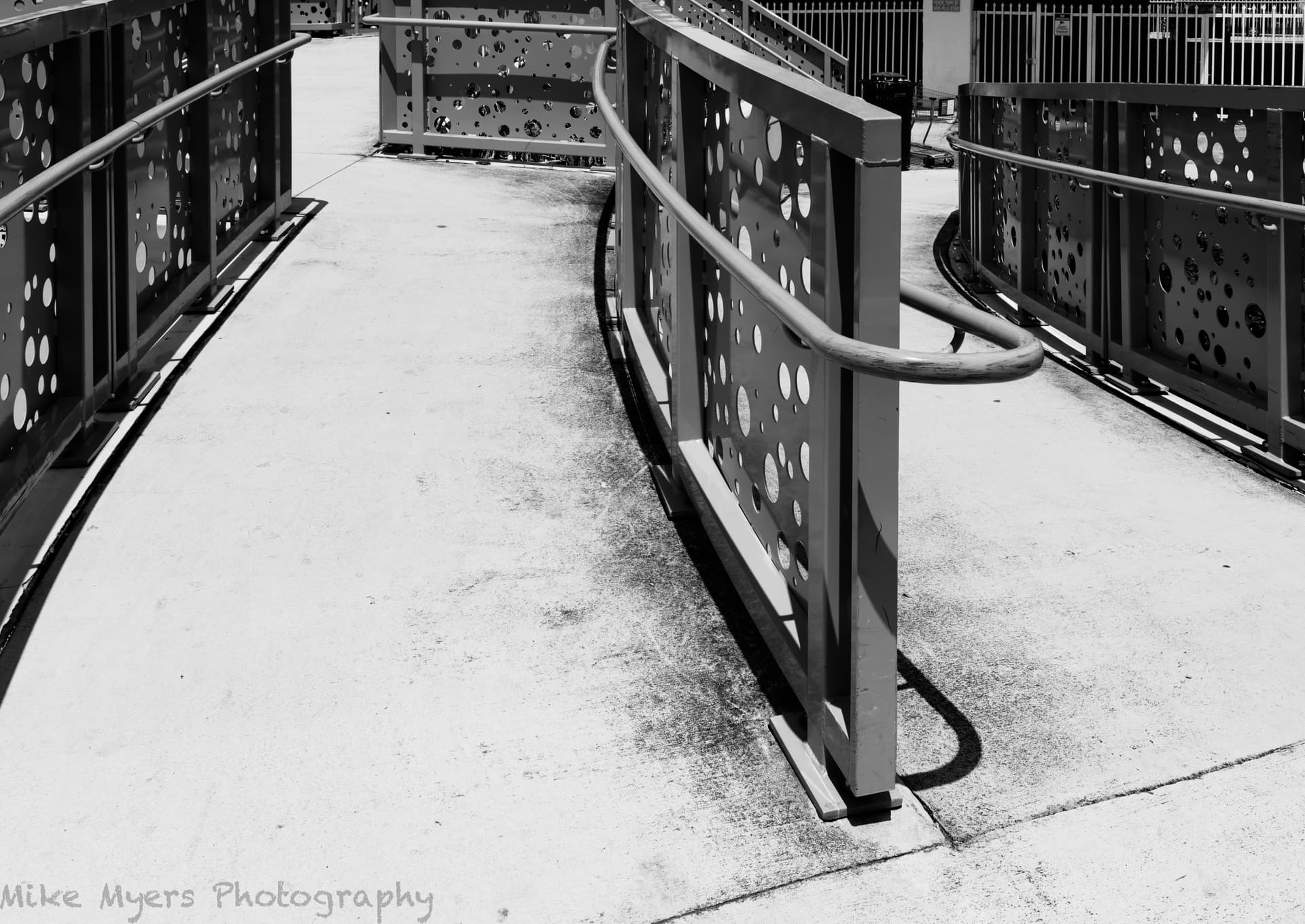
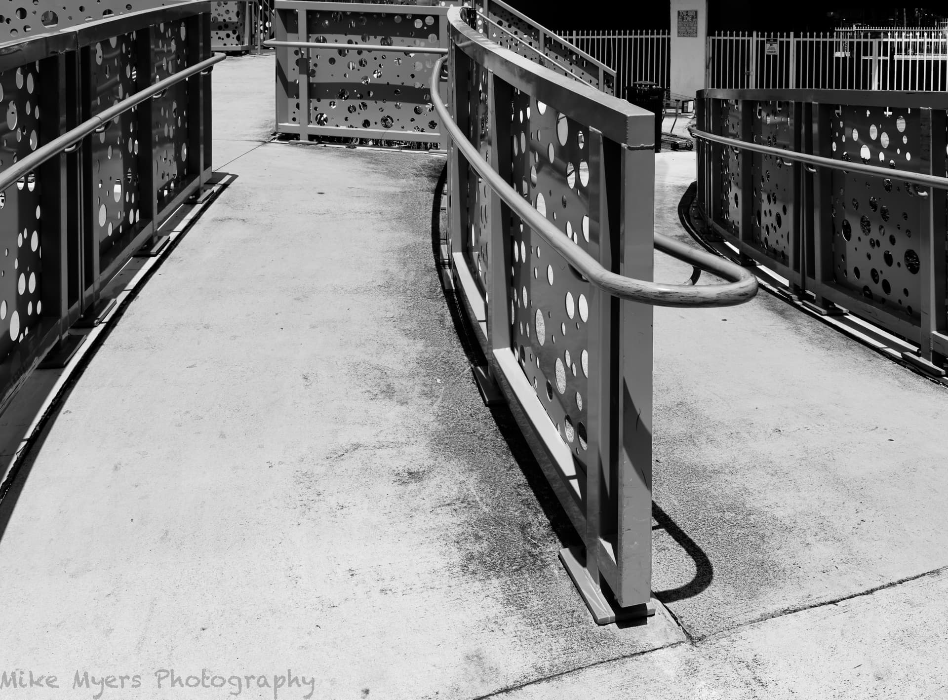
Two conflicting thoughts… As the artist, creating a graphic representation, you noted the it is good to reduce distractions, which I take to mean it is strengthening what is left of the image (without color).

…but, there is a flip side to this, seeing the image from the point of view of the viewer. As @JoJu pointed out, some of these “distractions” he enjoyed seeing, and simplifying the image by removing them took away something he wanted to see (at least that’s what I think he meant). I’m guilty of this too - since @Joanna’s (and your) photos are often so full of detail, I find it enjoyable to view them at 100% and wander around the image looking around for things I didn’t notice at first.)

Also, were you to hand me two photos of something, one in color and the other black & white, I would most likely ignore the B&W version and enjoy searching all over the color image. I might also enjoy the B&W image, but I would far rather see, enjoy, explore, and look around in the color version.

Way, way off topic – I broiled a steak two nights ago, with a little salt, pepper, Worchestire sauce, and a bar-b-que seasoning. Without the seasonings, I’d not have enjoyed dinner so much. I’ll be making coffee in half an hour or so, with cream and sugar. Leave out the cream and sugar, and I may drink it anyway, but I won’t enjoy it so much.

I think it is more of a challenge to create a good B&W image and still satisfy the viewer. I’m speculating that because it’s more of a challenge, you and Joanna enjoy doing it well despite the lack of color. Color tells the viewer more about an image, in so many ways. It’s like seasoning - too much of it, or used incorrectly, it degrades the end result. But used properly, and it makes the meal so much better.

(On the other hand, I’ve got to add that if I leave out color, other things become even more important, such as contrast, and shapes, and brightness. I think it’s more of a challenge to the photographer, if one still wants to get the viewer “involved in/with” the photo. …and since I’m not anywhere even close to the ability to do this, as you, it’s left for me to decide if the lack of color is a hindrance or a benefit… …for lots of reasons, Leica’s “Monochrom” cameras are selling out whenever they start to become available. The more I read about them, the more I want to buy one. …but I don’t think I have the skills, and the eyes, an the “imagionation” to be able to make proper use of them - yet. I’ve read what they can do, and how, and why, but I think converting my color images to B&W is good enough for me, and saves me $10,000.)

https://www.dpreview.com/articles/2062427975/why-leica-s-m10-monochrom-is-more-than-just-a-gimmick

Where can I find the “enclosed dop-file”?
I’ve got lots of time this weekend to experiment.

Agreed. This is not a particularly pleasing composition, either in colour or B&W. Nonetheless, I will use it to demonstrate something.

I guess the question should be, does colour really add anything to the image? In the case of this last image, I would deign to say not really. Essentially you have a black, white and blue image, but everyone knows that skies are blue, so any interest there is minimal.

You also need to consider tonal separation. At the moment, the crane is fairly much the same tonality as the building and, thus, gets lost in the jumble of lines. By working carefully with the Tone Curve…

Capture d’écran 2023-04-29 à 15.46.19

… I was able to separate out the crane, which is considerably brighter than the building…

… thus giving a more 3D appearance.

With colour photography, things can be a lot easier because you rely on colours to distinguish between elements. With B&W, you have to realise that different colours can exhibit the same tonality when converted to greyscale…

Colour…

B&W - no filter…

B&W - orange filter…

B&W - violet filter


And, why bother with expensive B&W cameras when you can have one camera that does both? That is, unless you believe the Leica Unicorn Dust blurb.

Yikes! Where did this come from??? Now that you’ve posted it, it’s obvious - but I never even dreamed of the ability to do something like this - I would have thought it impossible. But you proved otherwise. Very nice to know, for the future. In my crude B&W image, the crane and the building appeared the same, but with your adjusted tone curve, you brought out something that while not “invisible”, I certainly never considered. Thank you for the post. Maybe you should create a whole new thread about this capability, unless everyone else (excluding me) already knows it.

780_0614 | 2023-04-27.nef.dop (33,9 Ko)

Sorry, while that is exactly what I used to think, the more I read about it, the more I wanted to buy one, which isn’t going to happen. I can post a link to a long, complicated article explaining the benefits, or better yet, just post this video which covers the most important reasons. By the way, based on what you’ve consistently written about in these forums, a Monochrom camera would probably benefit you more than anyone else - but at a very high cost.

https://www.youtube.com/watch?v=UU5gSo5hTJo

I’ve deliberated set some of my cameras to create B&W results, and I’ve found it useful to change the viewfinder to show the world in B&W, but the real benefits of monochrome will never be reachable unless I get one of my cameras converted, or better yet, buy a used Monochrom.

Gee, it wasn’t until I downloaded your .dop and opened it in PhotoLab, that it hit me - what you did was to subtly darken everything in the tone curve, except the part of the curve that represented the crane - so the crane stayed the same, but everything else got darker!!!

Until just now, I realized the result of what you did, but now everything is obvious. Very sneaky!!! …and now it seems so very simple.

I’m curious - I have the image open in PL right now, with your tone curve. Is there a way that I can hover my mouse over something in particular in the image, and view where that brightness is located on the tone curve? The values at each spot on the image will have a number between 0 and 255. Did you make this change using “trial and error”, or do you know of a way to select the brightness value at any specific spot on the image? The way you did it is perfect, but it might be helpful to know how to do this in an image where it isn’t so easy???

Take a look at the B&W images on our website most of them taken with a 5" x 4" LF camera, with a ground glass screen that shows the image in colour.

You don’t need an expensive B&W camera to take better B&W images, you need to learn and practice how to see in B&W. You’ll have to come on over for a workshop.

Unfortunately, PL doesn’t show the luminosity under the mouse on the tone curve, but it does show the RGB values right next to the histogram

The best (only) way I know of to start doing this (again) is to set my M10 to B&W mode (which does not change the raw image, only the ‘jpg’) and to use my Visoflex device on top of the camera, which lets me “see” in B&W. Or, I could use my D780 in “live view” mode. Or, I just shoot normally, convert to B&W in PhotoLab, and I’ll eventually get to learn how to deal with this. Or, come take your course. I’ll think about this some more, later today. There are likely YouTube videos that would help me improve at this. Do you ever “teach” using Zoom?

To repeat myself, you don’t need a B&W viewfinder or screen to shoot in B&W. As I said, the viewing screen on an LF camera is in colour.

Stop looking for technology. We sometimes use something like this to choose the framing for an image and Helen sometimes uses a deep red filter in front of her eye to help get rid of colours.

You can’t learn “seeing” images over a video link. It involves going out and looking for subjects to photograph.

Only one quick question. Regardless of the answer, I will do exactly what you just suggested, and assume that you (obviously) see something I don’t (yet).

My question is do you decide if an image would be good for B&W before, or after, you capture the image - and if so, what (if anything) you might do differently?

Also - I haven’t read this link fully yet, as maybe I’m better off learning it on my own. But, since I usually read up on things before doing them, is this a worthwhile link to start out with?
https://www.pixpa.com/blog/black-and-white-photography
My gut feeling is to not read anything like this, to not change my camera to show a B&W image in the viewfinder, and to try to learn by experience - as in, would this image look better in B&W or color, before or after capturing the image? If I need to use a filter, I’ll do that in PhotoLab.

(Last time I tried this, I used the M10 with the Visoflex, and set the camera to B&W mode, which changed a lot of things for viewing, but the raw image was still a normal raw image. The ‘jpg’ was B&W, and when I ingested the images into my computer using Photo Mechanic, they all showed up as B&W - but were back to normal when I opened the files in PhotoLab.)

Both, but mainly the latter. However, since I always shoot in colour it doesn’t matter because that gives me the option to switch to B&W if I think it is appropriate.

I feel compelled to again quote what @Joanna said in another topic

It seems to me that you are looking for an off the shelf solution to the question, “How do I take a good photo?” I don’t think such a thing exists. Taking a good photo is a skill that requires good judgement of composition and exposure. You only get skilled at something by doing lots of practise. Or in the words of a well known aphorism:
“Good judgment comes from experience; experience comes from bad judgment.”

1 Like

It was published together with the B&W pic in question.

I accept that, but I don’t know if I’m really able to do so. I don’t seem to have any choice, as the D780 (and M10) are both going to give me color files regardless of what I want. But when I went out to buy dinner, I was very specifically looking for scenes that I hoped would look good in B&W. I only found one, and shot it from several angles, but only one of them looked good to me - but I learned that lesson long ago, and captured more than what I wanted, so I would be free to crop it later. Since my camera/lens doesn’t have perspective control, I left enough room so I could do that in PL as well.

I eventually did get what I wanted, and the various shapes only came together the way I originally wanted in one photo.

Trying to think in B&W, I boosted the contrast more than I planned, to make it more obvious. I suspect that @Wolfgang will boost the contrast to double what I did, but for better or worse, this image is what I set out to do.

780_0631 | 2023-04-29.nef (30.8 MB)
780_0631 | 2023-04-29.nef.dop (14.0 KB)

Very close - change “take” to “edit” and you’ll be spot-on! As in, what things to consider doing first, which will make the subsequent changes more appropriate. :slight_smile: Yeah, impossible, and unobtainable.

Found it. Last time I tried, I missed it.
Sorry.
So, in addition to everything else, I need new eyes? :slight_smile:

(I wanted to find it, so I could study exactly what you did, just like I do with @Joanna.)

Huh?? Why do you think that? It’s trivial to convert to B&W.

I must be missing something here…

I didn’t mean to say that converting to B&W was or wasn’t trivial. What I meant is regardless of anything I do on my D780 or my M10, the camera is going to create a full-color RAW file.

Everything else comes afterwards.

Most of the time, I will do some other editing first, but then select “Color Rendering”, and then “Black & White Film”. I then look over my choices, but somehow I usually select “Fuji Neon Acres 100”, as that seems to match what I’m after - lots of other choices, but I always come back to this one film. Maybe that’s because I seemed to always select Kodak Plus-X when I was shooting film a lifetime ago. From then on, I try to make the image on my screen match the image that is in my mind. I try lots of things for testing, but I already have an idea of what I like. I wouldn’t call it “trivial” by any means. Still, the Fuji film has an uncanny way of creating what I’m already imagining - and I sure can’t say that for the other films I’ve tried. That @Joanna like it is also a huge plus for me.

I don’t think you’re missing something, but more likely I am. Maybe you can please edit the above image the way you do things, and can I please look over your .dop file?

Back to the image, I thought about making the concrete a little darker, but I like it the way it is. This is what struck me like a lightning bolt, as I was walking up to this area - I stopped, thought about it, moved around a little, and got an image that included what I wanted in my final image, knowing that as I corrected for distortion the way I did, a lot of my image would be lost. I might crop away the whole left side, and part of the right side, keeping the middle part which was the most interesting thing, but I decided not to…

I was curious what tools might be available to help me edit the image once I’m working with it in B&W. I found this page, with a lot of ideas, some of which I think will be very useful:

https://www.youtube.com/watch?v=So3ixy-UODU

Too sleepy to try any of this tonight, but will give it a go tomorrow.
I think to do this, I need to go back to the original image, and start all over again.
In the meantime, I think this version is better than what I posted earlier. Watching that video gave me some other ideas… It may be uglier, but it’s closer to what was really there, dirt and all.
780_0631 | 2023-04-29.nef.dop (624.3 KB)

Thank you for posting that. I read it earlier, but it didn’t strike home until just now. I may never “catch up” with the rest of you, but hopefully I’m (slowly) improving.

I took several photos earlier today, most of which were “easy”. This one intrigued me the most, or maybe I should say challenged me the most. Maybe I’ll go back there on a rainy day, so I’ve got reflections in the image.

First question. Why did you use Tone Curve, Smart Lighting, Selective Tone and Contrast, all to do the same thing - increase contrast? What was wrong with just the Tone Curve?

780_0631 | 2023-04-29.nef.dop (1,2 Mo)