Thanks for the helpful response.
Yes, that is why I wrote
HSL is not really meant for B&W, but it can be used instead of other tools like e.g. renderings or FP presets.
Proper B&W conversion is not simply achieved by desaturating all colours, but the sensitivities of B&W in respect to colour ranges and filtering can be approximated with the HSL tool.
You are probably correct. Too subjective.
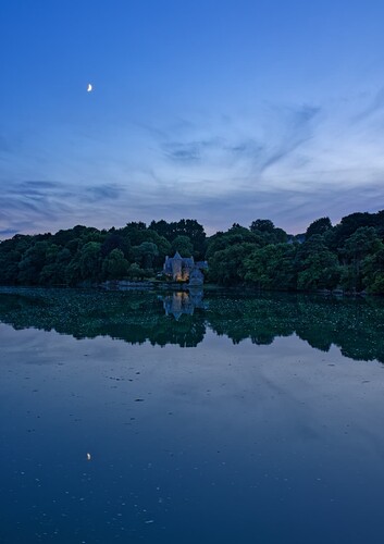
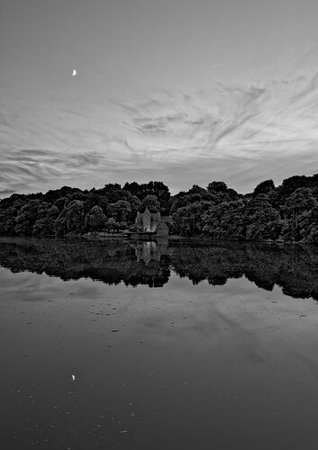
A little example of why I love using FilmPack. Same image -
In colour…
In B&W…
Just printed the B&W to A2 size
And, no, the B&W is far from a straight desaturation
Ive have suite bought from v1.2 and ive investigated the then free given essential version against elite suite. Essential was nice for it’s lensmodule but frustrating in denosing and contrast/tone control. (i was used to Silkypix’s Panasonic labeled developer which was great in color and toning.)
The presets who named the Filmpack are fun but i almost never use them.
Yes for searching for a certain look or taste which i didn’t know i liked it until i see the preset. I used NIK’s monochrome/b&w mostly for my b&w output.
The extra tools you get i use every image.
But does it change my perspective of making a image?
Nope…![]()
I do not think enough in front of a certain scene benefits of a FP preset.
I just try to take a image as good as it can be done in the circumstances.
And see afterwards how to deal with imperfections.
Nikcollection, well if you are very used to use it? Then pureraw and nikcollection could be also a option. ( i am not, i just dip my big toe in that collection.)
Ive you can affort it buy the suite elite version. The future update of PL7 to v8 will take over the earlier bought FP and VP so that’s nice.
‘software aquisition syndrome’ - yep, I got that too ![]()

