Well, I like also how #8 and #9 play together, but that’s for another topic.
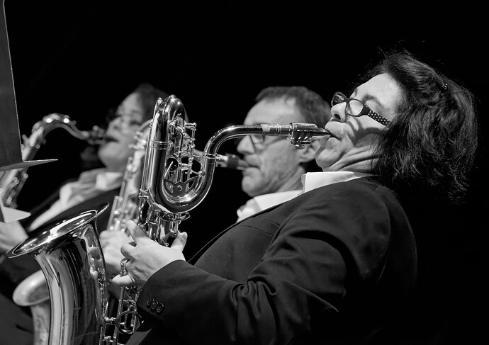
So difficult to get the framing, DoF and separation when standing at the end of a line of musicians…
AF-S-Nikkor-300mm-F4E-PF-ED-VR
and
#5 → AF-S Nikkor 70-200mm f/4G ED VR
#7 → AF-S-Nikkor-20mm-f1.8G-ED
Thanks for info.
I had an older version, AF-S 300/4 ED, which ended up being used mostly for headshots, rather than wildlife, the intention it was bought for ![]() . It was also OK for semi-macro but unfortunately it pumped a lot of dust. The PF version was said to have “worse” bokeh (didn’t check), but it didn’t matter in your case.
. It was also OK for semi-macro but unfortunately it pumped a lot of dust. The PF version was said to have “worse” bokeh (didn’t check), but it didn’t matter in your case.
Interesting that you would prefer a smaller aperture.
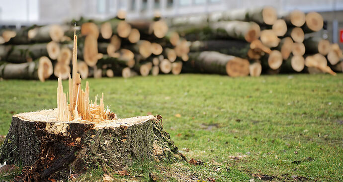
I kinda like the focus on the shards as an artistic thought. Sort of a miniature city of skyscrapers in wood, with the timber tones as a backdrop. I would have guessed that was your intent.
If the intent was to get both the stump and timber in balance than perhaps the camera was too close to the stump to show proper scale. And a smaller aperture.
All depends on your intent…
nice examples!!!
The intent was the trees in the background out of focus. But I think it’s to much. If I look at the image it hurts my eyes, like I have wrong glasses.
George
Agree that hurts my eyes too, but concluded the background tress were too “in focus” instead.
My eyes attempted to judge distance between the stump and trees from the focus fall off across the grass. But the background trees appeared “too focused” or too “near” relative to this continuous transition. Also near enough for my eyes to attempt to adjust focus - hence hurt.
A simple CL to blur the background seems to help my eyes. However, the blur from the blur tool is artificial, not natural DoF focus blur so a different dissonance.
Of course, my eyes are accustomed to looking at the DoF focus fade from longer telephoto lenses, not a 70mm. This may affect my perspective.
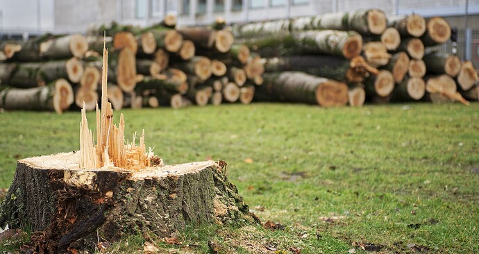
Used your puplished pic and lowered the background brightness locally (tree trunks, building) to keep your intention. → see VC1 gw_20181206-007.jpg.dop (44,8 KB)
context still present, but not distracting with the same color & brightness level
I mentioned this difference in a previous post and, yes it is quite disturbing to see Gaussian blur when you are expecting Bokeh.
If I’m really forced to use it, I will sometimes add two or three CLs, progressing away from the sharp area, with increasing amounts of blur, which better mimics the progressive Bokeh that gets “blurrier” with distance.
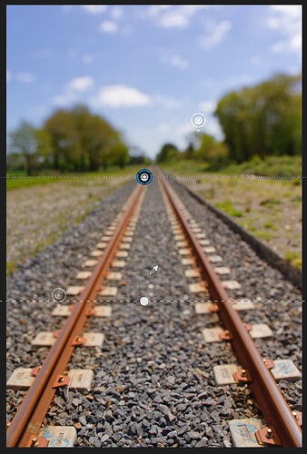
Single CL (0 selectivity) with blur at 87…
Three CLs (0 selectivity) with various blur intensities…
Attempt to show approximate positions of the three CLs…
I think it’s a great traditional way to focus attention on a subject of interest - near or far, the only way to do it in the good old days, when photography was a matter of getting most of the variables right in the camera.
To separate the main subject in B&W drawings, the contrast (local and more global) is mainly used. There might be some slight background blurring, but contrast is still the main “tool” for that purpose, as far as I understand it. Just like lenses do it, but only to some extent. I don’t have art academy background, these are just my 2 cents coming from observations.
Thanks for the suggestion.
I did this to see how my eyes adjusted since there were different views on how to correct the scene so our eyes hurt less. I rarely use the blur tool because it doesn’t look "natural to me, but maybe I can be more open.


