I sustain this view point !
Like Egregius, I use with circumspection Clearview under 20 ; here a very rare use case (1/10000) for rich I had a setting to 50 ; this picture was taken 80 km away, through the window of the plane, at 45° with many reflections.
Without Clearview, it was unusable…
in spite of the heavy treatment, it is a picture, not an illustration !
I could say the same about excessive reinforcement of contrast and saturation, even by great photographers ; I don’t like…
Hi found some more 
really dusty sensor
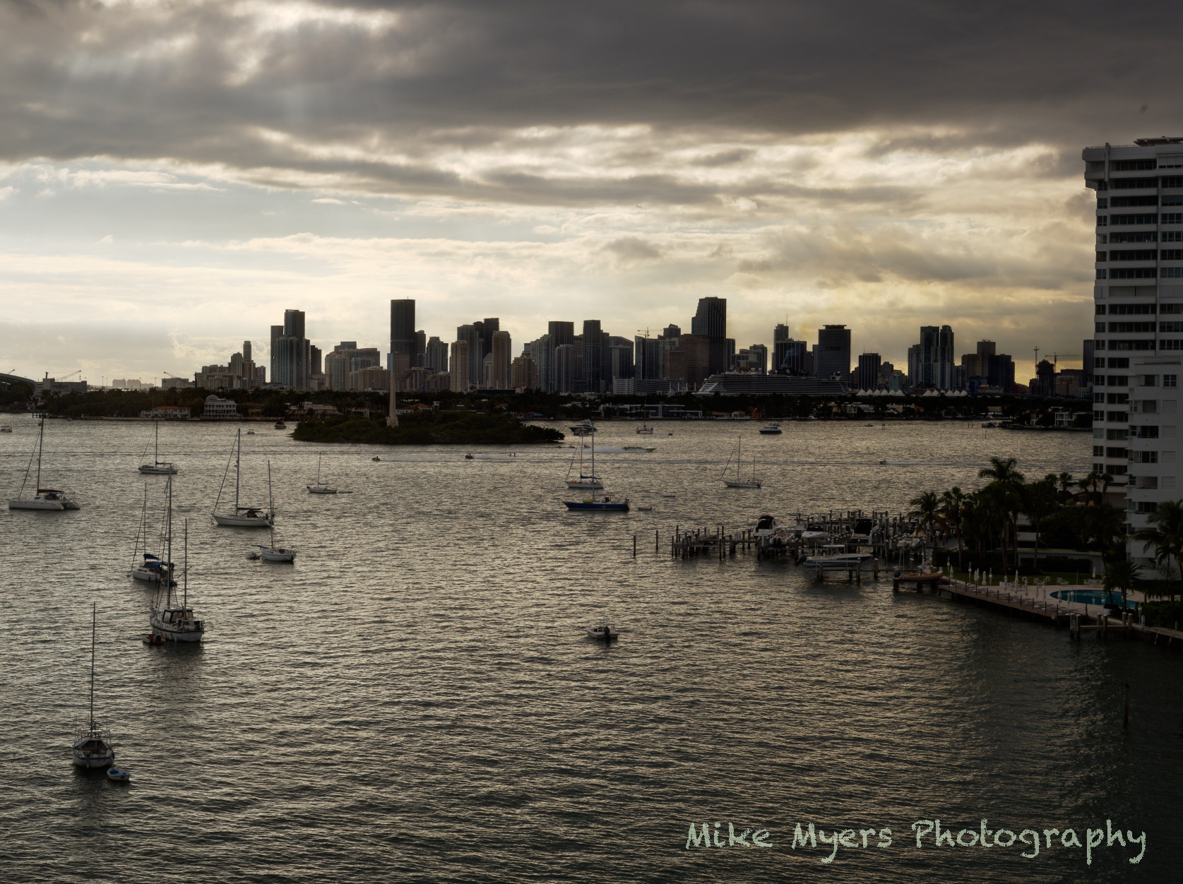
The “after” photo done by Joanna reminds me the most of what the clouds looked like. Thank you - just use local adjustments, and NEGATIVE clearview.
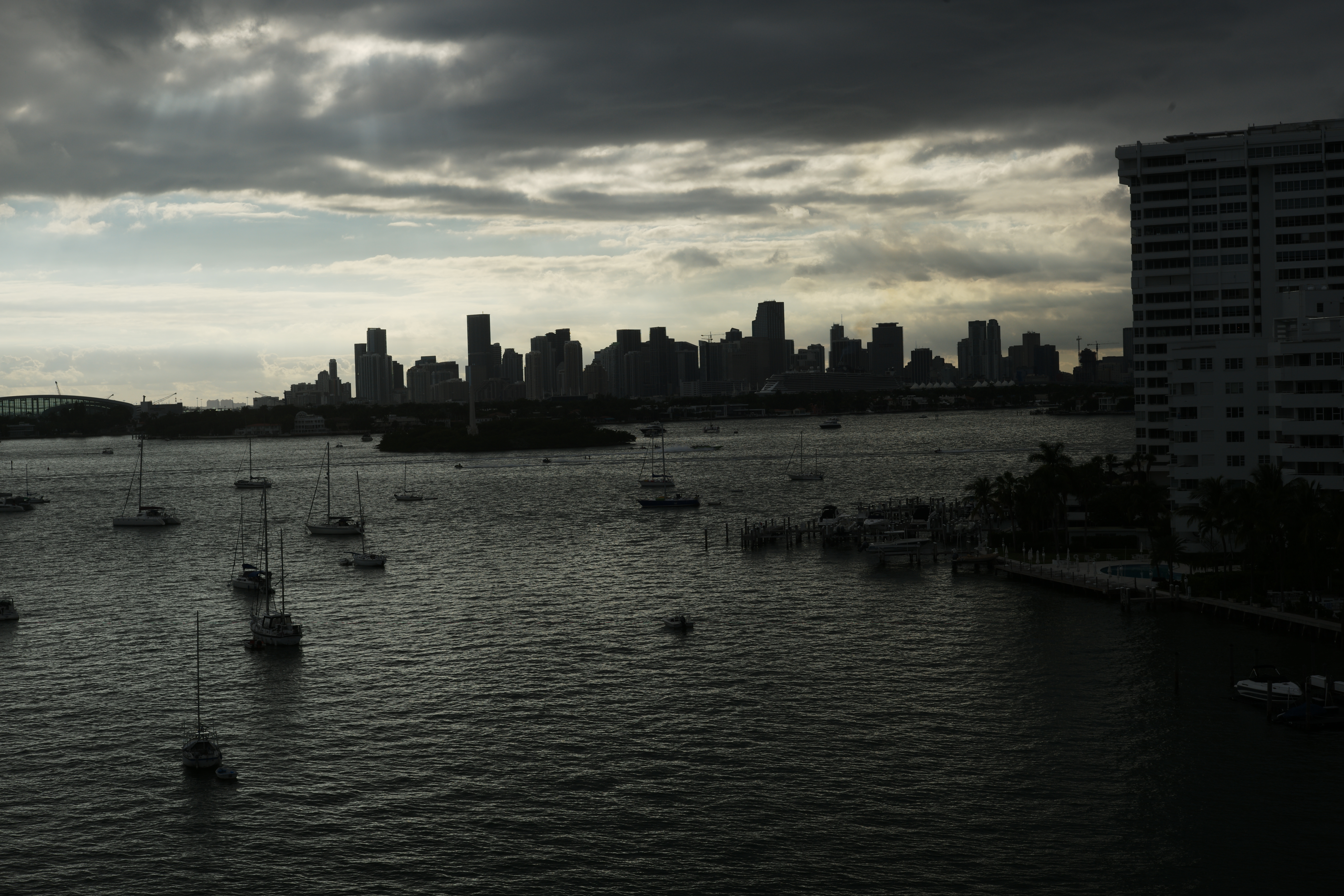
Man, as a pretty photograph, I enjoy what you did, but it doesn’t look “real”. The lower part is plausible, but the clouds are “too much”, and the sky at the left, just above the water, looks like there was a rainstorm or something going on.
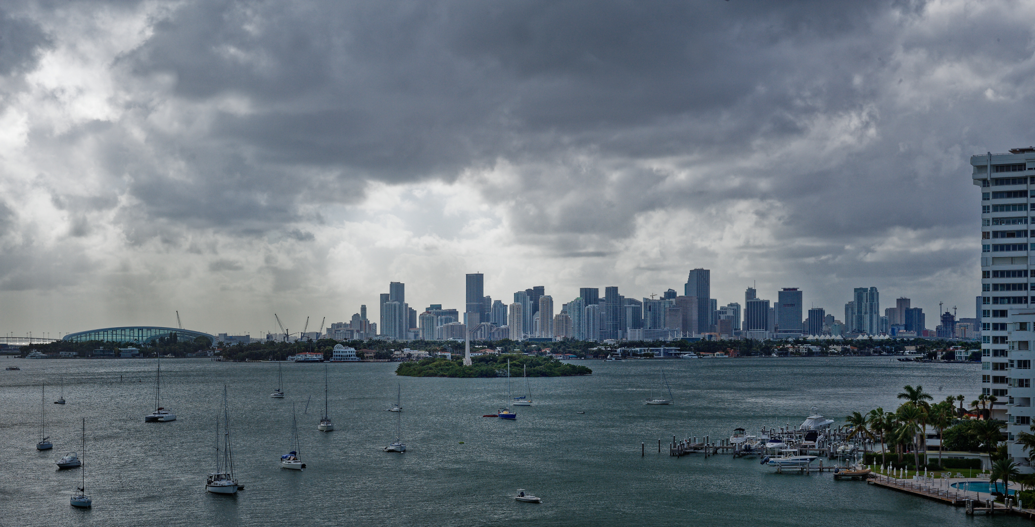
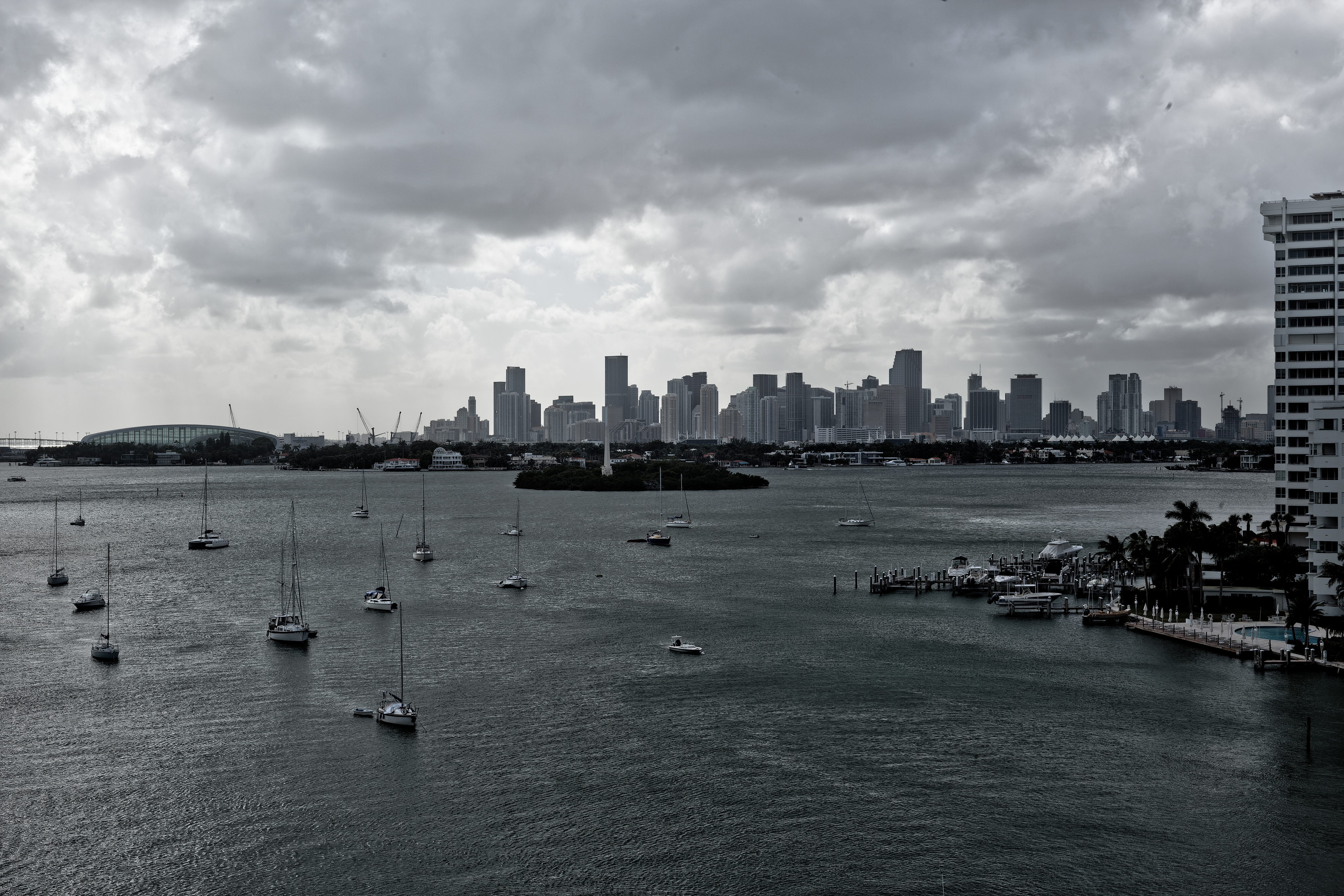
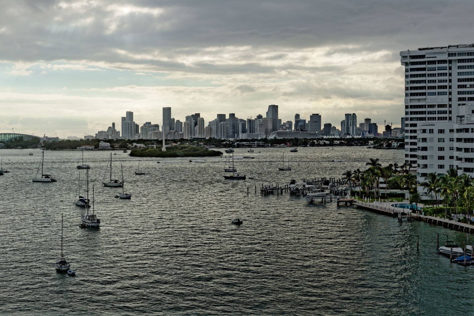
It’s a sort of cloudy day outside. I will take a new photo, shooting both ‘raw’ and ‘jpg’. I will post the ‘jpg’ here with no editing other than the lens/camera corrections, and I’ll upload the dog file to the cloud so anyone can play with it.
This thread has taught me a lot, mostly what not to do. It seems to me that as soon as anything is done, it no longer looks “real” to me. Let’s see how this works out. I’ll use a 50mm lens, not the 90, and try f/11 and ISO 200 as if I was using Panatomic X.
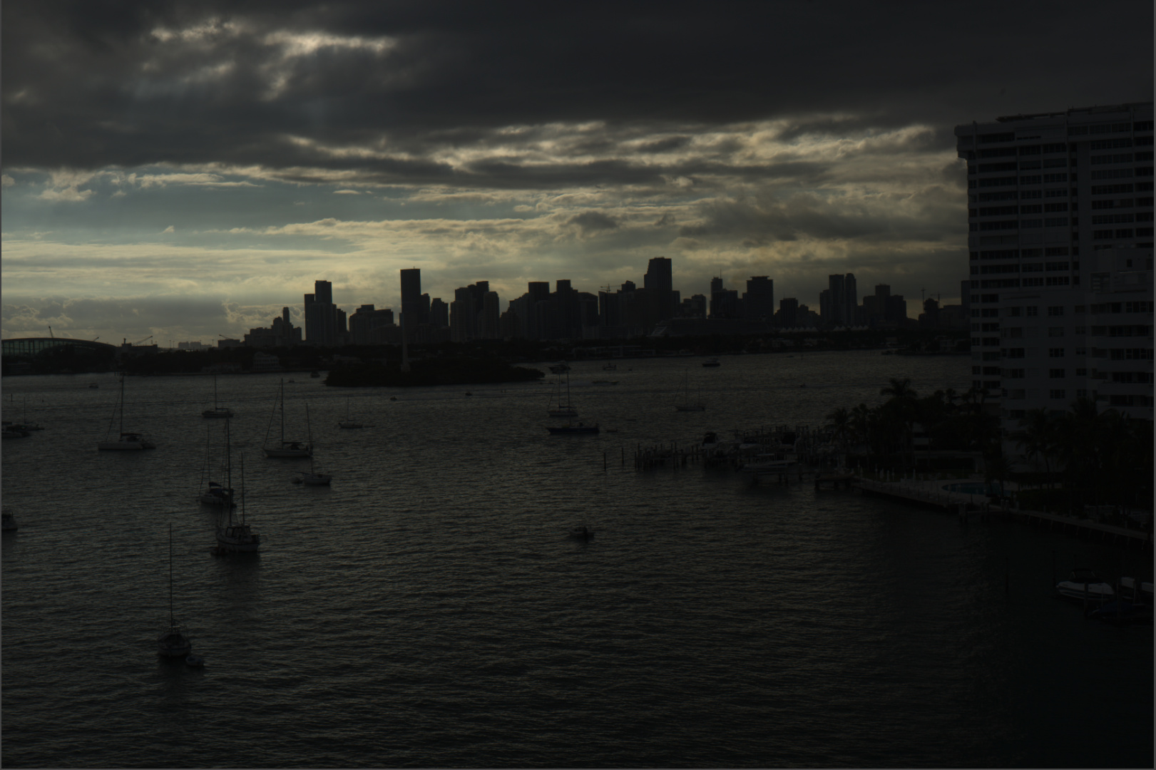
Here’s the ‘jpg’ image, straight from the camera, ingested onto my hard drive using PhotoMechanicPlus. Presumably this is what the camera “saw” before anything was done to adjust it. ISO 200, f/11, shutter speed using (A)perture Priority. I didn’t want to lose any detail in the clouds, so the water looks slightly underexposed. If I fix the water, I lose the clouds. People here say expose to the right - if this was not a good choice, let me know, and I will re-take the photo.
In the meantime, I will upload the ‘dog’ image to my server.
DNG image can be found here:
just out of interest did you do things with manual WB? to catch colortemps of the light?
it’s a interesting quest, reflection on the seawater, head on light, buildings far enough to have haze, f11 so even for m43 close to diffraction cliff, some would say over the cliff as in eveything beyond f9 is diffraction area but hence f16 is still nice to watch so…
and if you bracket 1/3-1 steps ev would that be a guide for how you can lift shadow to a natural look?
i main then you should have hightone (clouds) mid tone (sea in forground) low tone(skyline) rawfiles which shows the “exact” tonal view of that area.
White balance was set to 5000K. Now that I look in the book, I should have gone in the other direction for a cloudy day, 6000K or 6500K.
No bracketing.
No tripod.
Shutter speed was good, so I held the camera steady to make sure everything I wanted was inside the picture frame.
This was intended to be a learning curve for me in how to process an image. I already messed up with the white balance. It wasn’t an especially great scene - I just walked onto my balcony and shot. The only thing else I did was wait for the tour boat to be in a nice location.
I think that a high contrast scene like this can profit from a series of bracketed shots. You can then see which shot is best for both highlight and shadow recovery. As far as I see on my Canon cameras, the brightest spot that should have a structure needs to be at less than +2EV. When I set compensation to +2 and spot-measure the highlights, I usually get a good shot. Alternatively, I use UniWB if I must.
Alternatively, you can always decide whether you want an interpretation or a realistic representation. The latter can be hard to produce. Better make a difficult shot go wild than try to make it boring? ![]()
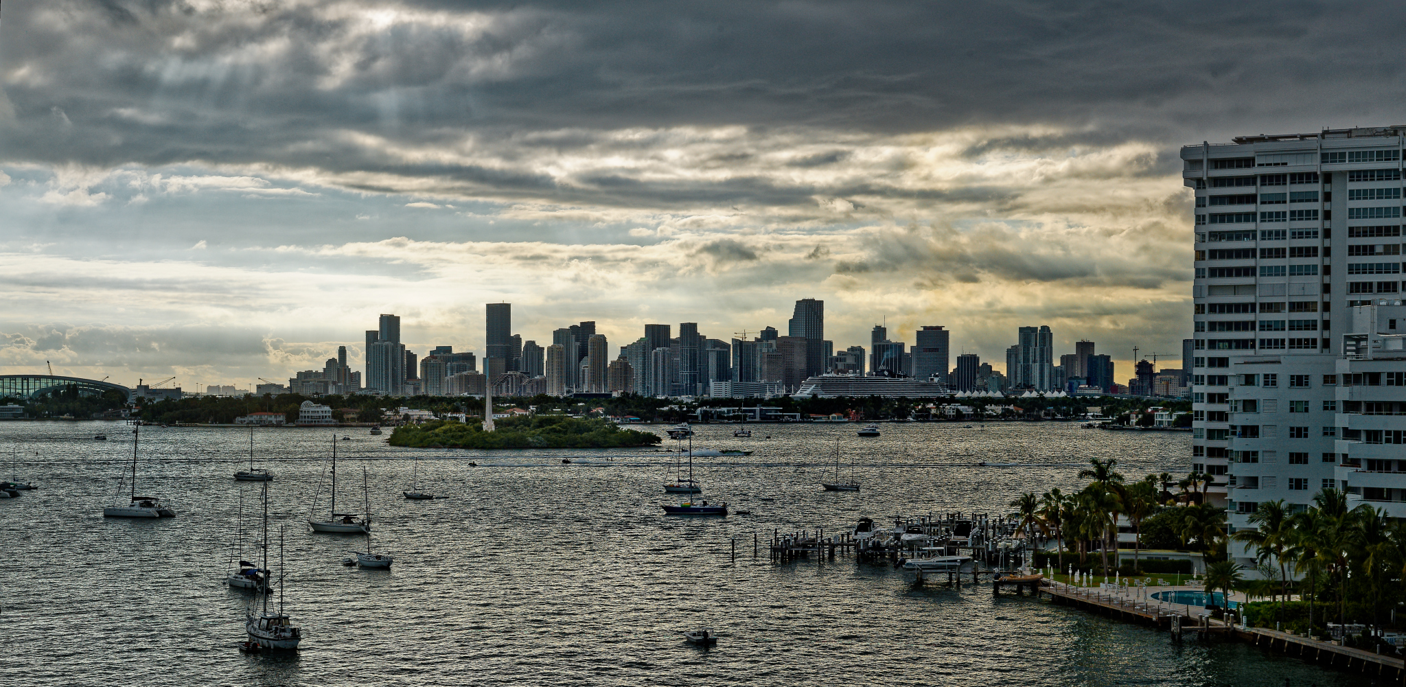
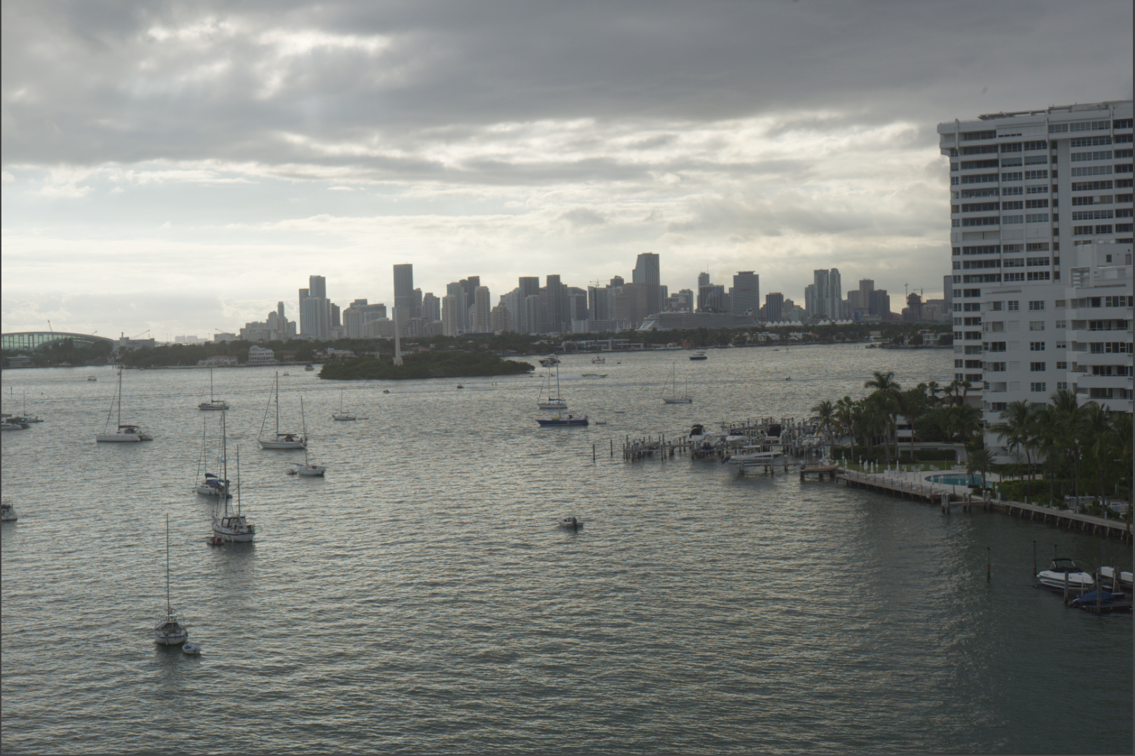
This is what I came up with. I know the building at the right is white, so I used that for white balance. The blue in the sky was only at the left - I didn’t play with that. I like to see detail in the buildings, so I used Clearview with the brush only over the buildings and the cruise ship.
‘platypus’ - my goal, even if it’s boring, is to show what I saw/felt when I held up the camera to my eye. In the ‘jpg’ image, the buildings and water look much darker than what I saw with my eyes. The buildings are a little sharper than what I saw. The small boats, and the tourist boat, look like what I can see, although once the sun drops out from behind the clouds, the top of the image gets VERY bright, and the rest of the image looks VERY dark, much more so than what it was like when I got the ‘jpg’ image.
Next time I will be more careful with the white balance. I’ll need to remember that with cloudy days, I make the WB setting higher, not lower.
I’m curious how others will interpret this image.
Okay, here’s the conflict:
- you saw something
- you felt something
- your camera saw something
Sometimes, the three things match, sometimes they don’t.
If not, it means that a decision must be taken:
- What is important? What I see or what I feel?
- Can I make my (see/feel) from what my camera saw?
- What if not?
*** reshoot and retry?
*** scrap and forget?
*** go wild?
Your shot is a good food for a learning loop (seems to turn in circles, but is not)
Well, the actual scenario was for me to pick up the camera with the normal lens on it, set it to 200 ISO, set the lens to f/11 (if I do this again, I’ll use f/8), set focus to infinity, and look up. I had set up the camera to take both a JPG and a DNG. I forgot to check the WB - I thought it was still on 5500 for sunlight. As I looked through the viewfinder, I notice the shutter speed, which I thought was fine, 1/500 sec. I noticed three things, the sky, the buildings, and the water. I didn’t want to be any more “serious” - if I had, I’d have used the tripod and made sure the camera was level (which it wasn’t). My eye was on the tour boat going across the scene from left to right.
For whatever reason, PL4 thinks the aperture was f/6.8 which it wasn’t.
What did I see/feel? I noticed the sky, partially blue, going behind the buildings. The water just looked like water. My “composition” was to make sure everything I wanted in the photo was captured. This went very quickly.
The end result as in the JPG image was NOT what I wanted, but I was sure that the image did capture what I was after. All I really did in editing was to level the image, crop so only what I wanted was still in the photo, lighten up the full image, and then the water. The buildings didn’t show the detail my eye had noticed, so Clearview fixed that, while I was trying to to use any more than necessary. The final thing was the white balance. I enhanced the sky, but so little I couldn’t tell the difference.
An attempt at your raw file (DNG) – two variants created using DxO Photolab 4:
Highlighting the far buildings (sujffix _1) using control points:

DOP file (only one found)
11-19-2020-Test photos Biscayne bay_L1001166.dng.dop (39.9 KB)
Using an external editor, PWP8:
Image _1 which highlights far buildings, further processed
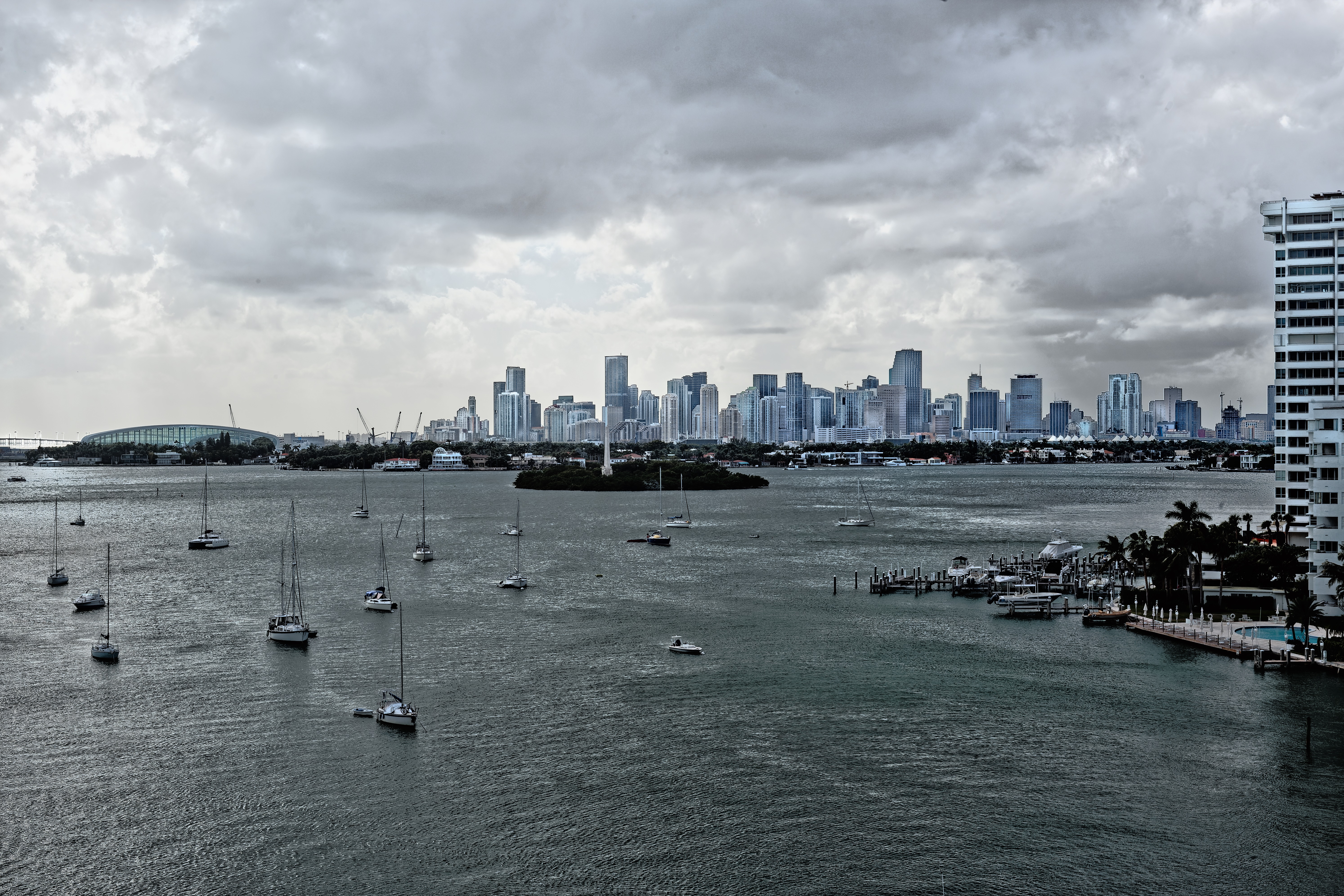
Image without highlighted buildings, with PWP8 using multi-color balance

Further frocessing of the Photolab result using Nik Collection color Efex Pro 4:
Further frocessing of the Photolab result using Nik Collection HDR Efex Pro 2:
Pierre 5018, the top image looks nice from the horizon down, but the sky looks too implausible to me.
The next one down still has a sky that bothers me, and the buildings don’t look “real”.
The third from the top has nine looking water, but I don’t like the sky or the buildings - neither looks “real”.
The bottom image looks great! The sky doesn’t stand out, the buildings look natural, the water looks wonderful, and overall, I like the photo. Personally, of all the photos anyone has created from this image, that last image is best. The sky is subdued, the buildings look just like what I see every day, and while I can see that you did “something” to the water, it just works. I think the warm tone from the image improves it. The warmth gives it more “life”.
I just took a look in full screen mode - I can even see the differences in the colors of the buildings!
I need to re-do the image I just posted that was taken today, so the buildings show up as nicely as you made them do so.
1 Like
Actually, this is not what the camera “saw”. It is a version of the RAW image that has been processed by the camera to fit into a (limited) jpeg file
By exposing to the right you are going to get the best possible balance between highlights and shadows. See what @platypus says here
This is a classic method of getting the best out of your sensor - in manual mode, set the exposure compensation on the camera to +2 and spot meter the brightest part of the scene. This will then guarantee that the highlights will not be over-exposed. Although the image you see on the back of the camera will look ridiculously dark, you have to remember that you are looking at the jpeg image and that, once you look at the RAW in PL, you will be able to recover an enormous amount more shadow detail.
Actually, the optimum aperture, to avoid diffraction, for most DSLRs is f/10 ![]()
Take a look at how FastRawViewer shows the highlight detail that can be recovered
And then the shadow detail that can be recovered
Neither of these is a processed version, FastRawViewer is simply showing the range of detail available for processing - especially by adding in contrast at various points in the tonal range.
Once the image is in PL, you need to start by maximising how the histogram is filled
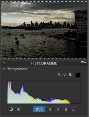
Notice how, with the untreated image, the right end of the histogram is flat - this means you are not working with the amount of detail that is available in the highlight end without blowing the highlights
Now apply a spot measured Smart Lighting
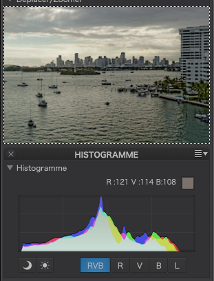
See that the upper end has less “wasted” space. And, if I modify the tone curve…

… I am able to get an even fuller tonal range
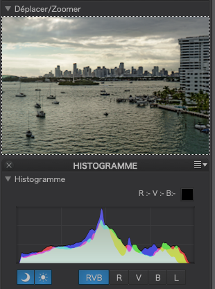
Now that we have maximised the available tonal range, we can go on to tweak other things. Here I have really boosted the shadow contrast to overcome a slight “flatness” in the shadow end.

I then went on to do some control point local adjustments to the sky and buildings and a couple of slight tweaks to the colour levels and this is the end result
And here is the .dop file
2020-11-28 | L1001457-Biscayne Bay Processing Test.dng.dop (30,8 Ko)
3 Likes
We now have quite a collection of interpretations. As we can see, DPL offers many possibilities to change the resulting image.
2 Likes
I tried to do the minimum possible because @mikemyers has repeatedly said that he doesn’t want it to look “processed”. The problem being that someone’s idea of processed is someone else’s idea of the perfection rendition.
Of course, Mike is trying to repeat what he thought he saw on a high dynamic range scene, where the human eye adjusts itself to what it is looking at and is capable of seeing the same scene in several different ways at the same time. In other words, what the eye sees is processed by the brain, subconsciously, to ensure that, in some ways, we see what we want to see.
During a teaching session, I did a couple of slides which compared the “dynamic range” of the eye to RAW and jpeg files :
- Human eye - between 14 and 20 stops (processed by the brain)
- RAW file - up to 14 stops (processed by software)
- jpeg file - up to 8 stops (if you are lucky)
Then we have to work out how to make processing software do what our brain does automatically 
That won’t be fun at all, i have to find a new hobby!
imagine that we do HDR, Focusstacking, Clone and repair, Color correction and all that on the spot and on the fly!
Do we have denoising too?
one small problem my sensors are 50plus and my “shadow recovery” is down some stops lately… ![]() not to mention my focusplane in AF is shifting out of focus…
not to mention my focusplane in AF is shifting out of focus… ![]()
1 Like
but it will not save from bad light
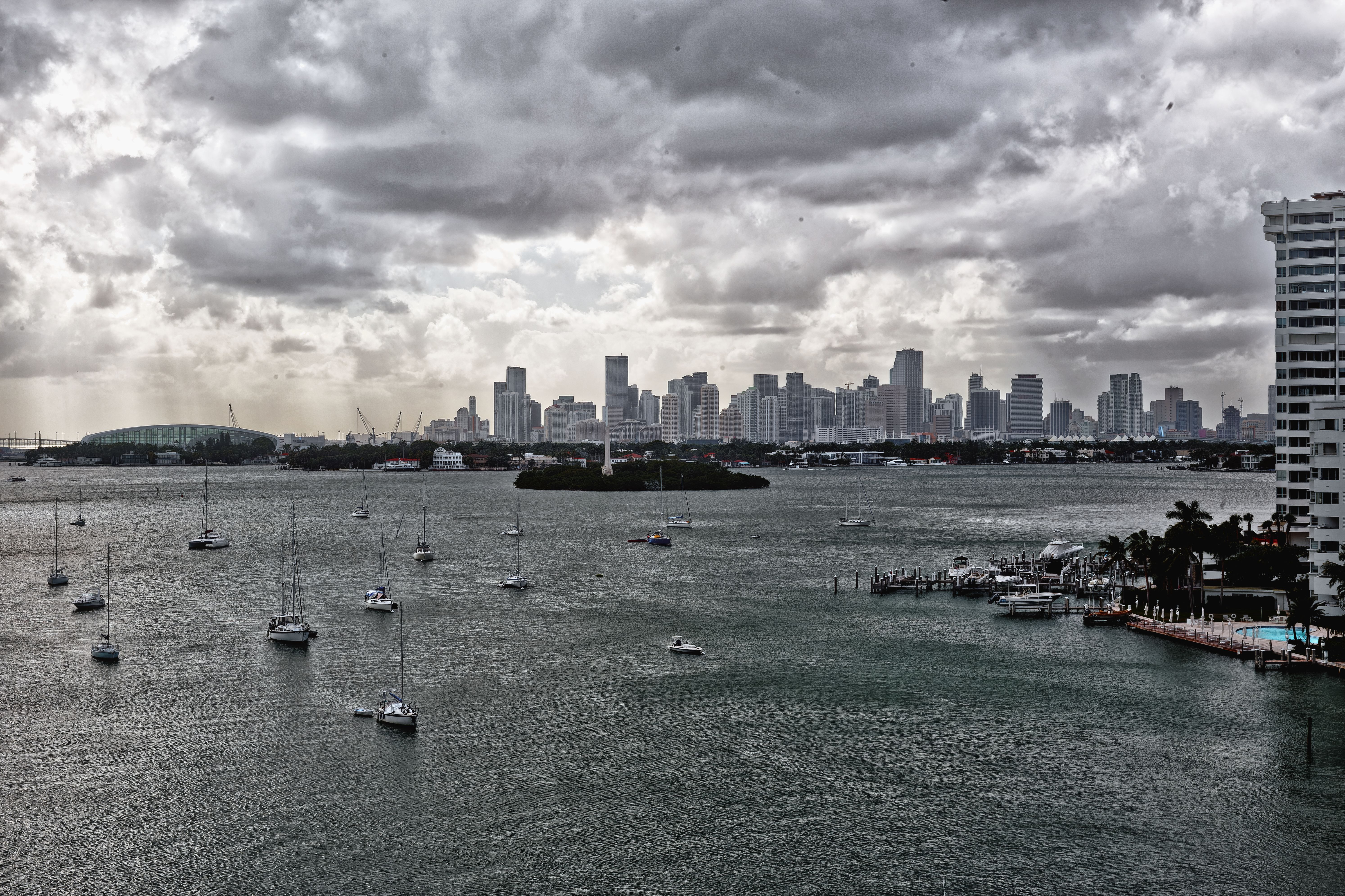
Just giving a try. the greens are lost on the right ; as Joanna pointed out there was margin in the highlight that could have saved those shadows. I tried to make a guided line to the island and give its importance to the sky, which for me is the point of interest in the pic, with contrast with the buildings.
A pic with light on the buildings and the island, could be interesting.
For me the light is not good for a good pic, cameras don’t see as human eyes, not talking of screens, and Dxo will not make magic.