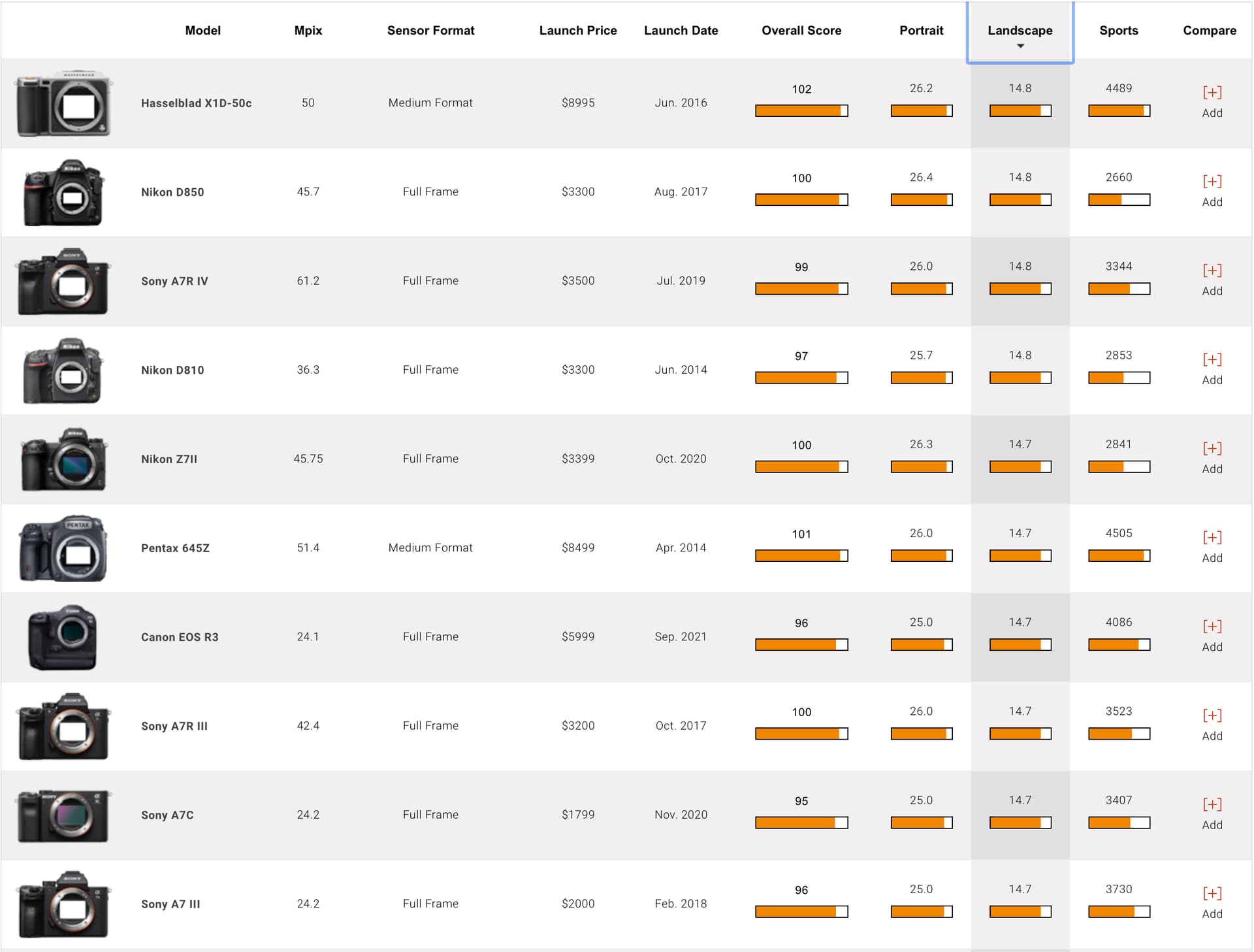
Thank you! I need to stop for a few weeks though, as my D750 is off to Nikon for a warranty repair of a new shutter - no idea when I’ll get it back, but I know it needs fixing, and I figure I ought to do it before they stop supporting it. That leaves me with my two Leica cameras, and my Df, none of which match the capability of the 750. I’m more tempted now than before to consider a Z camera (not the big new fancy one).
Regarding your changes…
a) I liked my sky yesterday, but I far prefer your sky, as the blue matches the water better. Yes, I was satisfied with it, but in retrospect your sky ties the whole image together better. …I wish I could “see” better. The first thing I thought of was a graduated filter for the sky, but using a control line as you did for the color is infinitely better. I will remember this next time. So 100 for “Luma” and Opacity. …my problem is I only see this after you do it. I need to make it part of my routine, and notice it, and think about it, when I’m first editing the image - or, edit the image, and come back to it a few hours later, and with a fresh viewpoint perhaps I’ll notice it before I post anything.
b) Pelican breeding season? To me, that crosses a line I’m not prepared to cross. I prefer your version, but to me, it’s no longer a “photograph”. There is no way that could have been done with film, in a darkroom. If I mail this out, or post it, the people I care most about will never trust me in the future, unless I say something about it.
c)
That was intentional, but it didn’t work. I was thinking that things closest to me should be brighter and clearer, but your version “works” better. The little peninsula shaped thing with the boat docks is “too bright and colorful”. Your way pushes the emphasis back onto the island and city, which was what I wanted. I can compare my masks to your masks, and this is obvious. I never came close to thinking about it, but your negative control line is what “fixed” my editing to the peninsula at the right. On your image, it is toned down, and having done that, you cropped a little more from the bottom which also helped.
Since the buildings are the focal point of the image, that is good. In a small image (email) it’s not very noticeable on the buildings, but it’s obvious that the white cruise ships benefitted from what you did.
Nice trick!!! Nah, it’s not a “trick”, it’s just getting the most out of the tools at hand. I never would have thought of this, but your image above showing how this negative control line worked on the image is worth its weight in gold.
I need to make these control lines part of my “vocabulary”, so I use them as easily as I use the crop tool.
My SUMMARY of what I’ve just learned…
That is my current goal. It’s one thing to know the classroom version of these tools, but it’s something much more to understand where and how to use them most effectively - as you do so naturally!!!