Stenis
(Sten-Åke Sändh (Sony, Win 11, PL 6, CO 16, PM Plus 6, XnView))
21
Is this sRGB-recommendations we have lived with for decades still the norm?? In my country (Sweden) Display P3 compatible phone screens is the norm today I would say. I-Phones have a market share of around 70% here so most people would see my pictures on a Display P3 screen and not on an sRGB-screen.
Is exporting in sRGB still a wise choice on a market where most people seem to use Display P3 these days to look at them? Yes, Windows is still the industry standard on computers by far but that does not prevent people like me to calibrate my Benq for Display P3 and for me it is fine to look at the sRGB-pictures there are out there because there will always be a mix of used color spaces out there and that goes for modern TV-screens too. I have no problems viewing my Display P3 pictures on my Samsung QLED either.
Every user has to make his or her own decisions because there is really nothing else than compromises open for us today - there is nothing like one choice fits all perfectly and I think few bothers to switch gamut on displays on the fly because we will mostly not be able to find out which gamut that actually was used when making these pictures.
I don´t see any problem either with using 4K monitors today. We can always scale low-res pictures in Topaz for example if that would be the case. The reason I switched to display P3 are two. I just don´t like the blueish Adobe RGB casts I use to get when using that color space. sRGB and Display P3 is a better match.
The other reason is that it is much more effective to use just one single color space - just one single color space and just one type of files instead of two with sRGB and Adobe RGB. Most color related problems seem due to that people often seems unable to organize their files properly so they don´t mix them when printing or use them for screen display.
I don’t think the screen is calibrated for a certain color space, just for the colors. The color space is just a display specific limitation to show all the colors.
George
George
Stenis
(Sten-Åke Sändh (Sony, Win 11, PL 6, CO 16, PM Plus 6, XnView))
23
Some semantics.
I asked OpenAI Chat GPT 4.1
Good question — here’s the clear answer:
Display P3 is a color space.
Here’s why:
Color space = a defined system that includes:
a specific color gamut (the range of colors it can represent),
a defined white point (usually D65),
a transfer function (gamma curve or tone response),
and sometimes primaries and matrix transforms.
So, Display P3 is a color space because it includes:
the P3 gamut (same as DCI-P3, but adapted for displays),
D65 white point (not DCI-P3’s DCI white point),
sRGB-like gamma curve (~2.2),
making it suitable for computer monitors, smartphones, and web.
In short:
P3 gamut → just the set of colors.
Display P3 color space → gamut + white point + gamma.
So when people say “Display P3,” they usually mean the full color space, not just the gamut. Let me know if you want a visual or chart comparing it!
… and I have calibrated my monitor for the color space Display P3.
Beside that I’m pretty sure you have understood my point despite I did not understand yours
Don’t get angry.
As far as I know calibration is the process of translating the shown colors of the monitor in a value so that when using that value later the same color is shown.
Gamut is the total of colors your monitor can show. I say it’s based on the light frequenty as shown in the color horse shoe.
Color space is a predefined selection of colors. To use these colors it must be translated to nummerical values based on the gamut of your monitor. Pure red 255,0,0 will not produce the same red on monitors with a different gamut, or might even not exist on other gamuts.
There’re 2 gamma corrections: one is done during the demosaicing process to correct for the linear response of the sensor and the non linear response of the human eye. The other is to correct for the non linear respons of the old tube based monitors. Modern led monitors are linear but the non linearity is build in these monitors to maintain a usability using these 2 monitors.
So you calibrate the monitor on true colors and depending what colors the monitor can produce it is said to be a AdobeRGB or whatever monitor. And even then watching the specification of the monitor it often mentions something like 90% AdobeRGB. As you can see on the by @fairy-wren selected monitors.
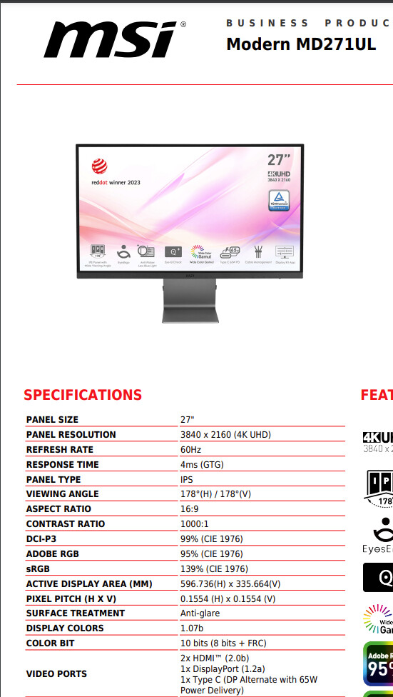
@KeithRJ Arguably you don’t need that much money to obtain a monitor that purports to cover a wider gamut.
So if we take the Asus ProArt 5K versus the MSI MD271UL I just purchased, roughly £748 for the 5K model but “only” about £350 for the 4K model and the MD271UL is about £179.
I have no illusions about the improved quality as I double the money spent (and beyond!), not least because the 10 bit colour of the MSI is actually 8+FRC, but once the correct .inf file was loaded it appears to be behaving correctly.
It fits on my desk with my two old Dell U2515H (25", 2560 x 1440, sRGB @ 99%) with “only” a third overhanging!
The quoted specification for the MSI does state the “CIE 1976” standard rather than the older “CIE 1931”.
With the larger resolution comes the issue that some software cannot scale but text is set at 200% and seems O.K. for writing this!?
I went down this path because the monitor is relatively inexpensive and allows me to see what using a higher gamut display with PhotoLab actually offers (I hope) and I have the two existing screens to fall back on!?
1 Like
Stenis
(Sten-Åke Sändh (Sony, Win 11, PL 6, CO 16, PM Plus 6, XnView))
27
Most modern monitors that supports wider color spaces supports both sRGB, Display P3 and Adobe RGB more or less to 100%.
Photolabs new and wider support for colors is not determing what you see on the screen because that, the monitor colibration and profile does. It is very easy to understand that if one has a modern hardware calibrated monitor like I have. I have three different profiles I can toggle between - Display P3, sRGB and Adobe RGB. On my Benq-monitor “puck” that has three programmable buttons to handle just that.
What I see on my screen is mostly limited by my current active monitor profile IF the software used can handle that. Photolab does a few contributions too. The most important is the camera-profile it has activated due to the camera ID-codes written by your cameras into your files. That profile can actually be changed to anyone of the ones there in Photolab if one wishes. That decides what I see together with your import preset.
Older software uses sometimes the ICM-profile files that gets created by the calibration-software used when calibrationg your monitors. That is in the most well behaved world. A lot of other software just defaults to sRGB or doesn´t handle this at all.
Photolabs wider color support got widened just because a lot of pictures are now produced using Display P3. Photolabs Classic color support was basically Adobe RGB and today that is just not enough when exporting Display P3.