I’ve run a short test, exporting, with lightroom, an image of a color checker as 16 bit TIFF file with each of the following profiles: ProPhoto RGB (ROMM RGB), P3, Adobe RGB and sRGB. Then, I loaded the files as layers in photoshop and checked for differences. The most I got is this:
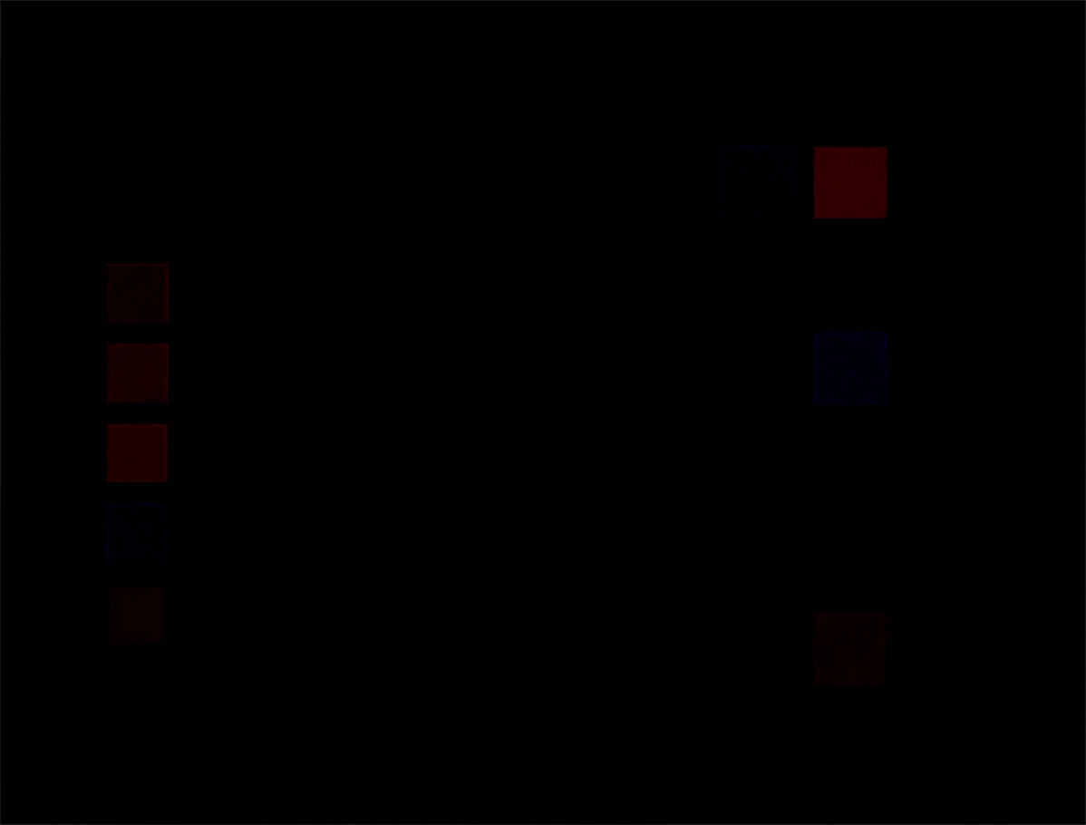
amplified with a steep tone curve (15in → 255 out)
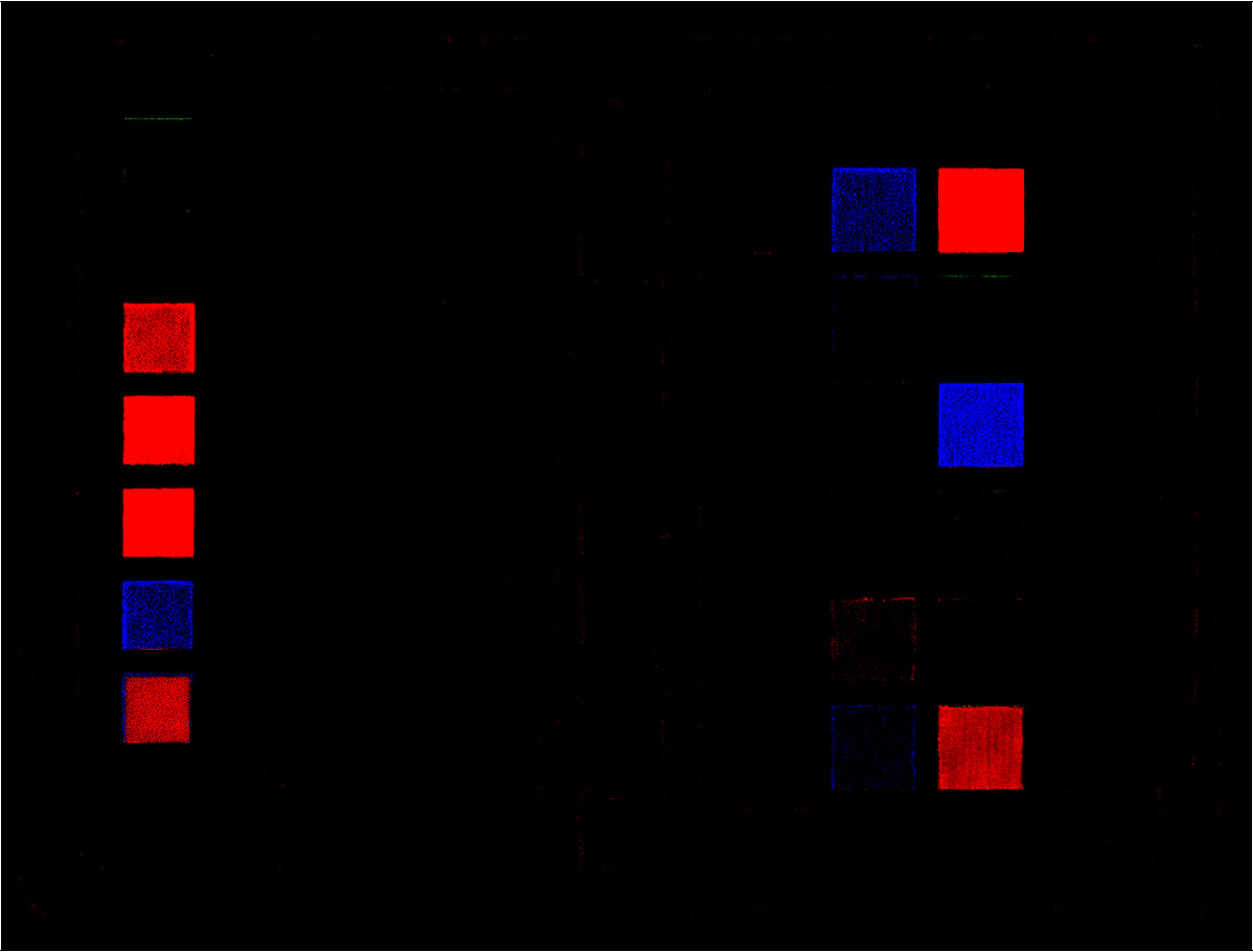
Reference in sRGB:
Differences can be seen (as expected) in hues located near the blue-green and green-red edges of the respective gamuts. Images with more content in these areas should show bigger differences. Testing the same thing with JPEG files provided the same differences, but to much lesser extent.
One does not need to get religious about which color space is the best, but choosing the smallest space can be a limiting factor - depending on how good (in the sense of “ability to differentiate”) your process and gear are. If you use sRGB JPEG, it should be used at the very end of the process and not at the beginning…but we already knew that. 
sRGB can be limiting in landscapes and portraits of people with yellow hair and cyan eyes, but skin colours should pass unharmed.