Carlingford, County Louth, Ireland

King John’s Castle or Carlingford Castle, County Louth:

6 Likes

Nobody has yet agreed with me, so this opinion is unlikely to be popular, but when I look at this image, there is so much to see, I don’t know what to look at. I see a beautiful sky, a wonderful castle right out of my dreams, lots of green vegetation, a boat, which I now realize is two boats, a “pier” like thing, more boats to the right, and a landscape off in the distance at the right.

Had I taken this photo, this is what I would be posting:

Nobody ever likes my crops, just like I never liked it when people were cropping my photos, long before I learned to do it myself and beat them to it.

Wonderful, beautiful scene, filled with beautiful “eye candy”. :slight_smile:

With this crop, my eye goes back and forth between the castle and the boats, but ends up on the beautiful castle. What a magnificent sight!!! And you got it all in. Very nice!!!

Mike,

What have you done? For whatever reasons the way you view the world seems to be different than for many of us. Basically my opinion is you took a lovely landscape and destroyed it because you get easily confused by a lot of detail.

I have noticed recently that you tend to crop the life out of a number of photographs to simplify them by removing elements that make you uncomfortable. The original is quite interesting and beautiful, I’m sorry to say this but your crop makes it look more like a holiday snapshot.

This image is about much more than just the castle and the boat. They are only two of the elements in this image but for some reason you’ve decided that they are the only two that count. You eliminated most of the very interesting stone pier on the right and left, most of the beautiful sky, the rolling hills in the background on the right, and most of the water is front of everything destroying the very interesting waterline against the piers. You took the image from really interesting to really meh!

The various elements of the original image is reminiscent in some respects of the Hudson River School.

Mark

Agreed.

Simplicity.
I was taught this a lifetime ago.
It’s OK that you don’t agree.
Maybe nobody here agrees.
You make photos that you enjoy.
I (try to) make photos that I enjoy.

It’s the photographer’s job (or can be) to direct the viewer’s eye to the main subject in the image. Lots of other stuff just confuses things.

Lots of articles about this - start here.
Simplifying Your Photos
That’s why I simplified the above photo, and many others.

Added later - remember, THIS is the title for this image.
The details I removed might be beautiful, but they have nothing to do with the title for the picture, as I see things.

I do understand why you wrote what you did.
I’m very curious to read what @Joanna thinks about this.

Both the original, and my image, show the Castle.
Which image is more powerful, based on the title?

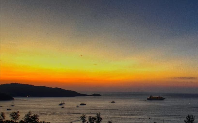
Based on your desire for simplification I reworked your image called Patong Beach, Thailand, Sunset.

Since titles seem the be one of the main things that drives the content of an image for you, I followed your lead and took the liberty to fix your image by removing all the busy details not directly related to the title. To paraphrase your earlier comment, when you look at your original version there is so much to see, I assume you don’t know what to look at.

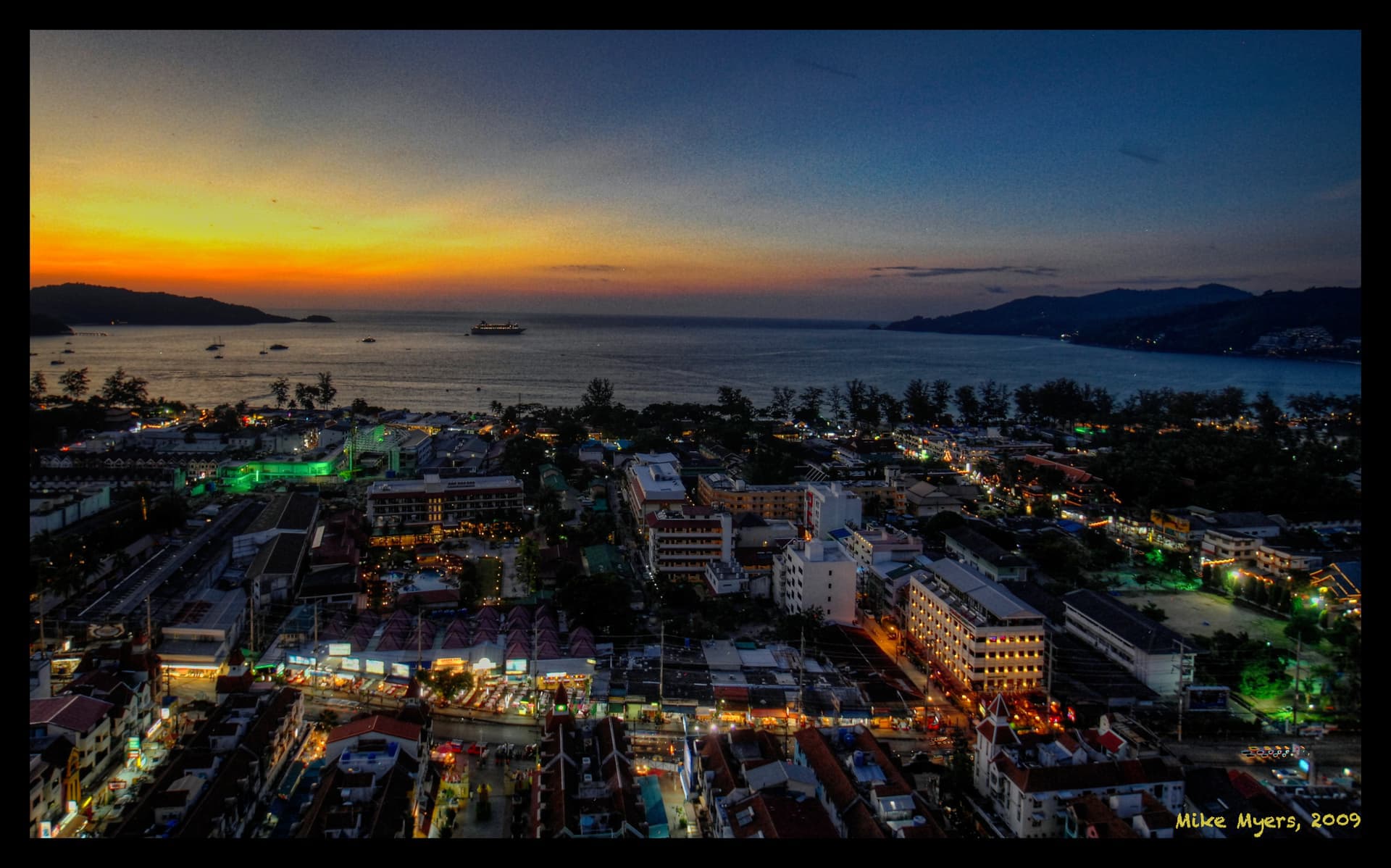
Is the way the light plays on the town the main subject or is it the tiny area of sunset in the upper left hand corner? Since the town takes up two thirds of the image is the photo just poorly titled or is it perhaps that titles matter far less than you seemed to be suggesting.

I think it is nowhere nearly as interesting as your more complex original image but, based on the standards you set for the original version of the image in this thread, I assume you would have to agree that my version of your original image is far superior because it is simpler, adheres to the image’s title and removes all the unrelated and busy fluff that distracts the eye from the subject in the title.

Given your proclivity to the mundane my version of your image should please you much more. If I am wrong, please explain why the much more complex detailed version of your shot works and @mrcrustacean’s original version does not.

Mark

Mike’s original version

My reworking of Mike’s version based on the standards he set for the original image in this thread

1 Like

I like the original. Yes it’s busy, but that’s a true reflection of what was there. In the cropped version it’s a photo of a boat. In the original, there is a boat in the picture.

I was actually thinking the boat lends an interesting twist to the picture which is otherwise mostly natural tones, where the blue boat is a decidedly unnatural blue and therefore creates more interest in the scene.

I wonder if this cropping is a variation of the sort that plagues sites like JetPhotos, where the moderators insist that the image be cropped to within a whisker of the extremities of the aircraft — which takes all of the art out of the photo and makes it simply a “record shot”.

In this case, there is very little left or right of the castle, save for giving the greenery on the right the status as part of the castle.

If I wanted just the castle, I’d look for another angle that completely excludes the boat.

4 Likes

Thinking further on this… neither version of the image portrays simplicity.

Simplicity is, I think, not thousands of pieces of stone and millions of leaves and branches. It is a single blade of grass, a single flower, or the plain lines of uncomplicated objects.

There is something between a photo of a single rose and a page from a Where’s Wally/Waldo book. I think the key is a modest number of focal points. The sky, the castle, the boat, the water. Yes there is a sea of masts in the distance, but that is not what one first sees in the image. Same for the complicated sea wall and the additional boats, the road signs, and the building below the castle.

(Could you please copy that response, and post it in the new thread I created with that image? I’d rather reply there, not here.)

No Mike, I don’t want to create a new thread. No reply is necessary. I was just trying to make a point. You either got it or you didn’t. There is absolutely no need to discuss it further.

Mark

4 Likes

I didn’t want you to create a new thread, I just asked you to move those posts to the thread in which I posted the images. We’re not doing very well about communicating, but I do want to respond to what you wrote…

I’ll post my response in the thread in which I posted that image.

Mike, as I said I was only making a point. It was only relevant in this particular thread. The fact that you want me to move it somewhere else to discuss it further suggests you really didn’t understand what I was getting at, which I guess is not surprising. There is no need to respond, but respond if you must. I have no desire to continues this particular discussion and it is unlikely I will have anything more to say on it.

Mark

1 Like

Well, you did include a good suggestion, and I revised my original image accordingly. Thank you.

Mike… You simply like to be beaten up ;O)
The original image shows a fine old castle in a modern landscape. If the castle was meant to be the point of interest, I would have shot it from an angle with no modern objects included, and I would have removed lamps, ice creame advertisment, tourists, etc. - leaving the castle to be digested without historical discrepancies. But the author preferred the post card version, and that (imo) is the second best choise allowing us to take in the totallity of the idyllic environment. Which makes your crop the third choise or worse. You have elevated two modern steel boats to fill 25 percent of the view in front of a historical monument. Now everybodys attention will flicker like a broken light bulb between the 15th and 21st century - wondering about the importance of such a contrast.
This castle should be photographed from a drone in order to leave modern artifacts out.

2 Likes

You said it far more eloquently than I did. That’s pretty much what I should have said when I referred to Mike’s version as a holiday snapshot. You hit the nail on the head. He cut out too many of the interesting bits in his crop of this attractive landscape, but not enough of the extraneous objects if his primary focus was the castle since the presence of the modern boats detracts from it.

This is low resolution version and is pixelized when zooming in, but if I just wanted to see the castle this is possibly close the type of crop I would have done. Of course it required the removal of some objects which were in the way which is something that Mike is dead against doing. The removal was done in haste and is just an example of what I would have done. The result would have been much better If I had spent more time on it. But, in any case, I still like @mrcrustacean’s original version the best.

Mark

After

Before

Well, we all have our own ways of seeing things, but based on the title of the image, I wanted the castle big and clear, and while I couldn’t get rid of the boat in front, I did get rid of all the distractions (as I saw them).

Of the various versions now posted, I prefer the version I made, but I’d rather have excluded the ship and the “boathouse”. Mark did that just great, but the resulting photo feels “off-balance” being cut off at the bottom.

To me, the original photo shows a blue boat in front of a castle, with a lot of other stuff all over. My mind wants to exclude everything except the castle, but that’s not possible, and if the blue boat wasn’t there, then there would be very distracting tan colored structure - yuck. The boat being there blocks that tan structure.

Nobody is “right” or “wrong”. Just different ways of “seeing”. :slight_smile:

A lot of people want to include so much in a photo, even if it has nothing to do with the subject. To me, the less there is in the photo, the better the main subject stands out. Simplify. Even when it hurts.

If I was interested in making a more serious attempt I would have extended the bottom more and perhaps cropped a bit more of the sky, but that would have required much more work to remove the overlaying objects. Since my version was only intended as a quick example of what could have been done to remove the boats I wanted to limit the amount of effort.

Mark

That proves my point, Mike. Statistically you have chosen to be hurt more than 50 percent of the times.
You probably know this silly joke:
Beat me hard! the machocist urged the sadist. No, the sadist replied, for she was are genuine sadist.

Goes with the territory. Suggesting people leave out beautiful or interesting things in a photograph almost guarantees that they will reply about how fascinating, or beautiful, or necessary they are. Photographers, me included years ago, are that way. But to me, and the articles I’ve read, including all that extra “stuff” weakens the message being given to viewers of the photo.

Here’s yet another example:
https://washingtonphotosafari.com/news/the-art-of-exclusion-in-photography/#:~:text=To%20create%20a%20compelling%20image,in%20the%20image%20is%20diluted.

I understand the reluctance to crop all those details out of the above image, but if the photo is intended to be a photograph of the castle, all that other stuff does is give the viewer a chance to look at all the “small” and not very detailed “other stuff”. So, the question becomes is that other stuff really needed/relevant to the photograph? The title of the photo says it all. By including the other things the size of the castle is reduced, and it becomes just one more object in the photo.

Look at all of the representations of the photo posted up above. If you were creating a booklet about the castle, which of all the photos shows the best view of the castle, while still maintaining all the rules/suggestions about composition, and so on.

To me, the original photo is a standard “tourist photo” - aim camera at subject, and capture photo of subject and everything around subject. By zooming, or cropping, leaving out all the other stuff makes the photo stronger.

Anyway, that’s what I’ve been taught, and that’s what I usually try to do, even if/when it hurts. Leave out all the “extra” stuff, unless it helps show the subject of the photo better.

I’d have cut out the boat, and the ugly “boat-house” thing, but at least the boat hides the ugly structure in front of the castle.

It’s all a matter of compromises, for better or worse - or, to avoid compromising, leave everything else in the photo, as it hurts too much to leave things out. Been there, done that, got criticized by people better than me at this sort of thing.

Most of that “other stuff” is irrelevant to the photo of the castle. And, by including that other stuff, the castle gets smaller and smaller in the photo.

About getting hurt - I suspect that eventually, people will learn what I was taught, especially if they look this up on the internet and get enough feedback.

That article gives a few examples of how to isolate subjects. But that doesn’t mean you should imitate it like a headless chicken.

George