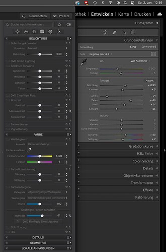
There is more than contrast…
Compared to Lightroom, inactive tools have the same type vs background brightness ratio of about 2:1. Nevertheless, Lightroom’s text is easier to discern and read, because active toolsets are brighter overall.
Moreover, DPL needs more space for a comparable set of settings. Lightroom can automatically collapse toolsets that are not in use, which means that scrolling is unnecessary in most cases. Also, DPL’s GUI looks busy in comparison to Lightroom.
Looks are subject to personal preferences, nevertheless, ergonomics should improve imo.
